Homegrown food and drink – there’s just nothing like it. Especially when it’s a meal specially prepared with fresh, locally-produced, seasonal ingredients, all accompanied by an ice-cold mug of beer – specially crafted too, of course!
This is the very experience that lies at the heart of Avling Kitchen & Brewery, a one-of-a-kind eatery based in Toronto’s east end. Long before it first opened its doors in July of 2019, the creators behind Avling had always envisioned a unique kind of eatery that would fuse their love for food and drink. Having previously worked in kitchens in their early life and then later in breweries, it was only natural that Avling became the food and beer haven that it is now.
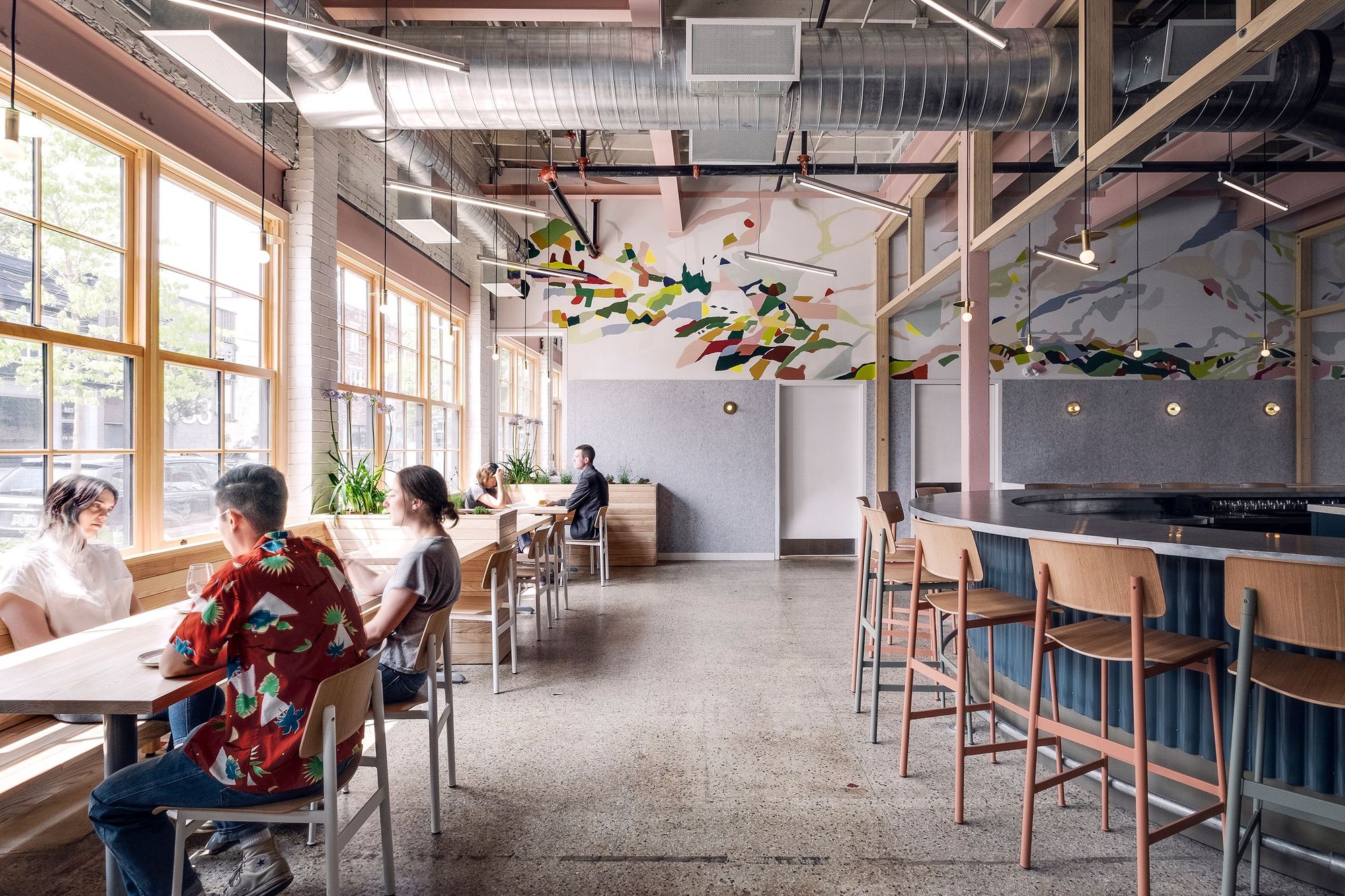
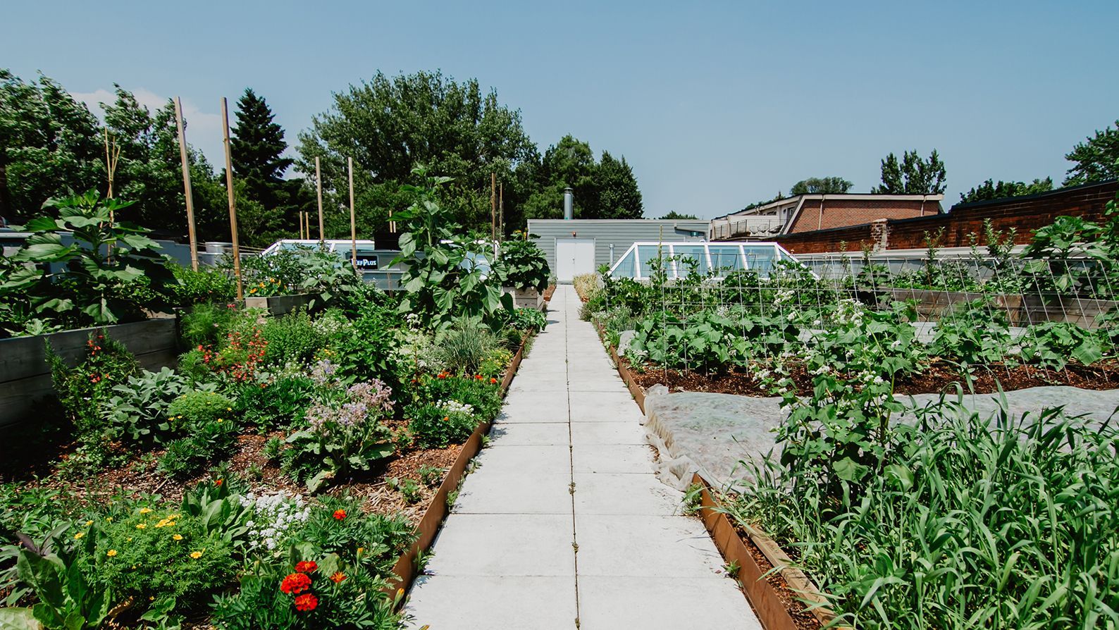
But it isn’t all just good food and beer either – as much as Avling Kitchen & Brewery celebrates a good dining experience, it has a strong sense of community laid into its very groundwork, that’s as much part of the entire Avling spirit and experience as well. This is also reflected as part of its identity, too: “Avling”, the Norwegian word for crop or harvest, was deliberately chosen to reflect its owners’ dedication to working closely with suppliers and farmers in sourcing all their ingredients.
But the road to crafting exceptional dining experiences wasn’t without its own challenges, either. In particular, with the vision they had in mind for Avling, one of the biggest difficulties was in coordinating together all the unique qualities that make up the entirety of Avling, and in pulling together all of the moving parts to turn it into the one-of-a-kind brand that it is today.
As for their advice to fellow budding restauranteurs, they emphasize on the importance of food branding and packaging, most especially now with lockdowns and the still-ongoing pandemic.

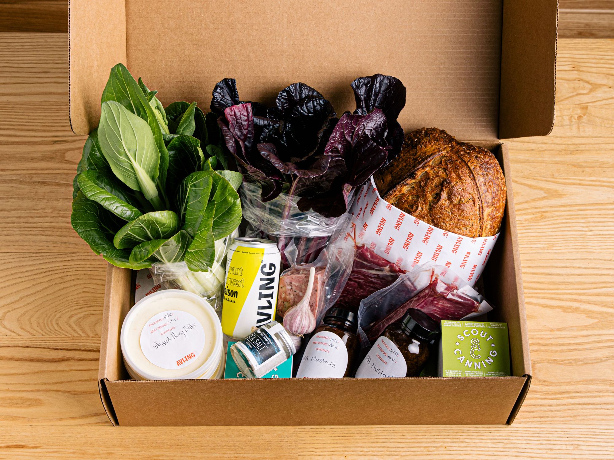
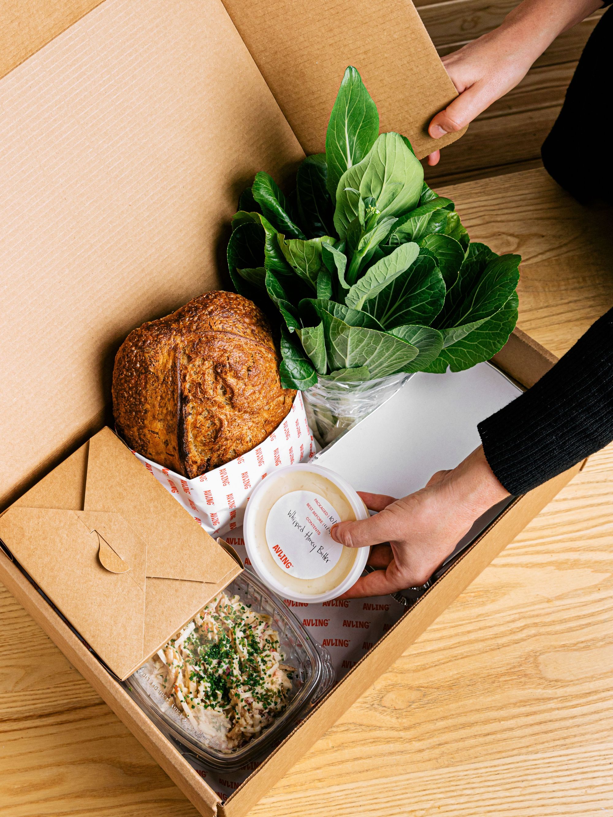
And with the current situation indefinitely shifting its entire customer experience, maintaining a strong, sturdy brand identity while still in remote conditions has definitely become more important than ever. One way they’ve been able to maintain that is by including noissue Foodsafe Paper as part of their packaging – which, of course, they’ve customized to reflect Avling’s own identity as well.
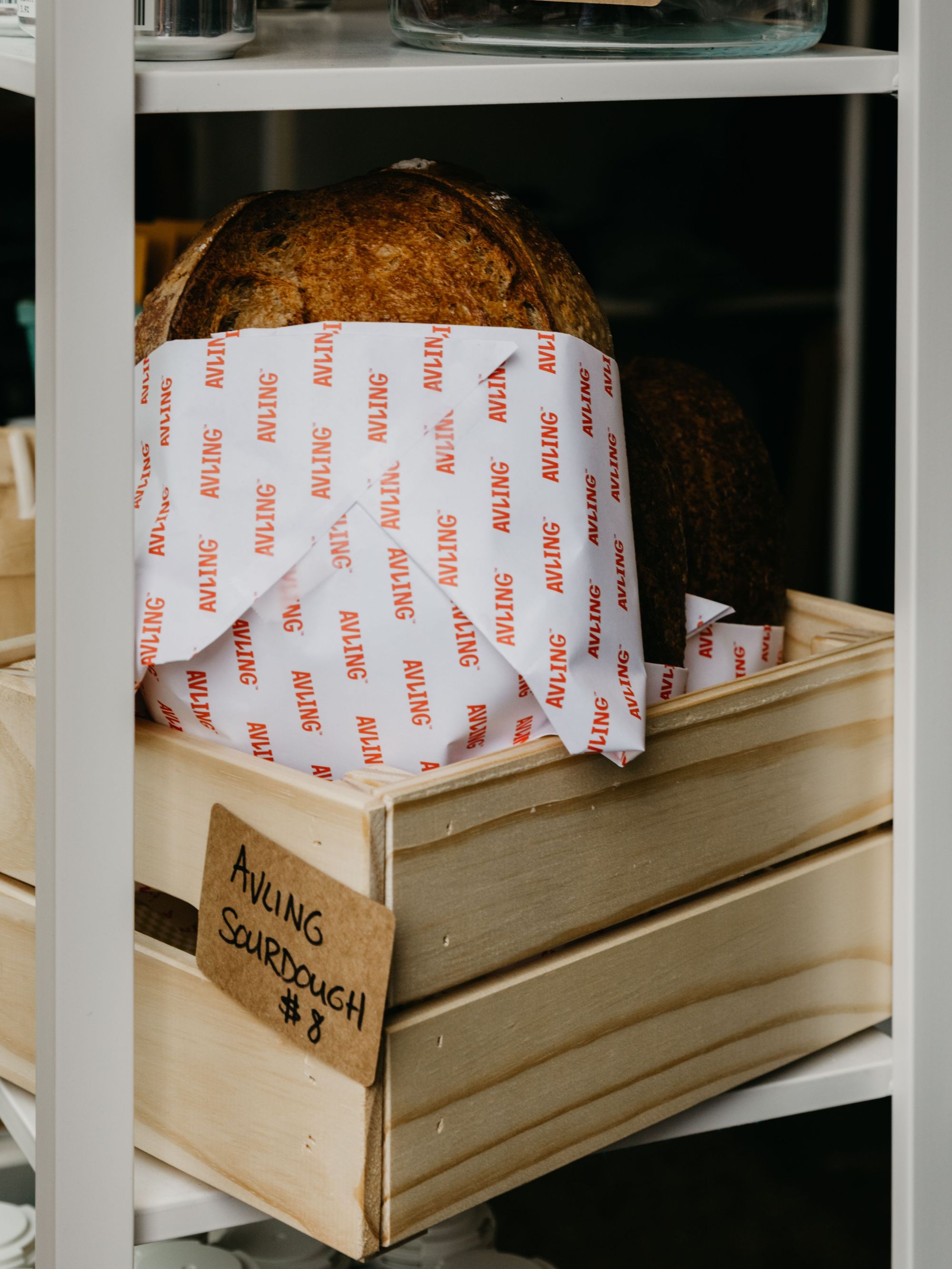
“Our logo is simply our wordmark, and it’s always been intended to evoke ideas, rather than a feeling, as you derive from a logo. The typography was meant to have energy and motion. In particular, the L in our wordmark reminds me of a plant growing and shooting out which has always felt especially fitting. The colours we use are modern, light, open. Despite the close connection to farming and the earth, and perhaps a seemingly obvious colour palette, we’re located in downtown Toronto and we wanted to employ a vibrant, modern palette that would reflect the urban setting that we live in”.
And indeed, if there’s one thing that Avling won’t fail to deliver on, no matter what condition the world may be, it’s good, old-fashioned hospitality, down to its smallest details.
“Hospitality is a sensory-based experience. Paying attention to the small, occasionally overlooked details, is a part of ethos”.
That’s definitely something we agree on – although communities may be far apart for the time being, there are infinite creative ways that businesses can still form meaningful connections with customers.
And if you ever feel like trying out one of Avling’s specialties, here’s a tip from its owners themselves: try out their tripe – it’s an often underrated yet traditional ingredient that’ll definitely add something new to your palate!
Find more of Avling Kitchen & Brewery here:
Website: avling.ca
Instagram: @avlingto
Like this story? Tell us yours! Share your brand story and love for your custom packaging and get a chance to be featured on the wrap! If you’re a noissue customer and are interested, you can join the Eco-Alliance by clicking here and answering a few questions here.
Questions? Email us at ecoalliance@noissue.co.