With skills in elucidating brand identities consistent with each character he works with, Greg Davies is surely making a mark in the creative world. Here we chat to him to learn more about his inspirations, aspirations and a little more about his collaboration with Shea Sassy.
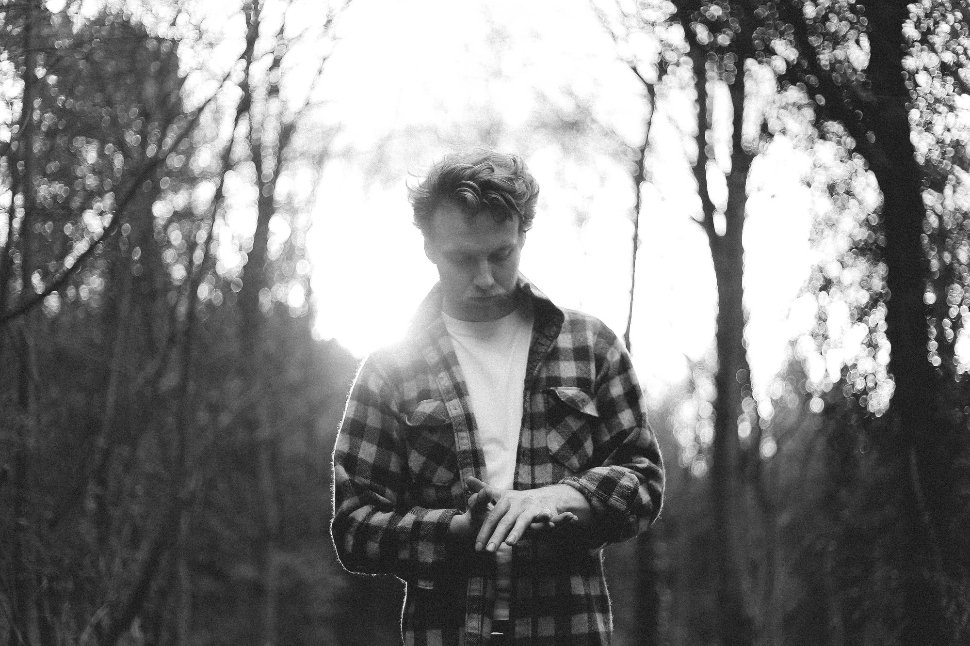
Creative: Greg Davies Art & Design
What are the key inspirations you draw on for your work?
I have a background in fine arts so I take inspiration from the masters of still life and surrealism who definitely help when it comes to art direction and finding an indulgent and creative vibe. I am also a big fan of the outdoors and try to look to nature for inspiration wherever I can. This can come in the form of stone textures, foliage patterns or even abstract lighting you find from a walk in the forest. Another major inspiration for me are my clients, as I find it’s very important to capture the enthusiasm they have for their products. You can then channel this passion into their brand identity which will best represent their brand and gives them the best possible start in business.
Tell us about some work you are proud of?
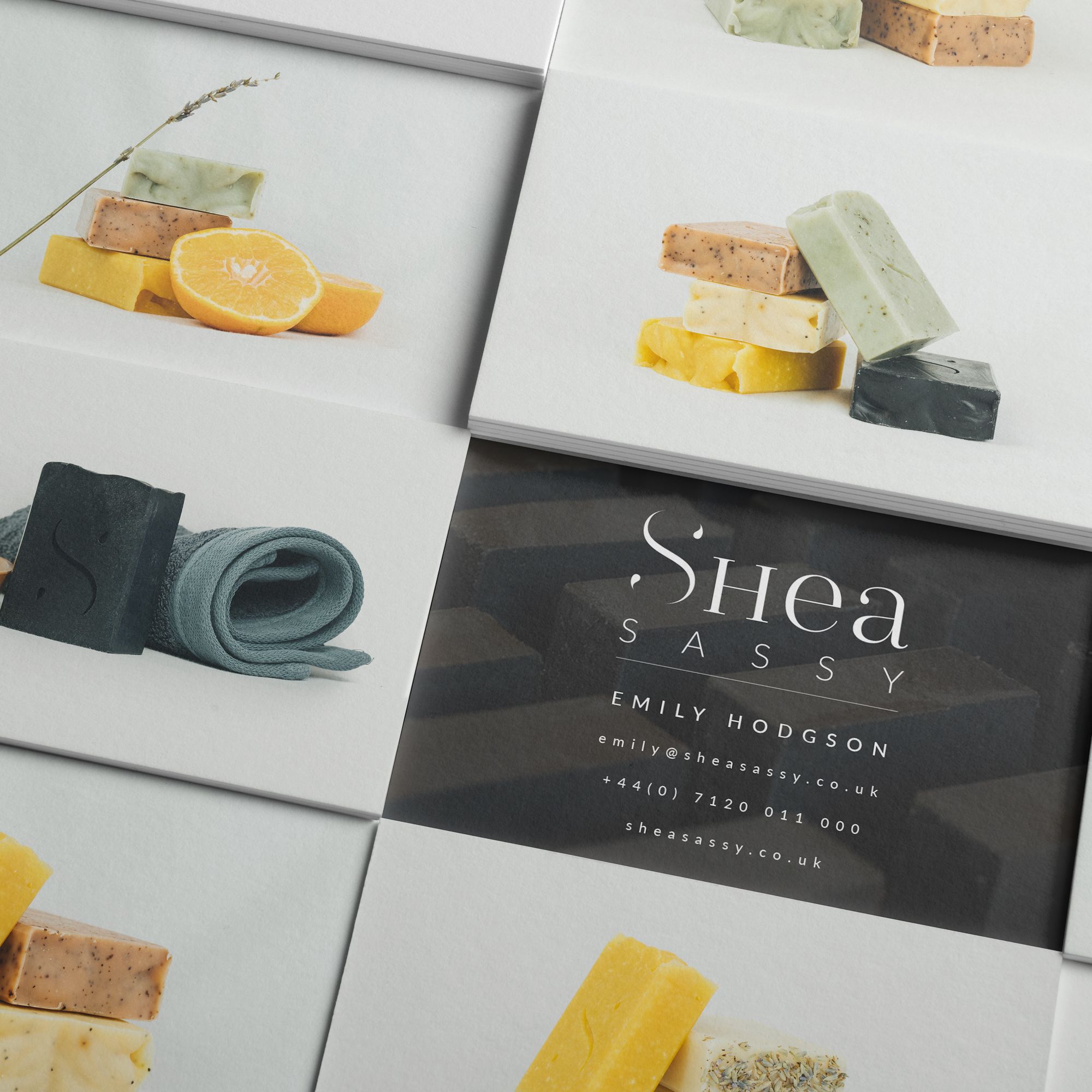
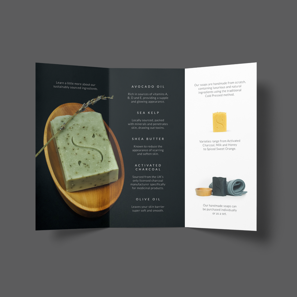
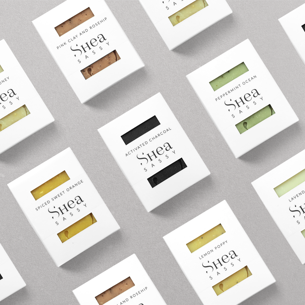
I am really proud of my latest brand identity for Shea Sassy as we worked very hard on getting the direction just right. This really allowed me to spread my wings when it came to the design and helped me to create a great ecosystem for the products, printed materials and website.
I am also proud of my work for Station IPA where I had to create a naming strategy for multiple products and define a theme for each individual item. The first design went down really well and I like to think it was a combination of great design and brand execution.
What are your favorite design tools?
I love to create my own brushes, calligraphy pens and ink textures as it feels great to be able to work with the materials that you are going to be using for your work. My favourite tool would have to be my ruling pen as it is expressive and loads of fun!
Photoshop is my favourite digital tool as I have grown up with the software and know it like the back of my hand. The levels at which you can manipulate, enhance and create is breathtaking and I would recommend it to anyone looking to get started in design.
What’s your creative process look like?
As a brief overview I always start a new commission by working closely with the client to outline a well defined route for the branding. Once we have defined our objectives I then like to sketch out all my ideas as it is the most expressive way to convey my creative thoughts. These ideas are then developed into digital assets using either Photoshop or Illustrator depending on the type of project. The client and I will then collaborate in delivering designs that they are happy with and that we feel are inline with the brief.
Name a favorite brand you’d love to work with?
Vogue is one favourite as I feel they are the pinnacle of high-end fashion and indulgent themes. A close second would have to be Stussy as their logo is one I would have loved to have created. Let’s not forget noissue as they are leading the charge for sustainability and ecologically friendly packaging!
What’s a brand you’ve worked with to create noissue packaging?
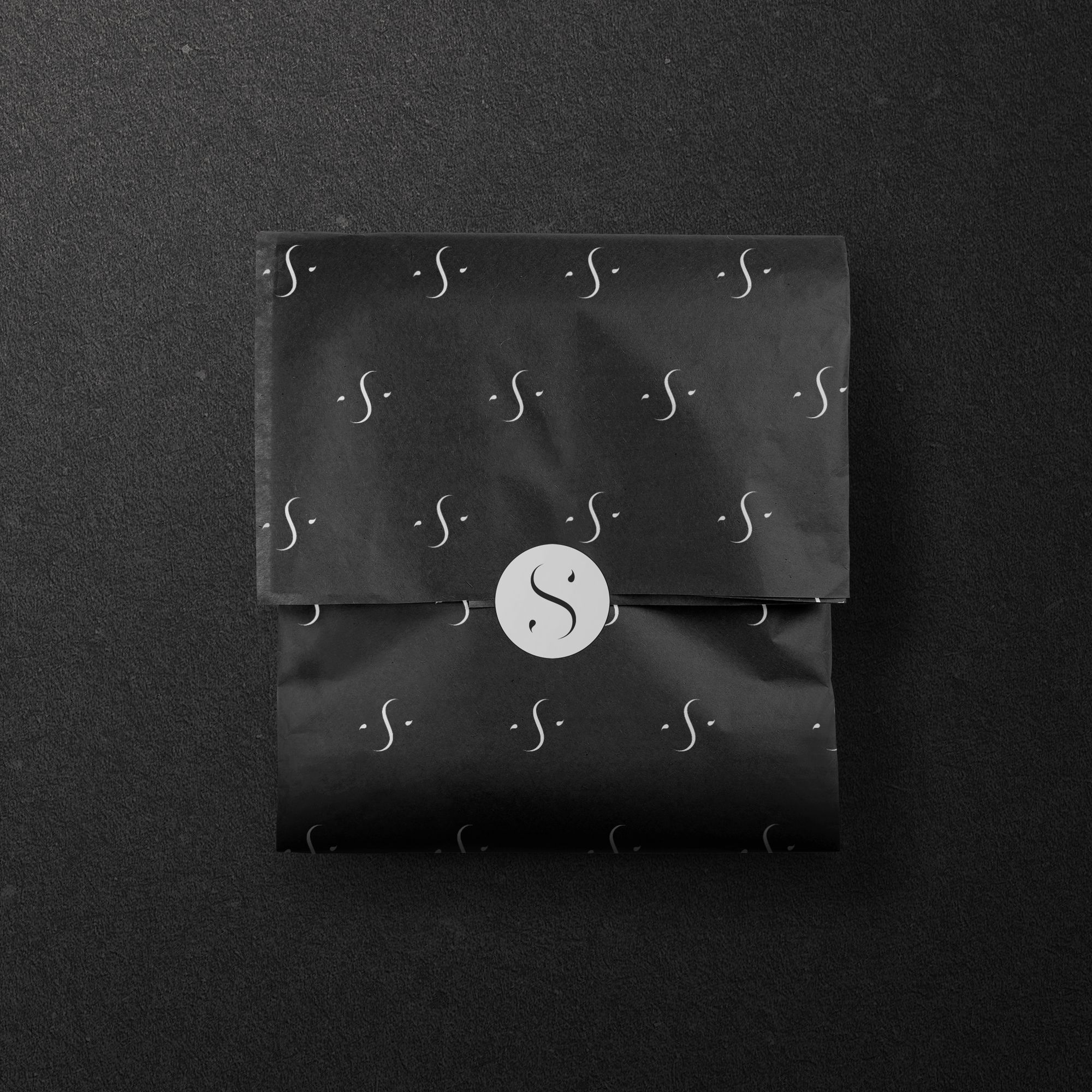
I’ve worked with Shea Sassy to create some lovely tissue paper and circular labels for their gift boxes. We wanted to add a personal touch and high-end feel to compliment their amazing products and well made packaging. The noissue products helped us to achieve this and improves the unboxing experience for the customer.
How did you meet the brand and how did you start working together?
This client was a referral from a previous client and we started talking about the brand just over 2 years ago. 1 year later I was in full swing in developing their branding identity, packaging and printed materials. It took about 1 year to create all the assets and we are looking to the future with regards to their future products and features.
Why did you choose noissue for the project?
Noissue’s social presence was very friendly and made them feel approachable despite being quite a large company. After finding out about their environmental objectives and beliefs it was a no-brainer to work with them. We were very pleased with the communication of their employees and the support we received throughout the project.
How did you find the design process? Why did you choose your specific packaging design?
The process was very straightforward as we knew that the “S” logo would be the main focus for the packaging design. For the tissue paper it was a case of working out the rotation of the logo and the size, as we wanted it to be subtle but make the unboxing experience unique. The labels added that extra attention to detail and could be used for multiple uses, extending the opportunity for a branded utility.
What does being part of the noissue’s creative, sustainable community mean to you?
It means a great deal that my client has reduced their footprint when it comes to packaging by choosing noissue. As someone who is very environmentally motivated, knowing that I have contributed to the planting of more trees whilst designing a brand is a very special feeling! I will definitely recommend noissue with all my future commissions that require a sustainable and unique packaging solution.