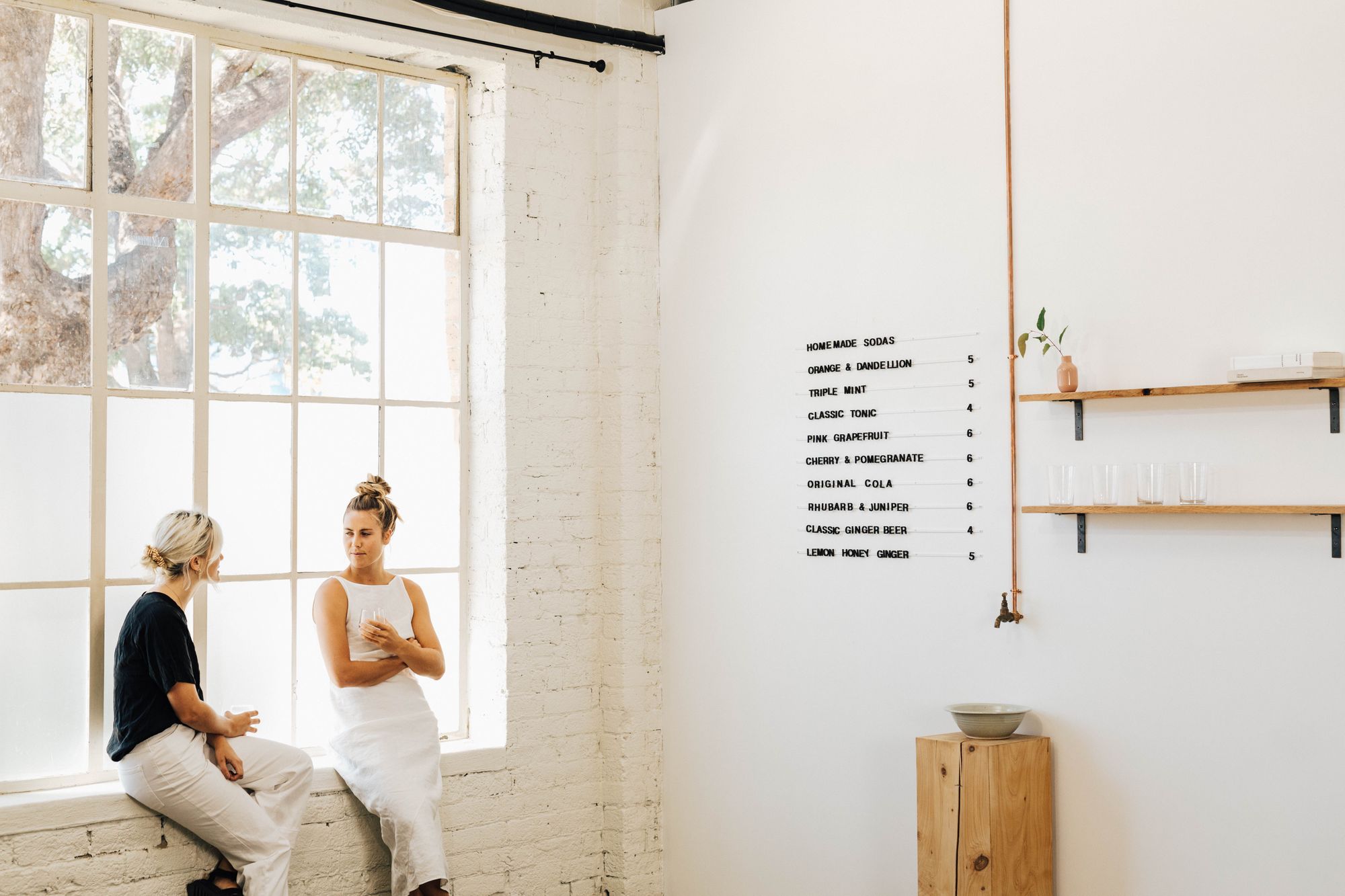
Whether you’re at a pop-up, market, collective, or have your own store - how your items are displayed, and how your space looks and feels is important to the overall customer experience. Just like how you put thought into your website, logo, and packaging, being thoughtful about your space helps reinforce the look and feel you’ve communicated on your website, social media, and through your packaging (hello - brand recognition!).
Today we’re talking to Will McCallum of George & Willy about his top 3 display tips you should consider, why ‘buy once, buy well’ informs a lot of what they make, and some of his favorite spaces that inspire.
Starting their business to make simple display products for creative spaces, George and Willy have always designed with the idea that whatever they make should inspire any space, and encourage creativity. Their products are functional, simple, designed to elevate your space, and wear in not out.
Hey Will, please share with us your top 3 display/fit out tips/must-knows:
For Retailers: Make something in your space remarkable, whether it’s an adult see-saw in your courtyard or a quote painted on the floor, make it something worth sharing or commenting on. It helps you stand out.
For Cafe’s: Consider every detail - people sometimes spend thousands on light shades and stools and artwork and then buy the cheapest toilet lock possible. Almost every customer interacts with the toilet lock, don't overlook such small details.
Consider your aspect - people love sun, sometimes indirectly.
Takeaway: Have something in your space that helps you stand out, and consider the little details. No detail is too small!
Tell us a bit more about your 'buy once and buy right' ethos?
If I buy anything I love doing research, looking at all the options and choosing the best product to fit the purpose. Whether it's a travel coffee mug, a ski bag or a vacuum cleaner. Researching, assessing and buying products is one of my hobbies. It's stressful to buy something knowing it is a short term solution. I always lean towards quality, which also tends to be the most expensive (short term). Naturally, when George & I began making products we went for quality, long term solutions.
Takeaway: Focus on quality.
What is your favorite product in the George & Willy range?
My favorite product in our range is always the one we are currently working on and developing as it is exciting seeing something come to life from a sketch, sampling and manufacturing always takes a long time and delays are inevitable so it builds the suspense! One of the products I particularly enjoy at the moment is the merchant sign, it is super versatile and can be used by pretty much anyone, anywhere. Solid build, great proportions and I enjoy the veg tan leather against the clean aluminium.
What's your favorite item in the office?
I love my leather wall pouch which is on the wall beside my computer - it is crucial to have a clear desk and the wall pouch allows me to hide messy things and notebooks from my desk.
I also really like our indoor swing.
Editor note: I really should have asked who the goodest employee in the office is. I’m guessing she is employee of the month, every month. She has my vote! Meet Frida:
Your favorite spaces that inspire you?
I have always loved Casey Neistat's office (he's a video maker with a really cool workshop). Everything is super functional and exposed.
This is a little house that we have just renovated and this is our workshop rebuild video (also pictured below).
One last bit of display advice for our readers?
Lately we have been talking about how a sign or menu is the first thing which people look at when they come into your store. So I think it's worth putting love into this feature of your fitout.
Having your space shared on Instagram is very powerful, so try and think of ways to encourage this. I always think about a cafe in London called Sketch. The whole thing is pink and gets shared on Insta more than anywhere else.
Takeaway: Focus on the first thing people will see when they walk in, and try and something in your space social-friendly (aka instagrammable).
We hope you enjoyed this post about curating your space! It’s always great to hear new ways to engage your customers in-person. The George and Willy team have kindly sent along a 20 off code for their products! Use code NOISSUE20 at checkout.
About:
George and Willy are about the simple things done well. We’re naturally curious about people, objects and spaces, and we create things that fit somewhere in between the three. Whether it’s displaying messages, menus, clothes or brands; Our products always have function at heart and are made from classic materials to ensure they’re long-lasting and age with your space. George and Willy. Better ways to display.
Instagram: http://instagram.com/georgeandwilly
Facebook:https://www.facebook.com/georgeandwilly
Website:https://www.georgeandwilly.com/
