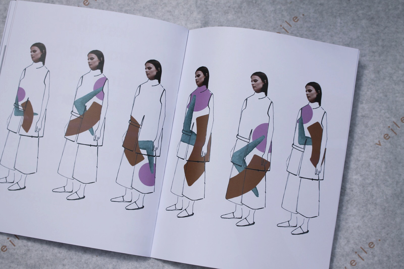
The abstract prints of the Vejle. collection consist of odd forms, shaped by emotion and expression. The shapes all have the same handmade touch but have a different composition with unlike forms and colors. This culminates in a structural wonderland of mixed colors and monochromatic shapes and shades, forming unexpected relationships. The shapes are imperfect and sometimes show a struggle in the way they are placed and stand next to each other. The prints explore the urge towards self expression. They are spontaneous, abstract, personal, clean, bold and seem to be cut and pasted.
In the studio we mostly work by hand and work very free. We like to use silk screen print techniques and more free drawing/painting, to have a diversity in the work. When we're out of our studio and feel inspired, we draw small sketches, which we translate later on in the studio to a full working print. To have better control over our colors and be able to combine shapes of different experiments we also use creative digital illustration programs.

At the moment Vejle. sells handmade silk screen prints on limited edition base. Currently we're quite busy in the studio making the next step and collection. One of the next steps is showing our print collection at Premiere Vision in the designs area next September in Paris.
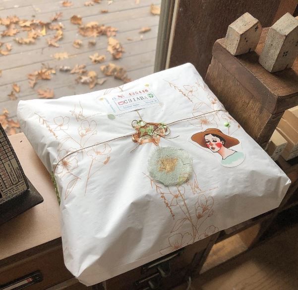
Use of color is one of the main ingredients in print design, the colors of the collection vary per season and because of that we wanted a stable color palette for our branding. In addition, the branding of the label is clean and minimal, which works well with the design of the prints. The base color is a beige/pinkish tone which fits with the Scandinavian look of the brand. For the tissue paper we worked with the fine feminine logo of the brand. We chose to play around with the logo and add them in diagonal lines. To show the abstract uncertainty that runs through the print collection, we added one lilac logo which is turned upside down, as a little surprise along the way.

At Vejle. we think branding plays such an important part of telling our collection story. The visual creative communication makes us, and we hope also the customer, enthusiastic about our products. Print design is all about visuals and being able to translate this in the branding makes the story complete.
We also try to share our care for our products and the importance of a long life cycle for your print/garment/object. Tissue paper helps to add the extra value and protects the product.
