You know your website needs to make a great first impression. It’s one of the key factors in attracting and converting customers. But you’re also a busy small-business owner trying to do all the things, and it’s easy for your website to become a little neglected.
Getting into the habit of making small tweaks on a regular basis can be a simple way to improve your website without it becoming overwhelming. And small tweaks can make a BIG difference! We’ve put together these five quick and simple tips that you can implement today to improve your website and increase its effectiveness.
1. Check it’s in alignment with your brand
Make sure all the elements on your website are consistent with your brand. Consistency builds trust. You can increase recognition and credibility using the same colors and fonts throughout your website, social media and packaging.
Think about how you want your brand to make your customers feel and make sure your website is helping to create the experience you want to create for your customers. For example, if your business sells humorous, hand-drawn cards and prints, and you like to have a bit of fun with your audience on social media, make sure your website reflects this. Don’t use dull corporate language and neutral colors. Make it fun and inject your personality.
If your brick-and-mortar shop is cozy and welcoming, recreate this feeling on your website through the imagery, product photographs, and colors. Help them to get an idea of what visiting your shop might feel like, even though they are shopping online.
Action: Inject your brand personality and tweak any areas of your website which don’t represent your brand.
2. Add clear call-to-actions
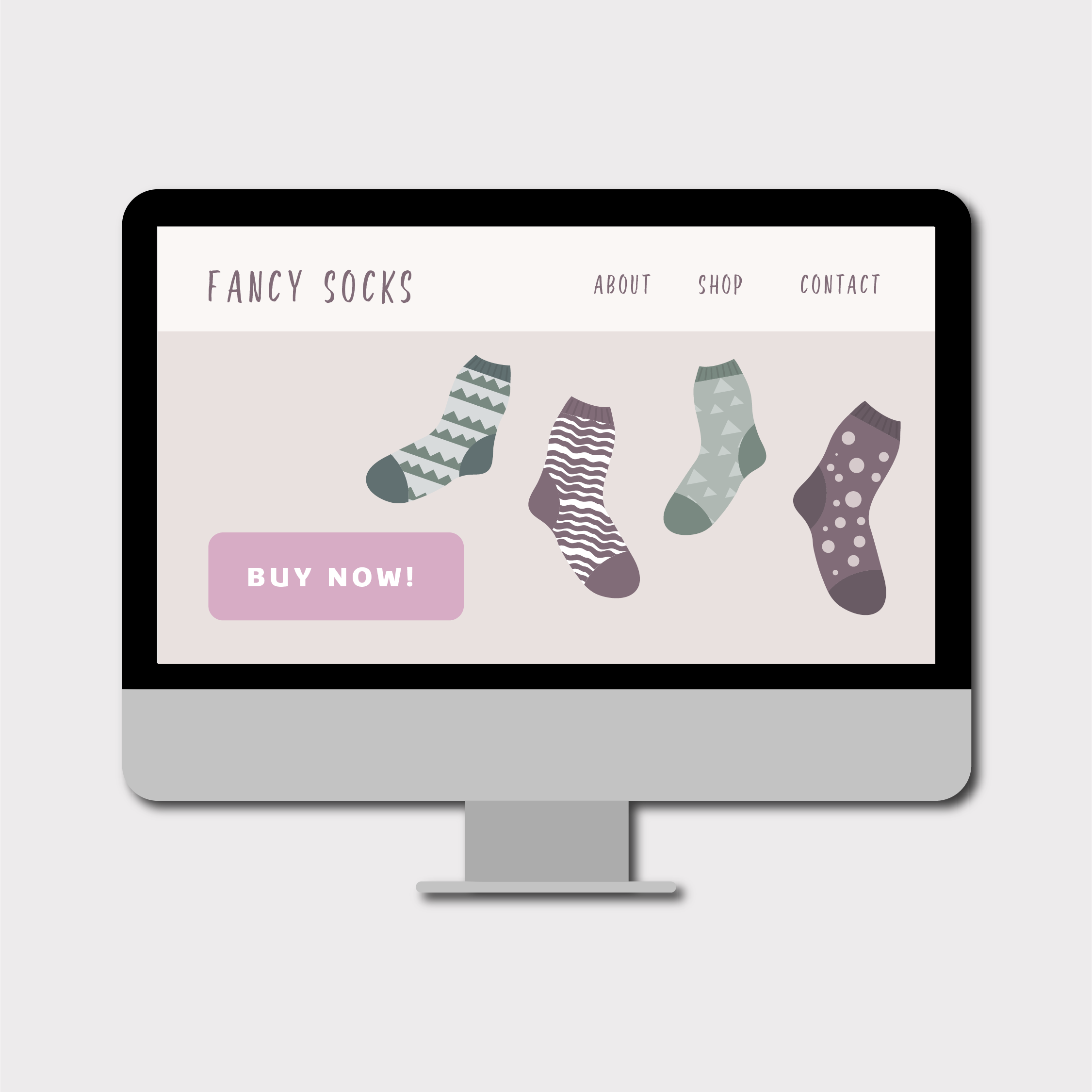
A call-to-action (or CTA) is a link or a button that encourages your website user to take action. People’s attention spans are really short so it’s super important to make it obvious what action you want your website visitors to take when they land on any page of your site.
Think about what the goals are for your website. Is your primary goal to book commissions for your artwork or do you want people to buy your prints? Take some time to define the priorities for your website and then add a clear call-to-action on each section of your website so your visitors know what you want them to do next.
For example, if you want people to buy your products make sure you include a big beautiful image showcasing your work with an eye-catching button linking to where your website visitors can buy them. Highlight your newest collection or best selling products, or the features and benefits of your products. Make it clear and easy for people to see what you want them to do.

Action: Decide on the goals for your website and add clear CTAs to encourage your customers to take action.
3. Add or update your email opt-in forms.
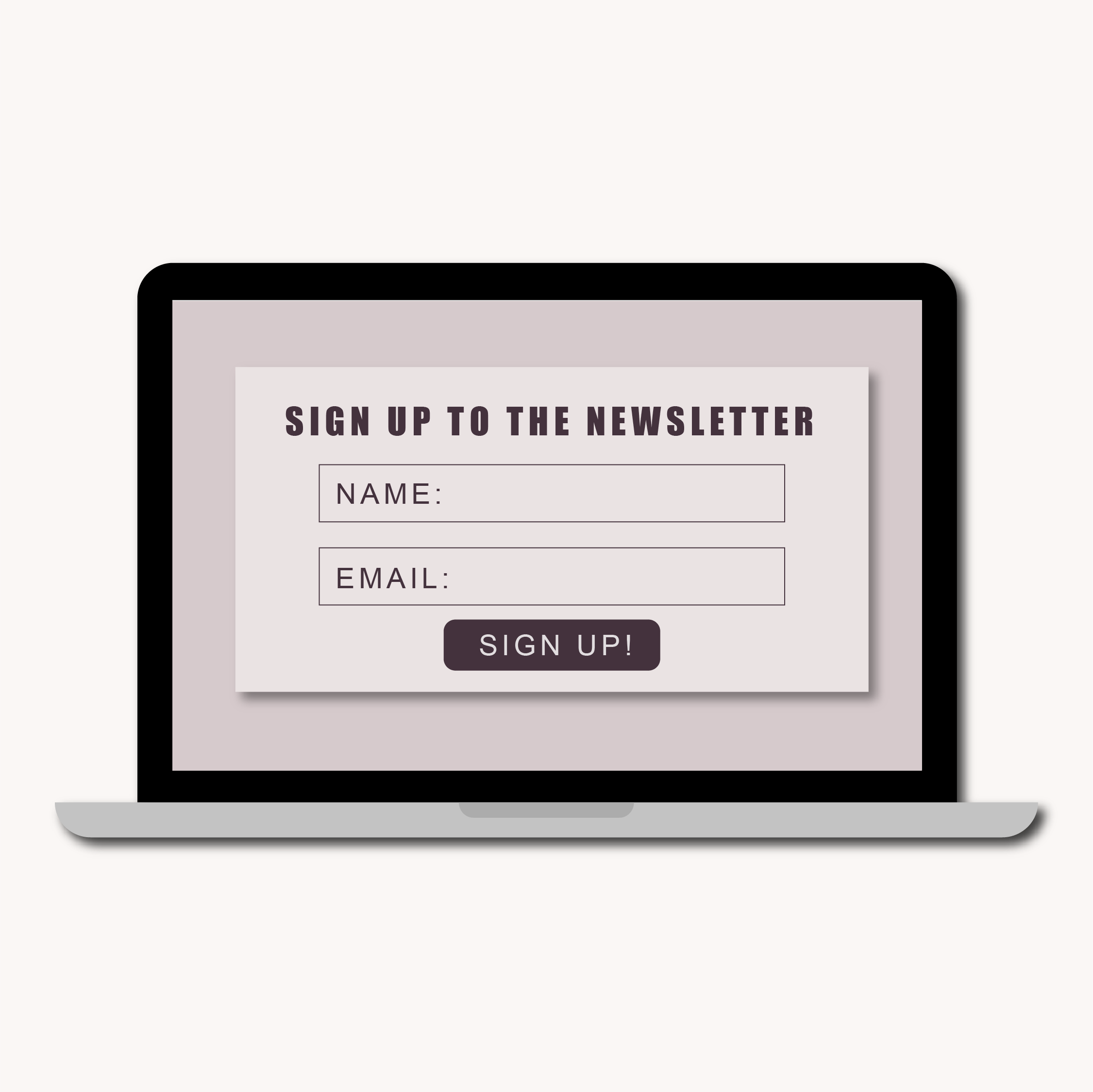
Building your email list can be a great way to nurture potential customers. By providing valuable content and developing a relationship with people who are interested in your product, you’re more likely to convert them into paying customers. But there’s not much point sending out email newsletters if you don’t have an audience. Add an email opt-in form to your website to collect visitors’ emails.
Make your email opt-in form quick, simple, and easy to fill out. Again, people have short attention spans so don’t make it difficult for them to enter their details. Pop your sign-up form in several places around your website. Your website visitors may not necessarily land on the homepage of your site so check you’ve got an email opt-in form on every page.
You can also encourage visitors to sign up to your email list by offering a discount for new customers or creating a free resource that will help educate them about your product. Clearly communicate what they’ll receive via your emails and what’s in it for them. For example, if you regularly offer your newsletter subscribers first access to your new collections be sure to mention that in your opt-in form.

Action: Simplify your email opt-in form. Put it on different pages on your website and clearly communicate what value your subscribers receive.
4. Add social proof
Social proof is providing evidence that other people have purchased, and found value in, your products or services. Adding social proof to your website helps build trust and credibility which can help to increase your sales. It’s basically the online version of word-of-mouth marketing. It’s a vote of confidence in your products and, used properly, it can be a powerful tool to convert more visitors into customers.
Social proof can be in the form of product reviews, customer testimonials, or social shares. Ask previous customers or clients to review your product or provide testimonials. Create a hashtag and ask your customers to share photos of their purchases. Have pictures, names or social media accounts alongside the testimonials to build credibility and increase the impact of your social proof.
Having a page on your website dedicated to testimonials or reviews is great but it’s even better to sprinkle them in among your other content for visitors to read while they’re still in the process of making their decision.

Action: Collect customer reviews or testimonials and add them to various places on your website.
5. Optimize your footer
The footer is often an overlooked website element. It’s easy to assume that because it’s at the bottom of the page a lot of visitors won’t see it. But actually, it’s one of the only areas which is the same on every page of your site.
It’s also what all your visitors will see if they scroll to the bottom of a page. If someone is reading the footer of a webpage, the chances are it’s because they haven’t found what they were looking for. A well-thought-out footer can help to direct visitors back to a different area of your website before they navigate away.
Here are a few things to include in your website footer:
- Social media icons or widgets
Social media is a great way to connect with potential customers. Directing visitors to your social platforms gives them an opportunity to continue to engage with your business and helps you to nurture that relationship.
- Email opt-in form
Having an email opt-in form in the footer means it’s easy to direct people to a specific area of your website to sign up and it ensures your sign-up form is on every page. It also encourages visitors to opt-in to receiving updates which allows them to keep the conversation going even if they are finished looking around your website.
- Location, opening hours and contact information
If you own a brick and mortar business, including your address, opening hours and contact information in the website footer makes that information easy to find and lets your visitors know you have a shop they can visit if they didn’t realize that while looking at your products.
- Navigation menu
Having a clear navigation menu in your website footer makes it easy for visitors to keep looking around your website if they have got to the bottom of the page because they didn’t find what they were looking for.
Action: Check you’re making the most of your footer. Add in some of the elements listed above to encourage visitors to stay on your site longer.
Investing some time to make these quick and simple changes to your website can make a real difference to your business. So get into the habit of making small tweaks to your website on a regular basis and see how they improve your website.
This is a guest post by Tanya Rodgers, a brand designer and illustrator, and owner of Me & Spirit Design Studio. Tanya specializes in creating breathtaking branding with beautiful illustrations, dreamy color palettes, enchanting design and comprehensive guidance on how to bring your new brand life - on and offline! We’re thrilled to have her as part of the noissue Creative Community!
