One thing brands seek in a creative designer is having the capacity to listen and collaborate closely with them. Begin Studio has that at their forefront – to design a brand that best represents their business and values and not just following the latest design fads and practices. From brand strategy, packaging, social media kits, and website design, Begin Studio is ready to connect and conquer.
Know more about Begin Studio and their collab with Lusan in our chat with them below:
Creative: Begin Studio
ABOUT OUR CREATIVE
Tell us a bit about yourself and your team.
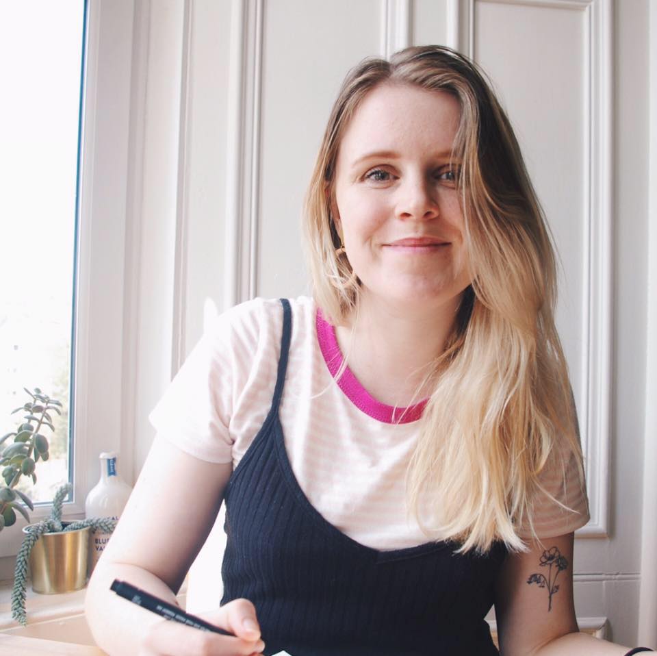
My name is Amy and I’m a British Branding Designer and founder of Begin Studio. I’m currently living in Delft, The Netherlands with my partner Iain and our cat Sookie.
My career started with a degree from Edinburgh College of Art in Graphic Design, I then went on to work in two Edinburgh design agencies and as an in-house designer for a Scottish hotel chain before I decided to go freelance and set up Begin Studio.
How and why did you start your brand?
When I decided to take the jump into freelance work, I realised that I could use my design agency experience and bring the thoughtful, research-led process to smaller clients that may not have been able to afford design agency price-tags.
I also really wanted to create a space that a pure reflection of the design I love, the businesses I love to support and ensure that my business works for me.
I’m really proud of the way I run Begin so that it supports me as much as I support my clients - for example, I take lots of time to work on myself through courses, time off for work-outs, rest days. It’s a very balanced approach that puts me first and not something I had found while working for others.
What’s your brand vision and why is this important to you?
With Begin Studio, I wanted to create a thoughtful and friendly space, where my client’s visions and goals are taken seriously and I can answer any of their questions around design and marketing. I also wanted to make sure that my work gives back to the planet through tree donations for each client and only design for sustainable packaging options. It’s so important to me to ensure that my values of fun, sustainability, and research-led design come through in all of my work and it’s become the reason my clients come to me!
What’s your design process like? Where do you usually get inspiration?
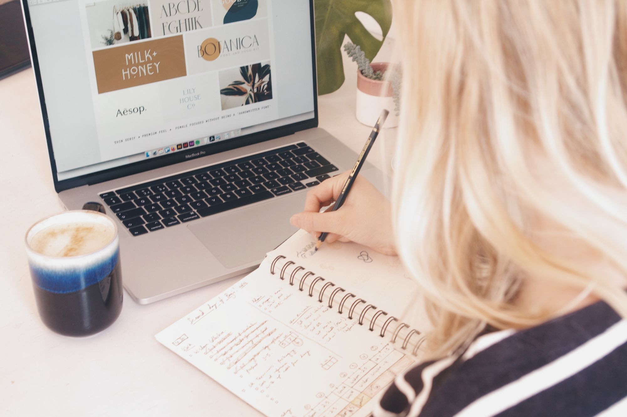
Every project that I take on starts with a full research process. It begins with studying my client’s competitors and inspirations and pulling together mood boards and case-studies. We then review this together to identify what my clients are excited about, what they like, what they dislike, what their goals are, and any other information that will help me craft a brand that fits with their values and where they want to be.
Then I start sketching my ideas and concepts out in a sketchbook before bringing them into Illustrator to digitalise. I tend to start with 5-6 different designs and by the end of the process, I present my best two to my client.
I often find that starting with such a thorough research stage and talking it through allows my designs to reflect the brief fully and meet my client’s expectations. So it’s hugely beneficial to my process and it inspires the rest of the project. I also get inspiration from magazines, the internet and the world around me.
My absolute favourite tip is if you are looking for colour palette ideas then look at home decor photos or magazines! You can tell if a room is warm, or cool, friendly or premium which should match your client’s values and they are so lovely to look at.
What does visual storytelling mean to you?
Visual storytelling is the foundation of branding! It’s all about communicating your values as a business by using colours, visuals, layouts, typography, packaging, logos and so much more. By doing this you create a story that builds a connection with your target audience or customers.
So it’s crucial that each element of your brand and business is tailored towards what your target audience wants to see and what values you want to communicate. As a small business, you can start by identifying what your key values are and what that would mean visually, to create a visual story through your brand that builds a strong connection with the customers that you want to reach.
What qualities do you look for in a client or collaborator?
Friendly! I love working with friendly people. I find that some branding projects are really straightforward and some are more challenging and take more collaboration — but if a client is friendly and committed to seeing the project through then everything is easier, more fun and the project always turns out better for it.
ABOUT THE COLLABORATION
Tell us a bit about your collaboration with Lusan.
Lusan, UK Terrariums approached me earlier in the year to help them build a new identity and packaging system for their terrarium kits and plants. Daniela is the founder and she is so lovely and so committed to her customers and audience. She was looking for a brand that represents her values and her goals for Lusan, that was also sustainable so that she can continue to deliver high-quality terrarium kits and plants to her customers.
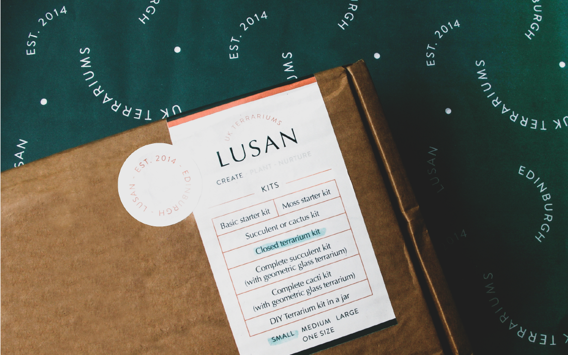
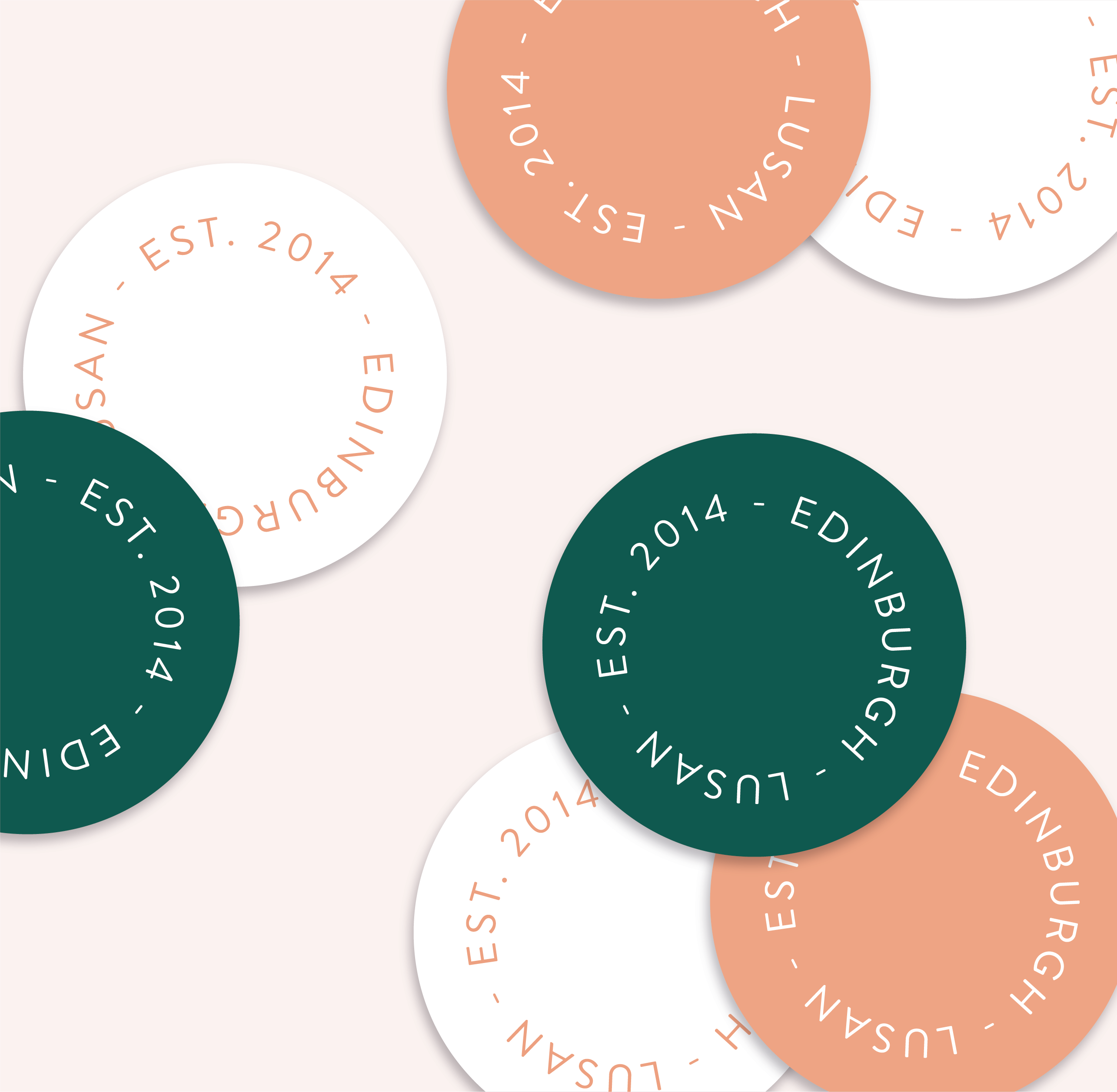
One of my favourite parts of this project was designing the three labels that Lusan use on the outside of their boxes. Each label represents a different part of their products and can be customised so that there was no need to print 10-20 different labels. We could print less, more sustainability and ensure there is no waste.
How did you and Lusan begin to work together?
We started working together after Daniela found me on a Small Business Community on Facebook. It turned out that we both lived in Edinburgh when the project started and we connected over our love for our city.
What inspires your designs for this collaboration?
My first inspiration for the project was the plants themselves! I loved the green colours of the succulents and cacti that Daniela uses. Her terrariums are also beautiful and so well crafted. So I felt that the brand should be minimal, well laid out and have a pop of bright colour to balance out the heavy use of green.
What was something that stands out about this collaboration for you?
A big thing that stands out to me is how committed Daniela was to ensure the new designs were rolled out onto every part of the brand. I think that businesses often feel that they can get a new logo and the brand will be finished but designers will tell you that visual storytelling is more than a logo - it’s also your website, your social media, your packaging, or anything visual connected to your business.
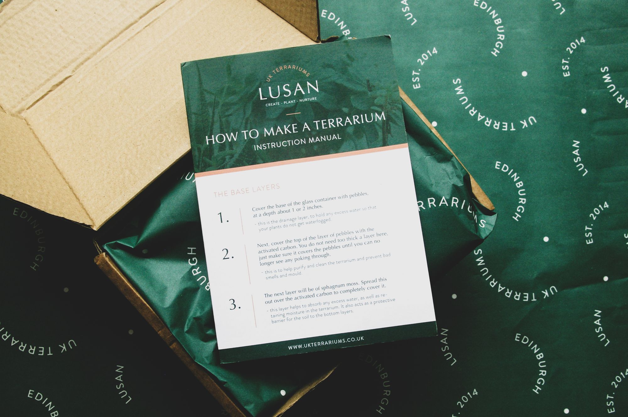
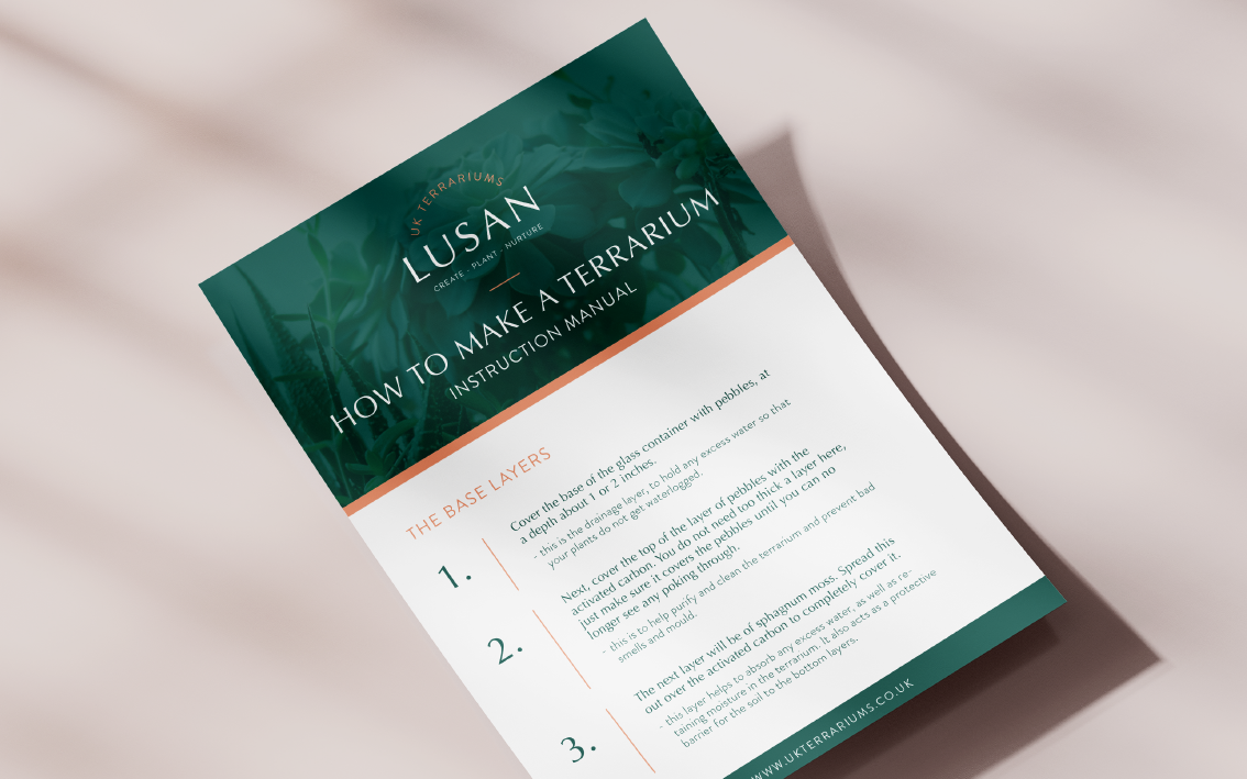
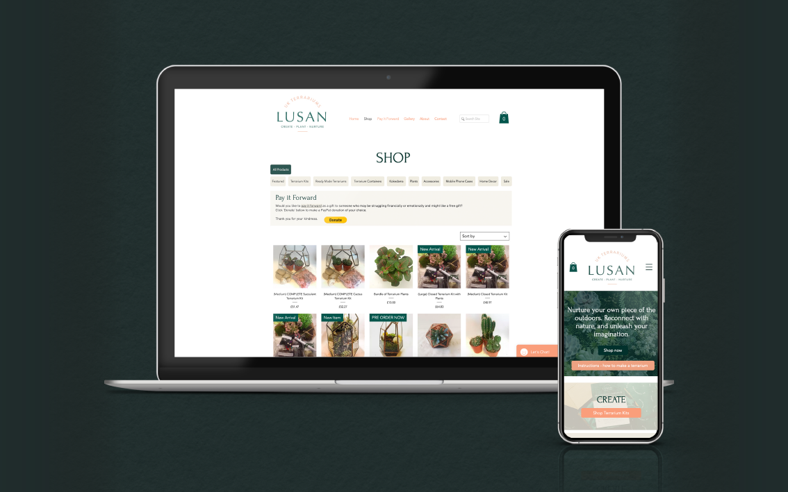
So I felt very fortunate that Daniela trusted me to create a new identity for her but that she also invited me to work on her packaging, her tissue paper, the stickers she sents out with her orders, the manual that’s inside, her Wix website and store, even give advice and guidance on her social media.
Why did you choose noissue for packaging? What products did you choose from our range?
I’m a big fan of noissue’s sustainability values and the way they champion small businesses such as myself and my clients in a friendly, approachable way. For Lusan, I think the biggest success was the beautiful tissue paper. Even though it’s a full-colour print, it didn’t bleed, it’s even, the Pantone match is perfect and it is so impactful to look at once a customer opens their parcel. It’s a huge triumph and is a source of constant compliments when I show the brand to my peers and other clients.
Find more of Begin Studio and Lusan here:
Begin Studio
Website: beginstudio.co.uk
Instagram: @beginstudio
Lusan
Website: ukterrariums.co.uk
