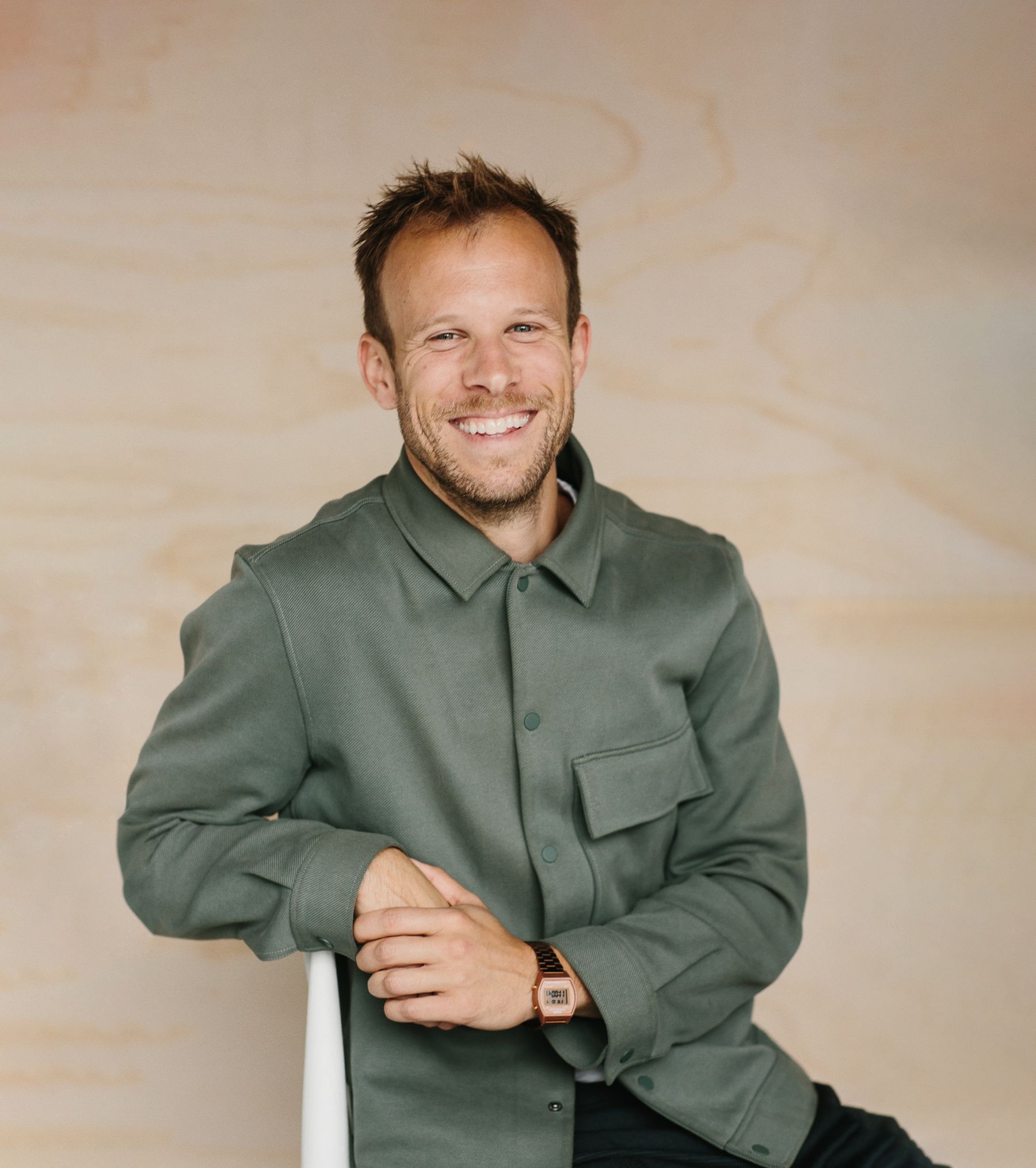
A Vancouver-based interdisciplinary designer, our featured creative Henry Slaughter, is ready to connect and create!
He independently manages design projects with great local and global brands. His work focuses on graphic design, branding and customer experience, finding creative ways for the businesses he collabs with to connect with their audience, build brands, and bring simplicity to digital interactions.
When he's not working with his own clients, he also supports the teams at Monday Creative in Vancouver and Atomic in San Francisco.
Read on and learn more about this awe-inspiring creative visionary below.
Creative: Henry Slaughter
Tell us about you and your design practice.
With a focus on graphic design, branding and the customer experience, I help businesses (and creative agencies) find creative ways to connect with and inspire their customer, build and evolve brands for modern landscapes, and bring consistency and simplicity to digital interactions. I’ve been working for myself as an independent studio and as a freelancer since 2014 in Vancouver BC and Sydney, Australia (2015–17) on outdoor and lifestyle brands (like lululemon), cafes and restaurants, and growing, online businesses like Laundry Day.
Tell us about Laundry Day.
Laundry Day is a Canadian business that serves a product category which typically caters to a “stoner culture” of unpleasant plastic bongs and flashy objects. Laundry Day values great, innovative product design, first and foremost, that blends seamlessly within contemporary homes of discerning individuals. It resonated and aligned with me because the entire product line and packaging is really considered and minimal.
How did you and Laundry Day begin working together?
Laundry Day owner, Victoria, and I share a handful of mutual friends in Victoria. We bumped into each other at my friend’s cafe earlier this year, and the rest is history!
What inspires your designs?
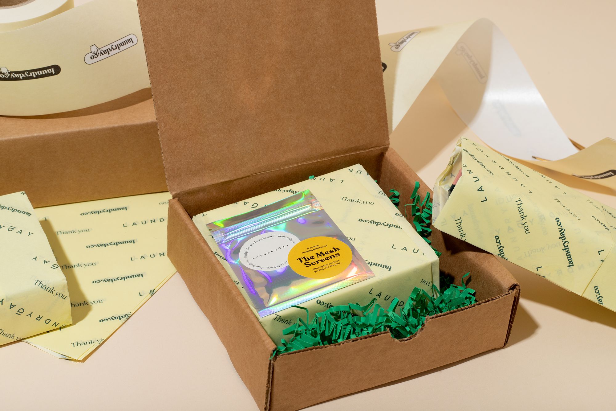
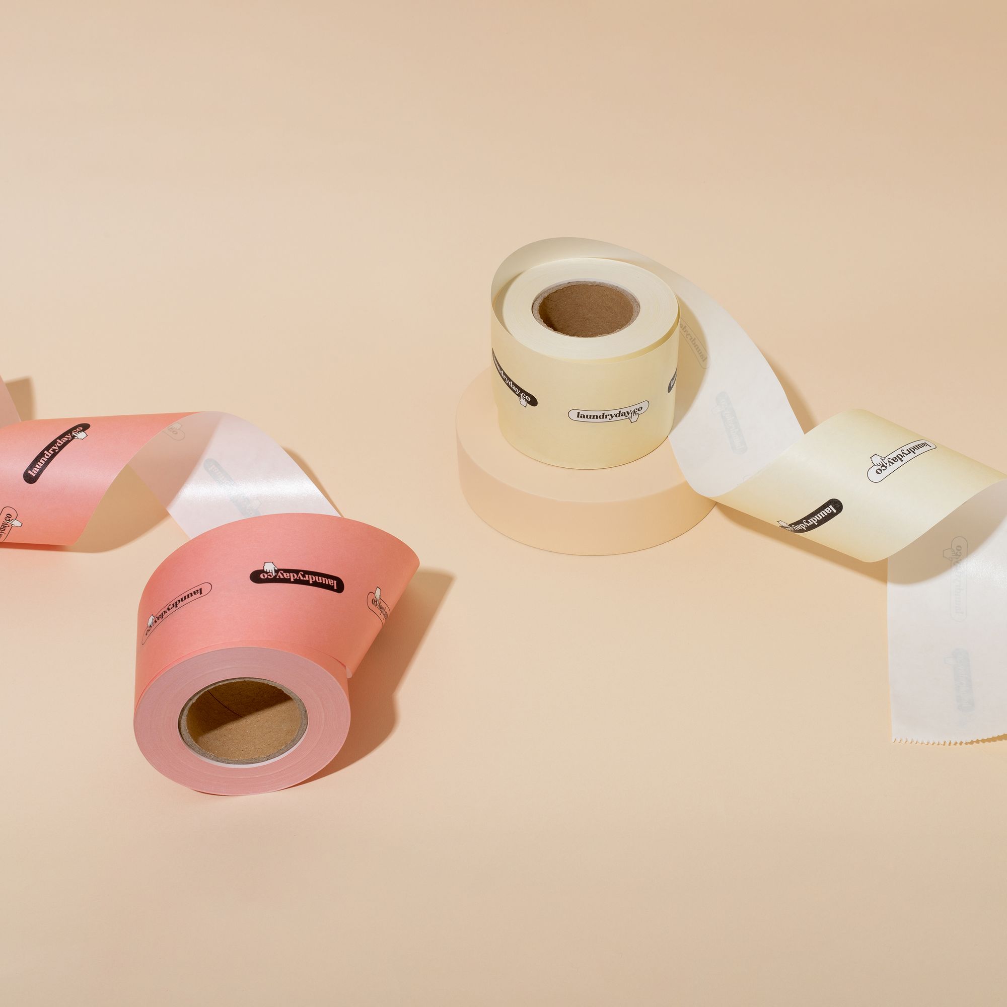
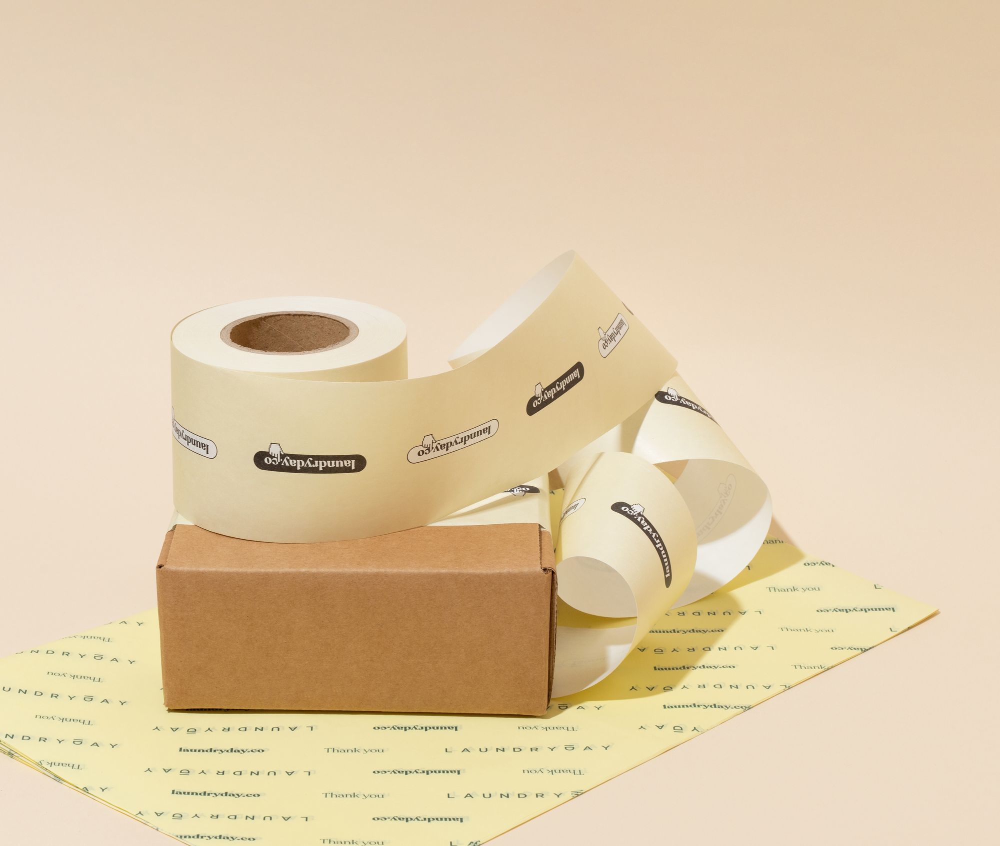
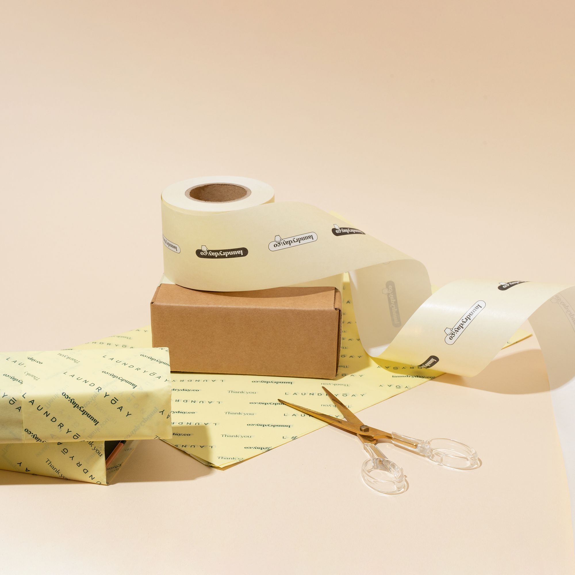
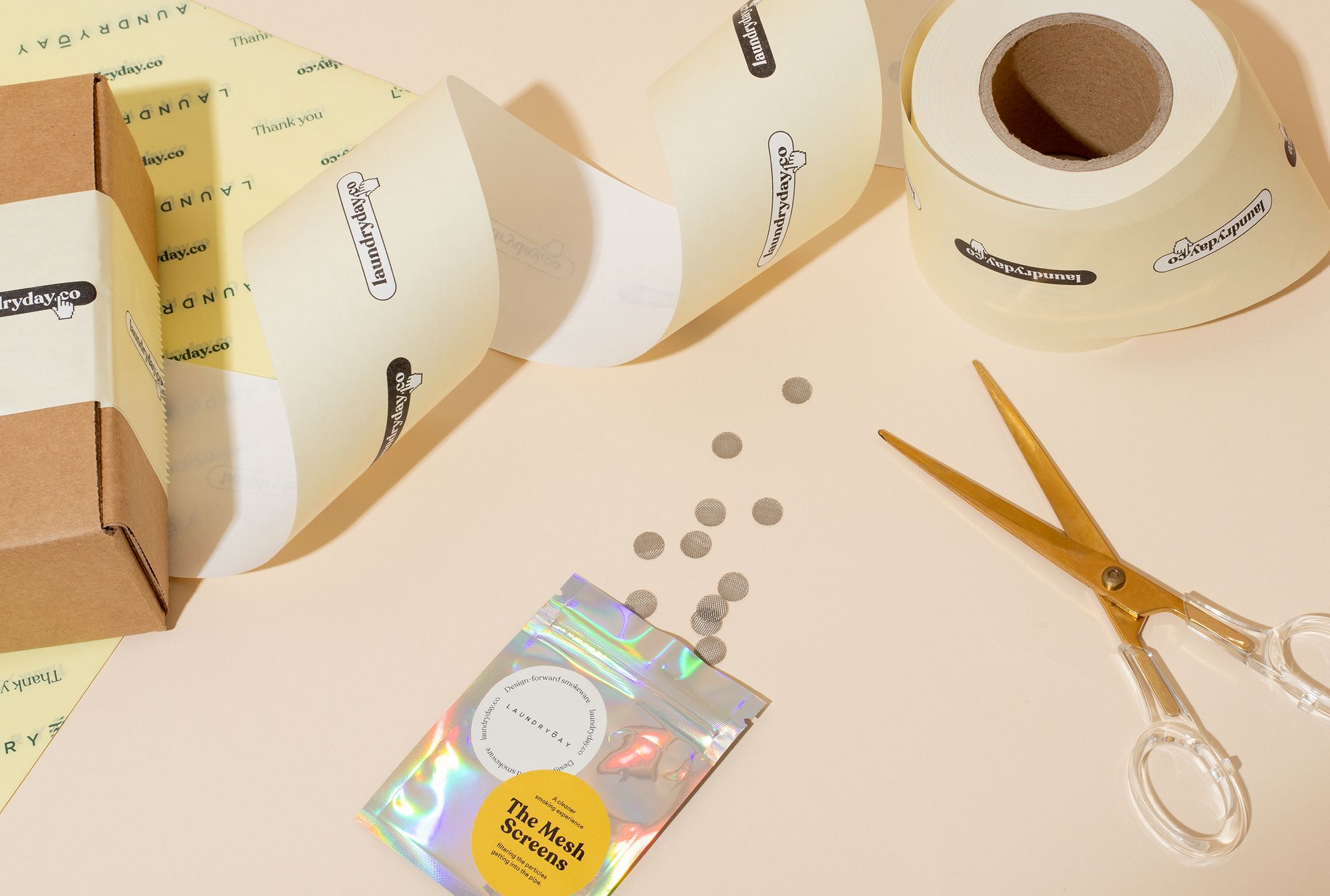
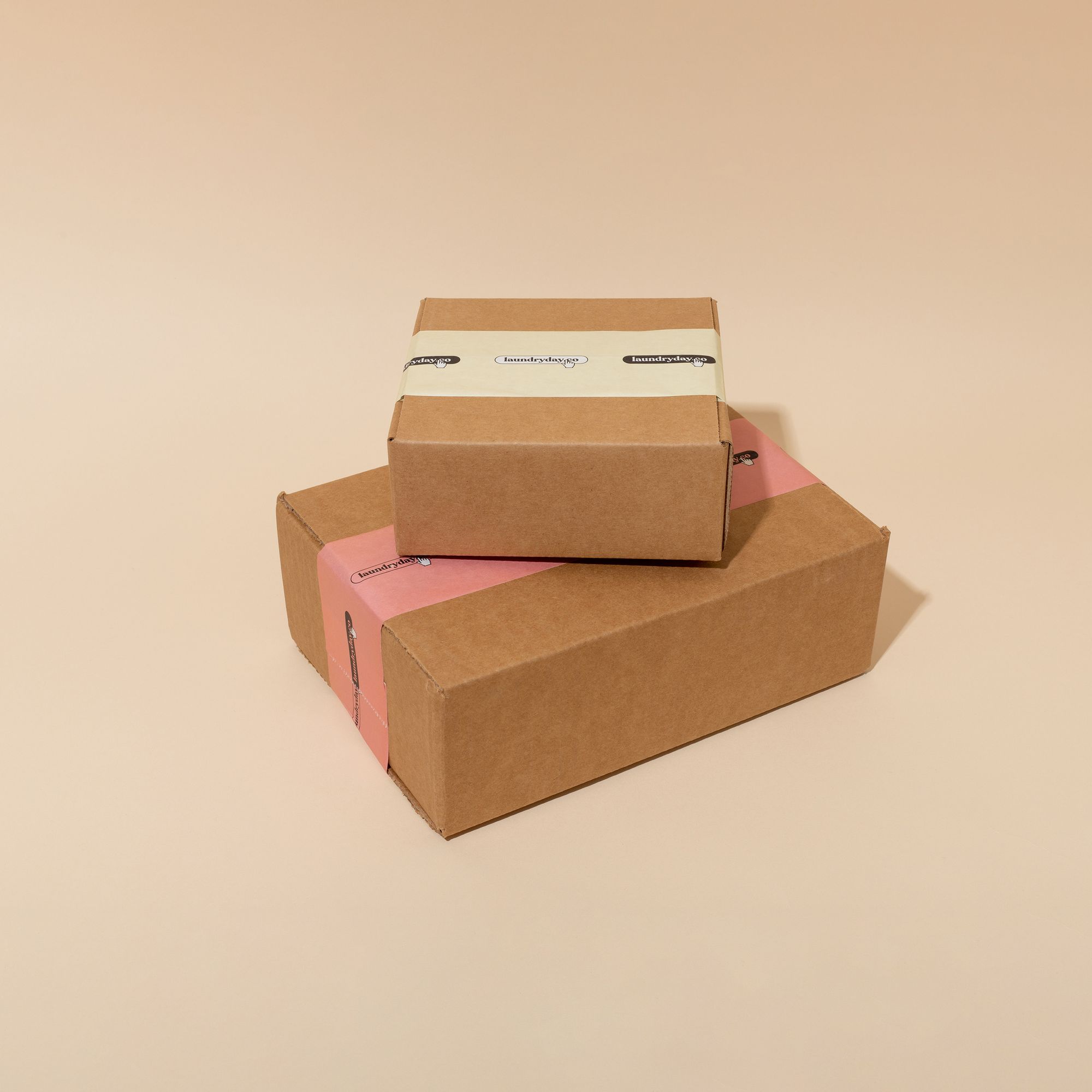
I get inspired by great usability, readability, and experience paired with something visually attractive. As our society becomes increasingly digital, I find the interactive space fascinating because I have a print background. In this particular project, I was designing Laundry Day’s shipping packaging materials, which are sometimes overlooked – the customer experience begins when they pick the box up from their doorstep. Since her products are bought online, I wanted to nod to the online/ecommerce experience by including the hand icon seen online when hovering over a link.
What stands out about this collaboration for you?
The simplicity! We’ve heard of shipping boxes for expensive items go missing off porches and entranceways, so we agreed to go as simple as possible, without sacrificing character and a bit of fun. I love that we were able to achieve an effective, graphic look, without being too loud (graphically) to be noticed. However, we’ll have to wait and see if we receive any feedback of lost packages in future to know for sure!
Why did you choose noissue?
noissue’s digital interface makes it easy to upload and select final products. For small business owners that want to try different packaging pieces but wan’t to avoid huge minimums without sacrificing value, noissue is a great solution. In hindsight, I should’ve confirmed the correct Pantone colour to ensure the right reproduction of our yellow tissue, but that’s something we can fix next time! It’s great that everything is recyclable too.
Find more of Henry and Laundry Day here:
Henry Slaughter:
Website: www.henryslaughter.ca
Instagram: @henryslaughter
Laundry Day:
Website: www.laundryday.co
Instagram: @laundryday.co
