Gelato and ice cream have a special place in a lot of people’s hearts (and stomachs). So having a nearby scoop shop is a dream! Sure, having one is cool and convenient, but it also brings a lot of fun and love into a community. It’s also perfect across all seasons—on summer’s hot days, spring’s just-right weather, autumn’s chilly afternoons, and winter’s extra-cold days.
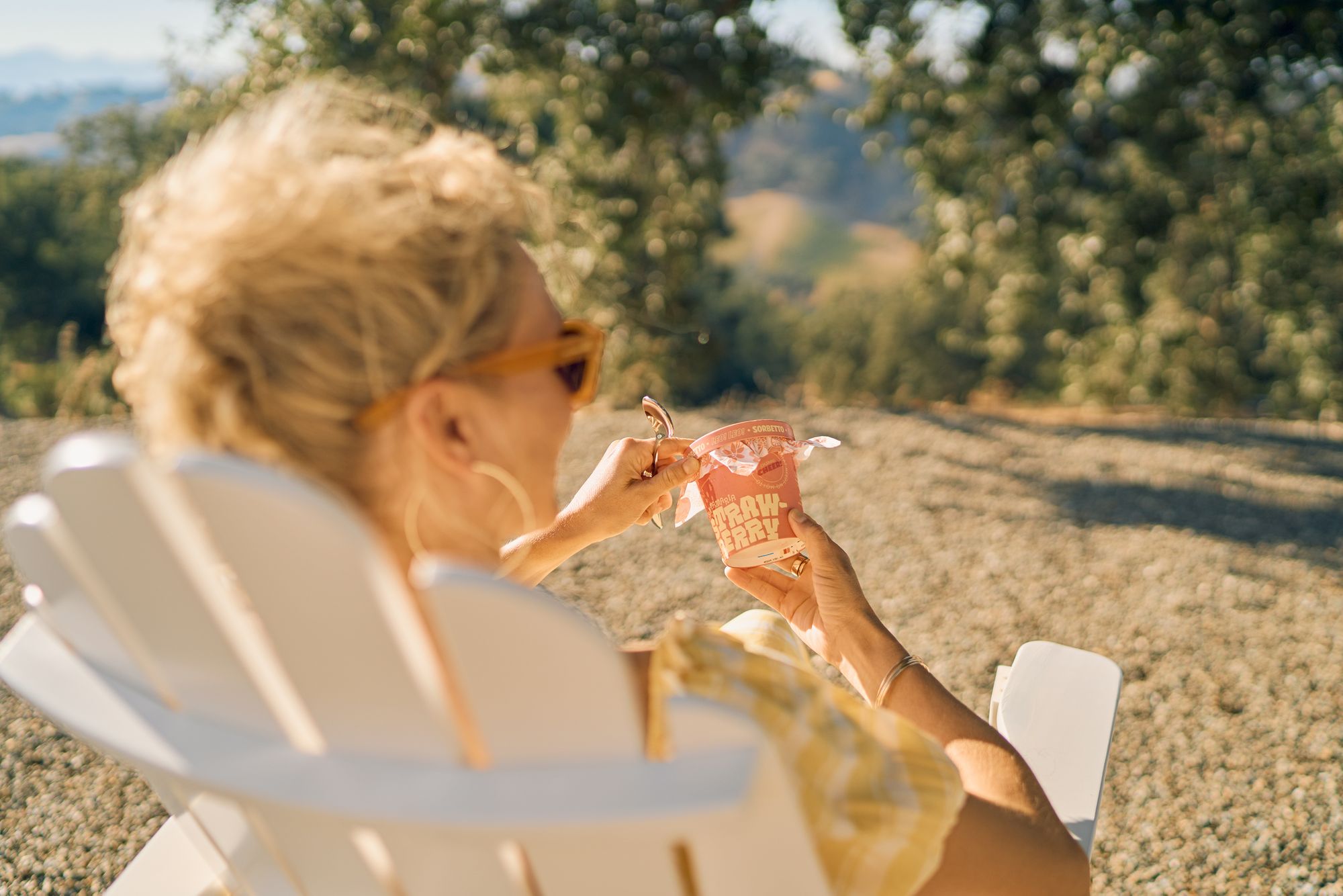
At Paso Robles in Sunny California, there’s one gelato shop for your sweet tooth to try next. Leo! Leo! is a gelato shop founded by master gelatier Niccolo Lekai. Leo! Leo! was created in honor of founder Niccolo’s Northern Italian heritage, from which gelato was first created. Leo! Leo! also prides itself on handcrafting their gelato in small batches with only premium, natural ingredients.
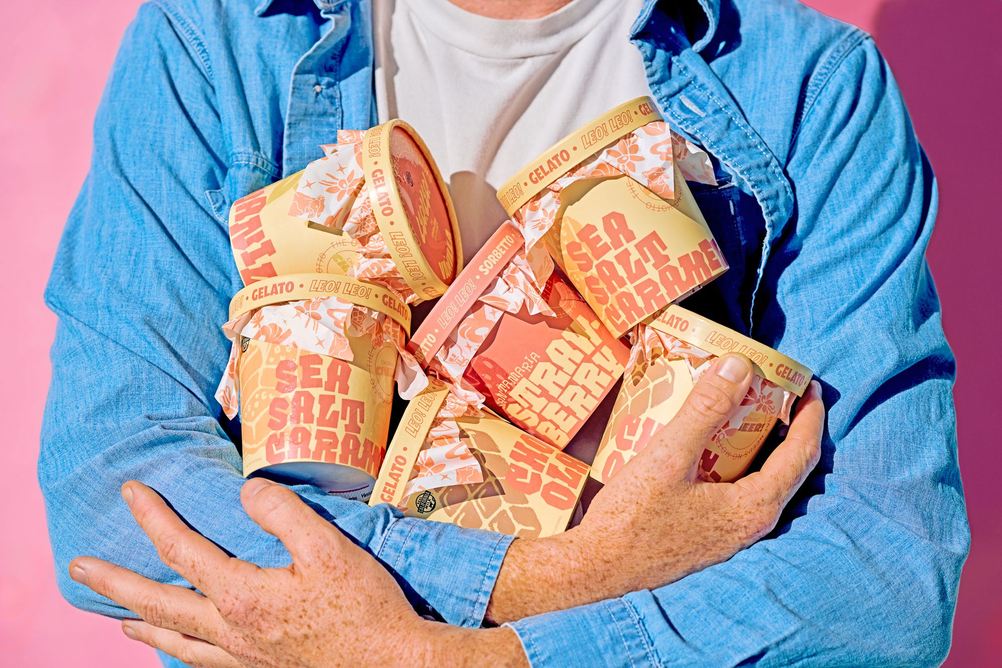
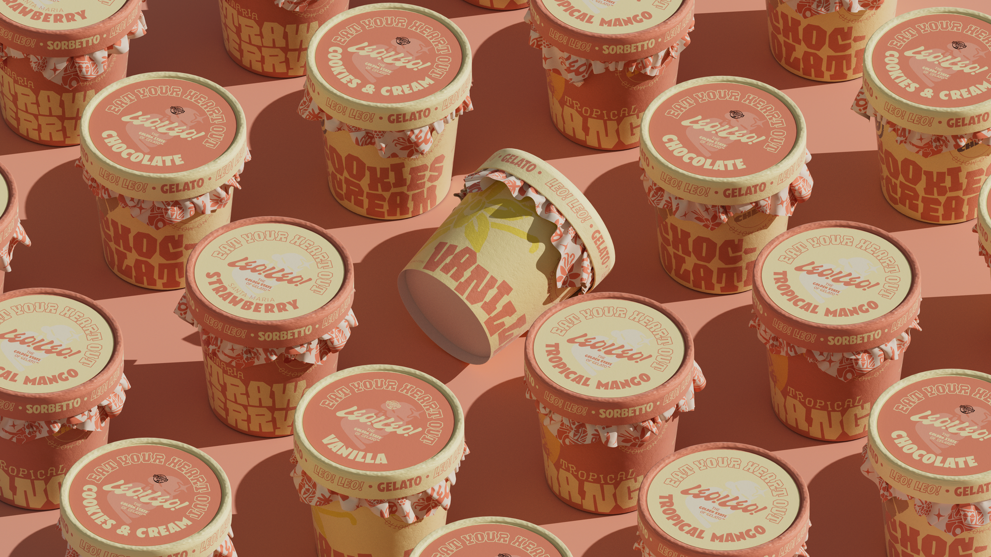
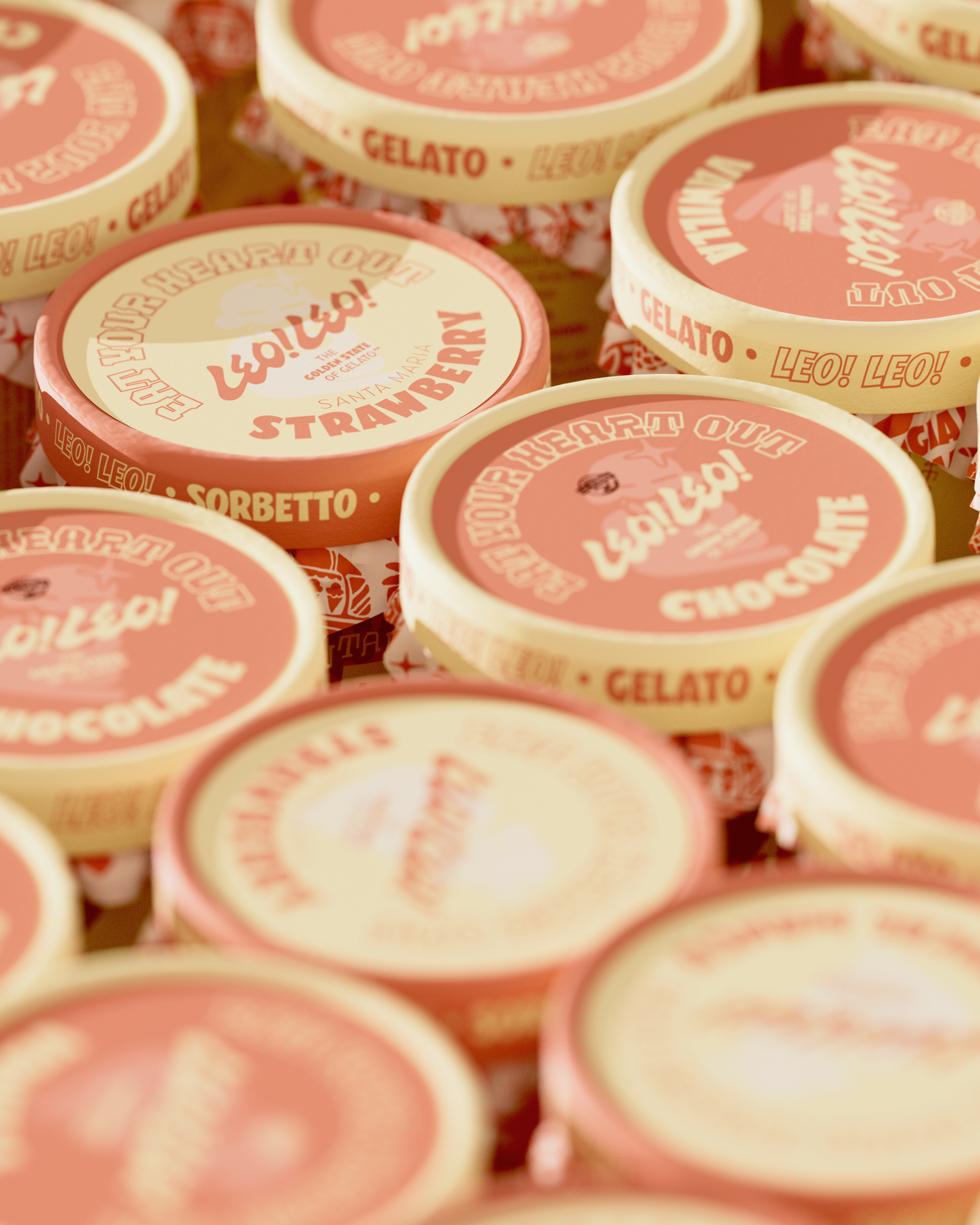
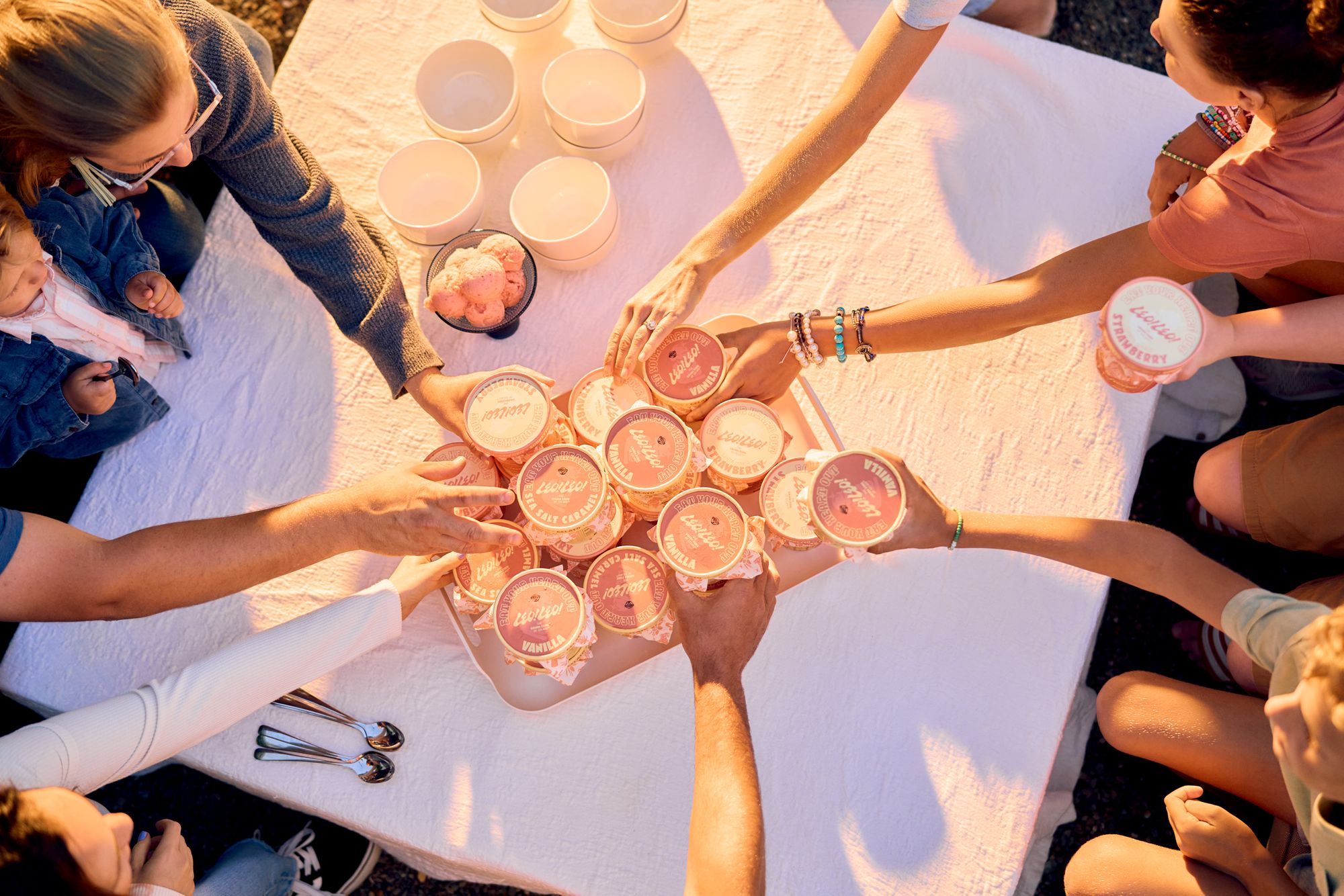
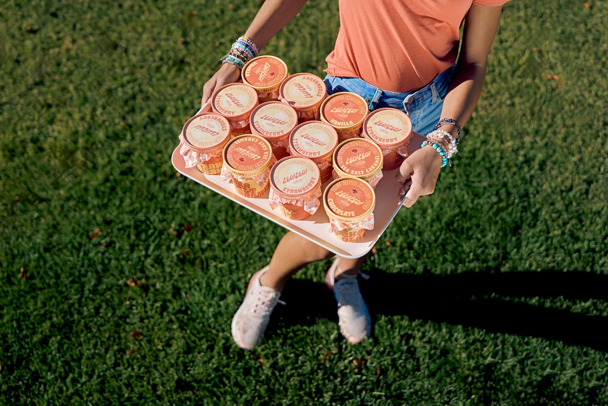
As they re-entered the CPG market, they needed a packaging refresh to reflect the renewed look that Leo! Leo! now has. Leo! Leo! collaborated with noissue for their very own food-safe packaging, which will help seal every pint stylishly and sustainably. Read all about our chat with the team at Leo! Leo! and their design studio partner, Studio Ethur Ethur!
Tell us a bit about your brand!
Rooted in tradition. Leo! Leo! brings forth knowledge and process of artisan gelato making from their family ties to their home region of Florence, Italy. After many years of summer trips from California to Florence perfecting the craft from the world’s most skilled gelatiers, Leo! Leo! owner & founder Niccolo Lekai returned to the states to build a brand committed to continuing the 500-year-old Italian tradition of handcrafting fine gelato on the golden coast of California using only the finest ingredients from its local community.
With ten years of business behind them, Leo! Leo! approached Studio Ethur Ethur for a rebranding exercise to become a consumer-facing brand that was approachable first from a regional perspective but scaleable to a national relatability. The main focus of this rebrand was not to depart from its Italian heritage, artisan quality, or locally sourced roots but to bring emotion, youthfulness, and approachability to the brand while keeping intact its core values of supporting its local economy at any cost.
Tell us about the design for your packaging and how you’re using them?
Strategizing its re-entry into the CPG confectionery market, Studio Ethur Ethur crafted a comprehensive brand identity with a primary focus on ownable brand language, emotional motivators, and feeling approachable to a wider audience while maintaining an Italian-American tone of voice.
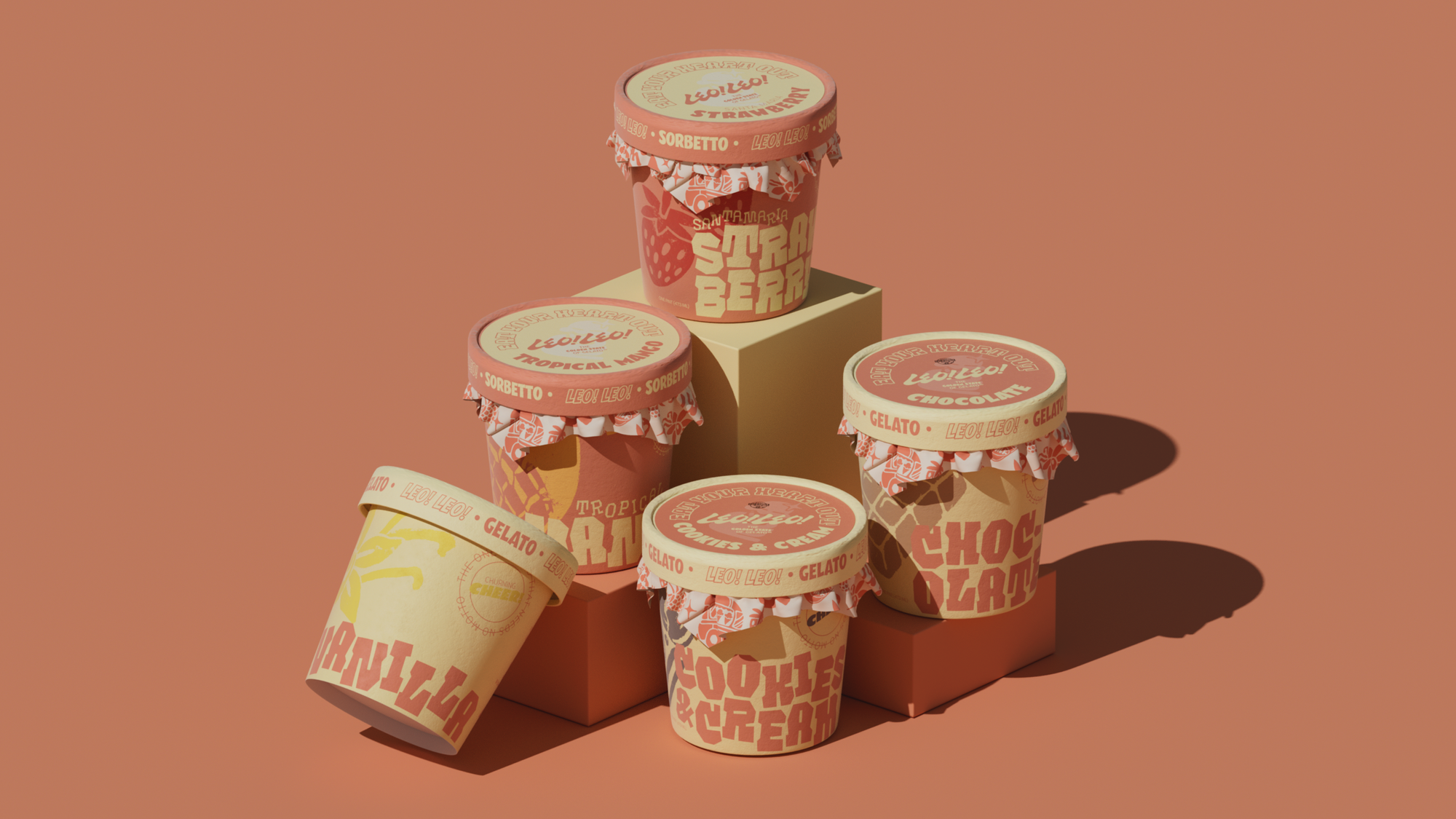
Recognizing the power of visual identity in consumer perception, we strategically developed a contemporary and relatable persona that extended seamlessly across new naming, branding, packaging, apparel, digital, web, and print collateral.
What made noissue a good fit for your packaging?
The intent was not only to offer an evocative, transparent, and relatable brand experience but also to establish a visually own-able shelf presence. Every element was thoughtfully curated to ensure immediate recognition and association, fostering a connection with consumers that transcends the crowded shelf space from its competitors. This deliberate emphasis on visual cohesiveness underscores the objective of carving out a unique and memorable space within the competitive confectionery market.