
Ever noticed how your favorite brand’s signature blue looks exactly the same on everything from a business card to a shipping label? That kind of consistency usually comes down to one thing: Pantone. As the global authority on color matching, Pantone helps brands get their colors exactly right.
But if you’ve peeked at a Pantone swatch book, or if you’ve ever considered printing with Pantone colors, you might wonder: is it really worth it? And why is it so expensive?
Let’s break down what makes Pantone special—and what to do if you're working with a tighter budget.
What is the Pantone Matching System?
Back in the 1950s and early ’60s, color matching was a mess. Designers worked by hand, and printers had no universal reference to keep colors consistent across jobs.
Enter Lawrence Herbert, who joined the Pantone company in 1956 and acquired it in 1962. By 1963, he launched the Pantone Matching System (PMS), giving the design world a standardized way to communicate color. Instead of saying “sky blue,” designers could specify “Pantone 300 C” and know they’d get the same result every time.
PMS uses spot color printing—a premixed ink laid down in a flat, uniform layer. No tiny halftone dots like CMYK inks. This makes colors appear brighter, cleaner, and far more consistent across print materials.
Today, Pantone offers thousands of formulas across paper, fabric, plastics, and more—making it the gold standard for brand color consistency.
Factors behind Pantone's high price tag
If you’ve browsed Pantone’s books or digital tools, you’ve probably noticed they’re not cheap. Here’s why:
Proprietary color system
Pantone doesn’t “own” colors, but it does own the formulas and codes used to reproduce them. It’s like owning the recipe for a secret sauce. That intellectual property is what you’re really paying for—and what they’ve defended in court.
Licensing & software integration
Pantone partners with companies like Adobe and printing software makers to embed its system across the creative process. This ecosystem of licensing, APIs, and partnerships contributes to the overall cost.
Quality control
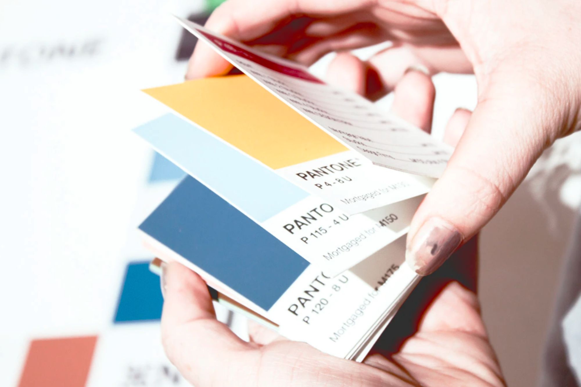
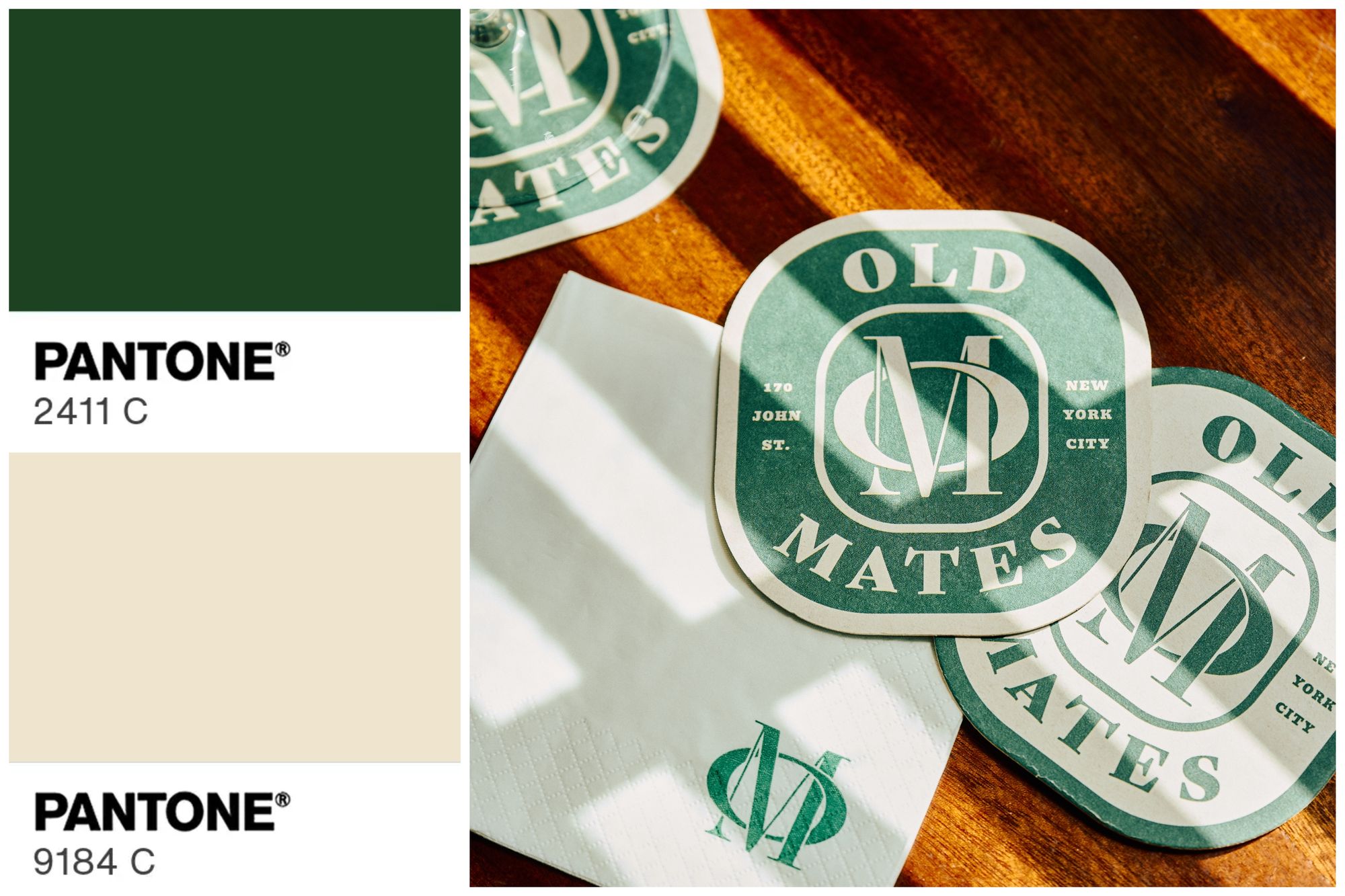
Pantone color swatches are meticulously created using standardized paper and calibrated ink recipes. In-house experts check for exact matches across every batch, so a Pantone 219 C in New York looks the same as it does in Tokyo.
Physical materials that fade
Swatch books are printed with genuine Pantone inks on actual paper—which fades over time. Pantone recommends replacing them every 12–18 months to ensure what you see is still accurate. It’s all about keeping colors true.
Constant innovation
Pantone invests in expanding its color libraries, researching new materials, and even forecasting trends (like the annual “Color of the Year”, which influences everything from runway fashion to packaging design). That ongoing R&D adds value—and cost.
Why Pantone printing can be more expensive than you’d think
Even though Pantone uses a single ink color for each spot color, printing with Pantone inks can still be just as costly—or more expensive—than CMYK printing. Here’s why:
1. Custom inks vs standard CMYK
CMYK printing uses the same four base inks for every job—cyan, magenta, yellow, and black—regardless of the colors in your design. But with Pantone, each color is either pre-mixed or custom-mixed by the printer, often from 13 base pigments. This means:
- The printer needs to stock or mix hundreds (if not thousands) of inks over time.
- Switching between colors for different jobs may require flushing and cleaning the presses, which takes time and labor.
2. Setup time and manual labor
Unlike digital CMYK printing, Pantone jobs—especially for offset or screen printing—may require manual setup and color matching. That means:
- Each new Pantone color can add time to the press setup.
- Small changes between jobs (like switching from Pantone 186 C to 485 C) still require cleaning, recalibration, or even separate runs.
3. Pantone books and quality control
Printers themselves invest in Pantone books and software to ensure accuracy, and those tools aren’t cheap. Maintaining a high standard for spot color consistency means ongoing training, tools, and sometimes reprints if a match is off.
When Pantone printing makes sense
So, when should you consider Pantone over CMYK?
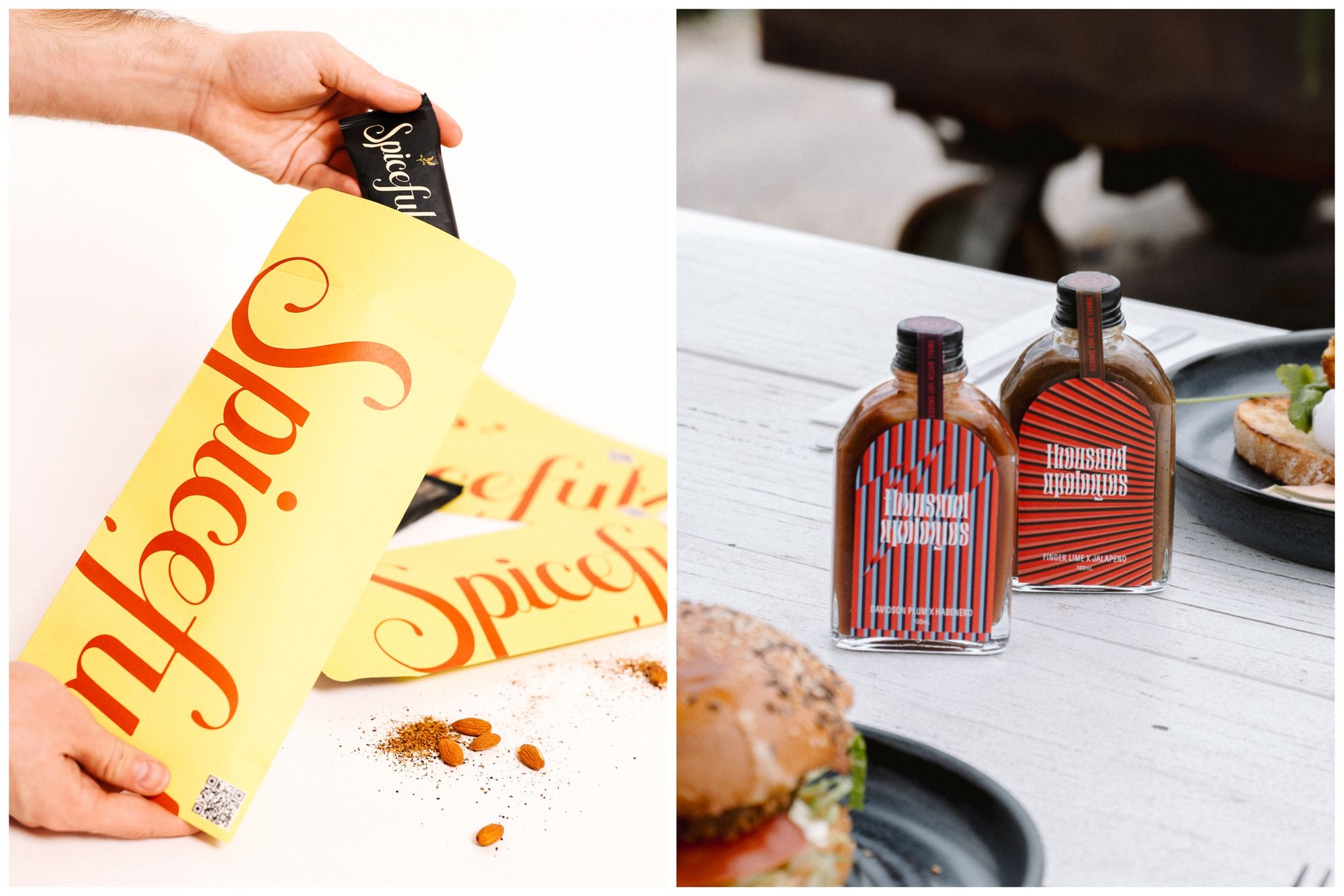
- You want perfect brand color consistency – Your logo or identity depends on specific shades that need to look the same across every package, tissue paper, or bag.
- You’re using just 1–2 colors – For simple designs with minimal ink, Pantone printing can be a cost-effective alternative to full-color CMYK.
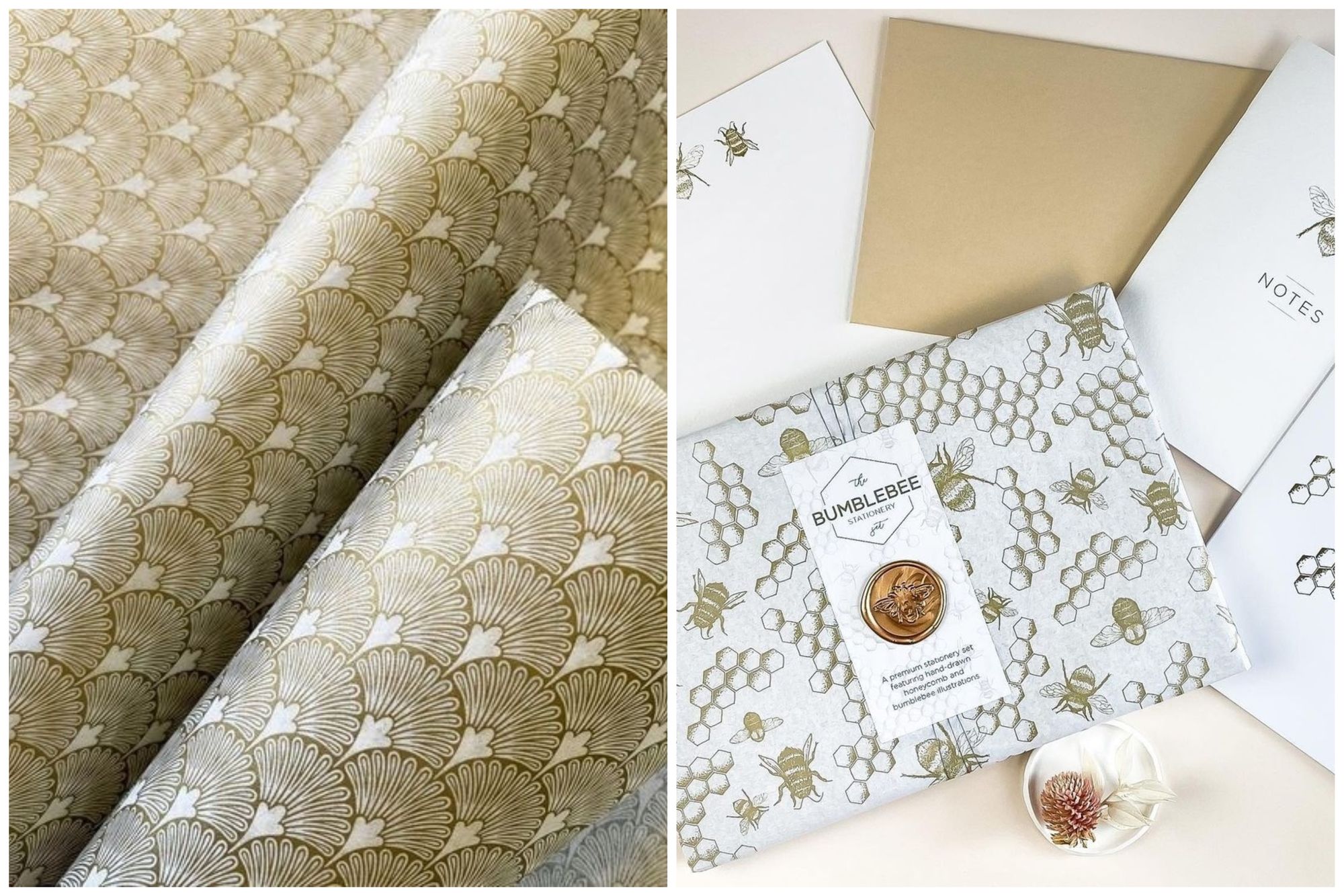
- You want specialty colors – Some hues, like neons, metallics (gold, silver, copper), or pastels, just aren’t achievable with CMYK inks.
Alternative color systems for small businesses
If you don’t need ultra-precise color matching, these options are great (and often free):
CMYK Color System
CMYK stands for Cyan, Magenta, Yellow, and Black – the four inks used in process printing. CMYK combines these four inks in tiny dots to create full-color designs. It's ideal for packaging with gradients, photography, or multiple colors—but doesn't consistently reproduce Pantone hues exactly.
RGB and HEX Systems
RGB (Red, Green, Blue) and HEX codes are made for screens—think websites, apps, and social media. If you’re printing, you’ll need to convert them to CMYK or Pantone for best results. Color shifts can happen in that process, especially with bright or neon tones.
Read our guide on the significant differences between CMYK and Pantone.
How noissue approaches color management
We know color accuracy matters—so does your bottom line. Here’s how we strike the right balance:
Pantone Printing
Used for brand-critical items like our custom tissue paper, cotton tote bags, and fabric drawstring bags. Our design tool helps convert your HEX or RGB codes to the closest Pantone ink match—making screen-to-print more seamless.
CMYK Printing
Perfect for multicolor designs and everyday packaging like custom stickers, tape, and cards. It’s cost-effective, vibrant, and well-suited to flexible print runs.
Both Systems
Some products, like our recycled kraft mailers, support both systems. Want a clean 1–2 color logo? Pantone's your friend. Got detailed artwork? CMYK is your go-to.
Strategies for cost-effective color management
Here are some easy tips for keeping your brand colors consistent without needing to splurge:
- Stick to a few core brand colors across packaging to build visual consistency.
- Request samples or printed proofs if you're unsure how your colors will translate.
- Consult with print pros (like our team!) to pick the best color method for your design.
- Keep materials in mind—uncoated paper, kraft stock, or glossy finishes can shift how colors appear.
Read our helpful guide on color spaces and custom-printed packaging.
Creating colorful impact that matters
Pantone is the gold standard for brands that need pinpoint color consistency—but that doesn’t mean you need to go all-in to make an impact. At noissue, we combine Pantone and CMYK printing to help small businesses create beautiful, customized packaging that stands out and stays within budget.
Want to see how your brand colors come to life across our product range? Explore our design tool or chat with our team—we’ll help you turn your vision into packaging that wows.
Frequently asked questions
Does Pantone own colors?
No, Pantone doesn’t own colors themselves. What Pantone does own is its color identification system: the names, numbers, and specific Pantone ink formulas it assigns to each shade. Think of it like a proprietary recipe rather than the ingredients.
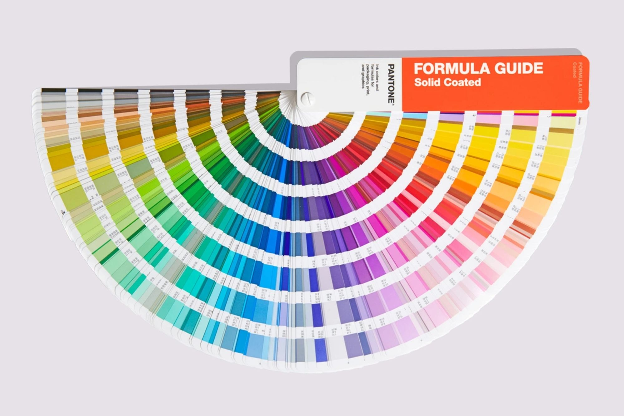
Why are Pantone books so expensive?
Pantone books (also known as guides) are premium tools made with specially mixed inks, printed on carefully calibrated materials under strict quality control. These color samples are standardized references trusted across industries, which adds to the cost.
Are Pantone colors copyrighted?
Colors alone can’t be copyrighted. However, Pantone’s system—including its naming conventions and matching formulas—is protected as intellectual property. Courts have recognized that duplicating their system, not using the colors, may infringe on their rights.
Can I use Pantone colors in my packaging without purchasing their systems?
Absolutely. If you're working with a professional printer or supplier, they’ll likely already have access to Pantone swatches and licensed mixing tools. You can reference Pantone shades through partners like noissue without needing to purchase the whole system yourself.
Are digital Pantone swatches as accurate as physical ones?
Digital color swatches are useful but limited by computer monitor calibration and light-based display. Printed Pantone books reflect ink on paper, which gives a far more accurate representation—especially for final print work where color precision is critical.
What's the difference between Pantone spot colors and process colors?
Pantone spot color inks are pre-mixed and printed as solid fills, ideal for sharp, consistent color reproduction. Process colors like CMYK blend inks in fine dots to create a wide range of tones, making them better for full-color images but less precise for specific hues.
Can I convert Pantone colors to other color systems without losing accuracy?
Not always. Each color system has its own range (or gamut), so an exact match isn’t guaranteed. Pantone does provide suggested conversions, but some vibrancy or tone can be lost. If color fidelity is crucial, it's best to consult a print expert (like our team at noissue!) who can advise on the closest achievable match.