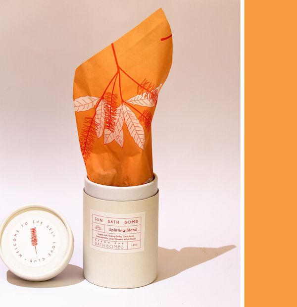
@byronbaybathbombs
It’s no secret that poorly designed packaging can have a negative impact on your brand — not to mention a potential loss of sales and revenue! As a designer, how do you know whether your packaging is set up for success?
For starters, the most successful packaging designs take more into account than simply the ‘look and feel’ of what you’ve created.
Contrary to popular belief, there’s a lot to consider before you even start the design process. Below, we’re sharing five common mistakes packaging design beginners make, and how you can easily avoid them. Let’s go!
Mistake #1: Beauty over function
If you’re new to packaging design, you might be tempted to put all of your focus on visual aesthetics rather than your packaging’s overall functionality. While visuals are certainly important, creating a positive user experience for your customers should always come first! That all starts with ensuring your packaging is both easy to use and serves its purpose. Is your packaging simple enough to open? Will the material protect your product from getting damaged in transit? These are the essential considerations to design for.
To avoid leaving a negative impression on your product and brand, consider testing packaging options before investing in a full order. The packaging you choose should be strong enough to protect fragile items from getting damaged, but not to the point where customers will have to struggle to access what’s inside!
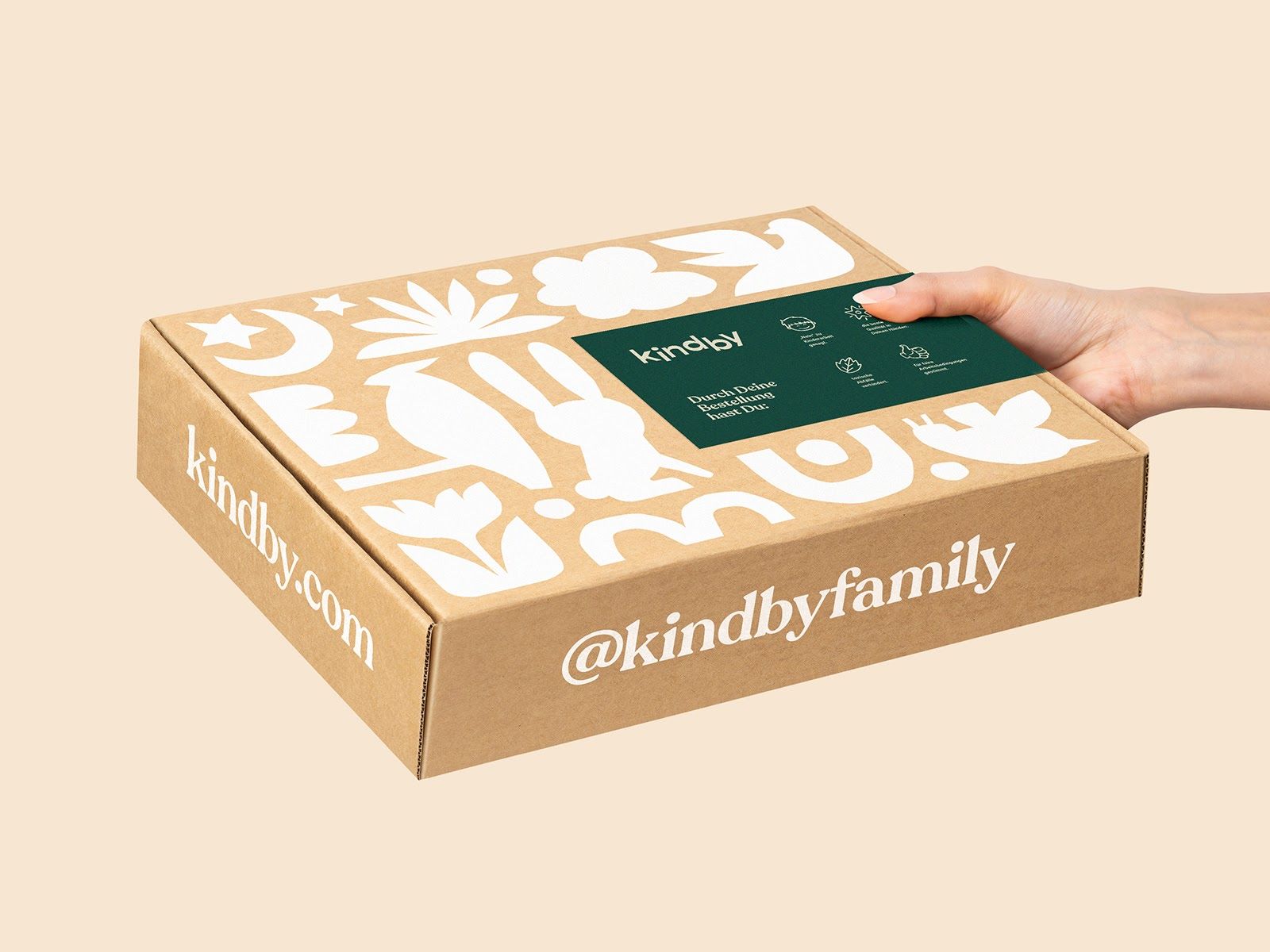
Mistake #2: Excess packaging and waste
Have you ever received a shipment only to be disappointed at the needless and wasteful packaging included? Consumers today care about sustainable packaging now more than ever — and with good reason. Sustainability should be top of mind as we all work towards building more environmentally conscious brands.
When possible, avoid excess packaging that doesn’t add any functionality to your design. As you make an effort to minimize your package as much as possible, also opt for utilizing eco-friendly materials that are:
- Compostable: Made from renewable plant-based materials and/or bio-polymers.
- Recyclable: Made from previously used plastic products, including single-use bags, bottles, and other common plastic items.
- Reusable: Packaging that can be used multiple times for a variety of functions.
Not only will customers appreciate your sustainability efforts, but it’ll also help to build brand trust and reinforce your values as a company.
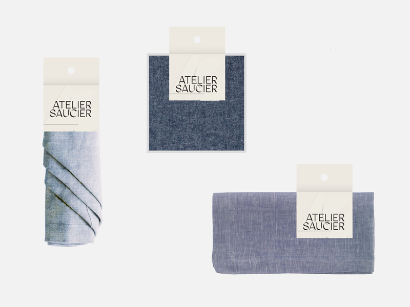
Mistake #3: Not licensing artwork
If you plan on outsourcing any visual assets for your packaging design (fonts, illustrations, patterns, photography), always remember to double check your licenses to make sure you can use the asset(s) as intended.
Artwork sourced online typically requires that you purchase a license allowing for commercial usage (or at the very least, ask that you credit the artist on the packaging itself). The same goes for fonts — most fonts require that you purchase a license if they’re intended to be used on a commercial product.
Incorrectly licensing (or not licensing at all) could result in some serious issues, so always double check the licensing for any outsourced creative assets you plan on incorporating into your design.
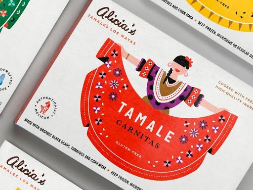
Mistake #4: Lack of strong branding
When someone receives a package, they should immediately be able to recognize the brand behind it. While that might seem obvious, you’d be shocked at how often this gets overlooked. The good news is, there are plenty of ways to inject your brand personality into your packaging design.
For starters, thoughtfully choose colors and typography that support your brand voice and messaging. If you already have those ironed out, great. If not, take some time to research how different colors and fonts impact consumer perception before deciding on a color and typographic palette. Here are a few other tips to help ensure your branding stands out:
- Ensure your logo is clearly and prominently displayed
- Edit any supporting copy so it reinforces your brand voice
- Include custom details like a personalized card, stickers, etc. to add to the overall brand experience
Never underestimate the power of brand storytelling that your packaging design can provide to build lasting relationships with your customers!
Mistake #5: Overcomplicating the design
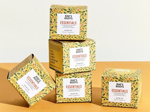
When it comes to packaging design, less is always more. At the end of the day, a straightforward, clean design makes for the most successful packaging. If your design is cluttered with text, colors, graphics, and lacks overall focus, you will risk losing the attention of your customers.
Keep your design minimal enough to avoid confusing your audience, and put the focus on what’s most important — your brand. You want to make sure your packaging is clear and eye-catching so that it stands out from the crowd, but also clearly indicates what to expect inside. When in doubt, remember less is more.
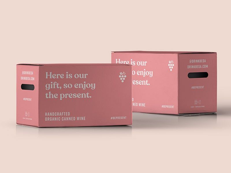
Now that you’re equipped with some of the biggest dos and don’ts of packaging design, it’s your turn to put these pointers into practice. Successful packaging design is so much more than just visual aesthetics — always be mindful of your customer’s experience, while still thoughtfully weaving your brand personality into the design. And, remember — less is more!
Renee Fleck is the content manager at Dribbble and is a design enthusiast who is passionate about helping creatives learn, grow, and get hired. Find her at Dribbble.com/reneefleck
