A graphic design studio for brands that seek to be seen and heard, Third Ginger Studio is based out of Sydney, Australia, ready to collab with passionate brands that want to breathe life into their creative vision.
Here we chat to Kaitlyn, a dreamer and the creative visionary behind Third Ginger. Read on as she tells us more about her brand and inspirations and a sneak peek of her collaboration with homeware brand Autumn & Thistle.
Creative: Third Ginger Studio
ABOUT OUR CREATIVE:
Tell us a bit about yourself and your team.
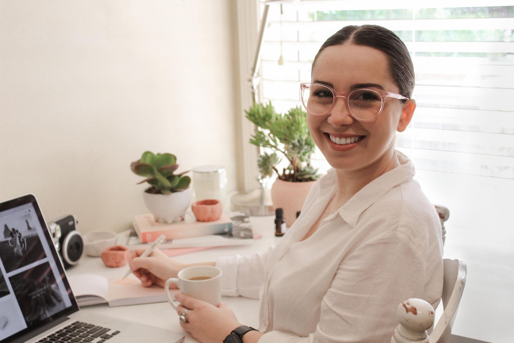
Hello! I’m Kaitlyn, the designer and dreamer, the mover and maker behind Third Ginger Studio, a strategic branding studio calling Sydney, Australia home. Currently a one woman-show collaborating with other like-minded businesswomen. Born from a love of creativity and design, we breathe life into conceptual ideas crafting them into strategic solutions for the business you love. We create brands for passionate, creative people (and businesses), whose values align with ours and who put their heart and soul into everything they do.
How and why did you start your brand?
I started Third Ginger Studio mid 2019 (feels like a long time ago now!) I had always wanted to work in my own business/own my own studio and I decided to just take the leap.
I did however put in a lot of groundwork before officially launching. I had already started an Instagram sharing my work and began building hype to the eventual launch of the Third Ginger brand. Then once I was ready, had my website up and running, and had an idea of my process and packages, I just figured now or never. I knew I would never feel 100% ready, so I took it live!
I’d always had this dream of working with other women who were doing amazing things, and this is how I knew how to help them do exactly that. Helping other business owners feel confident in the image they’re putting out there in the world, and knowing they’re attracting the right type of people, that’s what really fuels me and keeps the essence of Third Ginger Studio alive!
What’s your brand vision and why is this important to you?
Here at Third Ginger Studio our brand vision is to build honest & strategic brands with creativity & intention for passionate-business owners.
We don’t want to work with just anyone. We want collaborative partners who are passionate, full of soul and who love what they do enough to make a go of it! We hold our brand vision and core values near and dear to our heart. It is our guiding light and what we base all of our decisions on. It’s how we remain true to ourselves and our audience.
Our core values – exude creativity, passion is a driving force, honesty breeds honesty, connection over results and intentional but creative – is what lights our fire. They keep us honest, humble and creative.
We love it when our clients possess similar traits and bring new ones to the table! It’s like the stars aligned waiting for this synchronicity of ideas.
What’s your design process like and where do you usually find your inspiration?
I believe it’s the design process that sets designers apart. I take an extremely collaborative approach to the whole project because at the end of the day, my client knows their business inside and out and I’m there to help guide them through the visual side of that and to help them create a strategic brand.
My entire process starts with client meetings, getting to know each other and how we’d work together, then having an in-depth conversation or two about brand strategy and getting down into the nitty gritty of what makes them special. This is where the true magic of the brand comes alive.
This extensive strategy document outlines all the facets of their business, their audience, their positioning, their big dreams and future goals. This then informs every design decision.
I take a breath and deep dive into the subconscious of their brand, discovering those little quirks, the small details, the points of difference that I can then leverage into visuals. So, I guess you could say that I find most of my inspiration from my client, their business and the brand strategy.
But of course, places like Pinterest, Instagram and design out in the world (my camera roll is filled with photos of typography, design, colour palettes from nature) are always a great starting point for mood boarding and style inspiration.
What does visual storytelling mean to you?
Storytelling is this tradition that helps share and communicate ideas, histories and values in a way that other methods can’t. Storytelling in branding is a major game changer.
The brand strategy is the foundation for this storytelling. Using visuals to tell the brand story is what connects and resonates with the ideal audience. It is the missing link between business and consumer and ultimately how to retain loyal customers.
Through generations and shared experiences, stories are what connect us. Stories are personal, relatable and work to humanise a brand, building a strong emotional connection with the audience. People buy from people they can relate to, people they feel an emotional connection with, people they can see as being their friend, not a faceless stranger in the street.
Leveraging storytelling and sharing a more personal side to the brand is what audiences want to see. Social media has made it increasingly easier to share our stories and more and more people are intrigued by how business owners spend their days, what brands they love, the behind the scenes and the real life behind a brand. It is these stories that weave relationships that reach past the screen and far beyond a conversion or sale. Storytelling has become a crucial element of success for many small business owners and cannot be underestimated.
What qualities do you look for in a client or collaborator?
I’ve been incredibly lucky to have worked with the people I have already, and they all have similar qualities that have resonated with me. Number one quality is passion, for sure! I love what I do, and I want others to be 100% invested in what they’re doing and ultimately, what we’re creating. I love working with people that are forward thinkers, open minded, courageous, humble and creative. I think it’s incredibly important to share these traits, as long as bring new ones into the partnership, because there’s nothing wrong with a few differences to make sure we’re both learning and growing after working together.
ABOUT THE COLLABORATION:
Tell us a bit about your collaboration with Autumn and Thistle.
I’ve been following the journey of her shop since before she opened! It’s been pretty special to understand where she started and where she’s going and sharing in the journey along the way. Autumn and Thistle is a homewares and boutique home décor store based in Richmond, NSW. They stock candles, gift wares, local handmade products, artwork, teas and so much more!
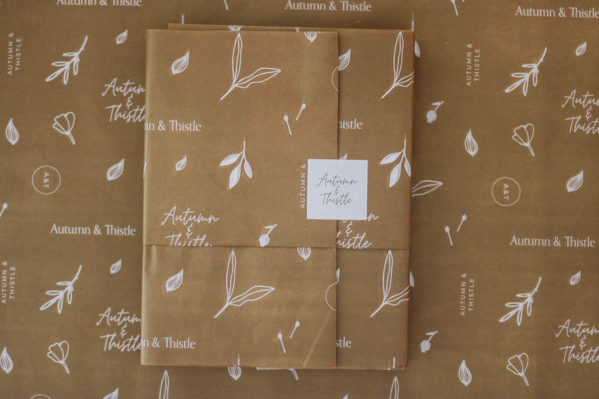
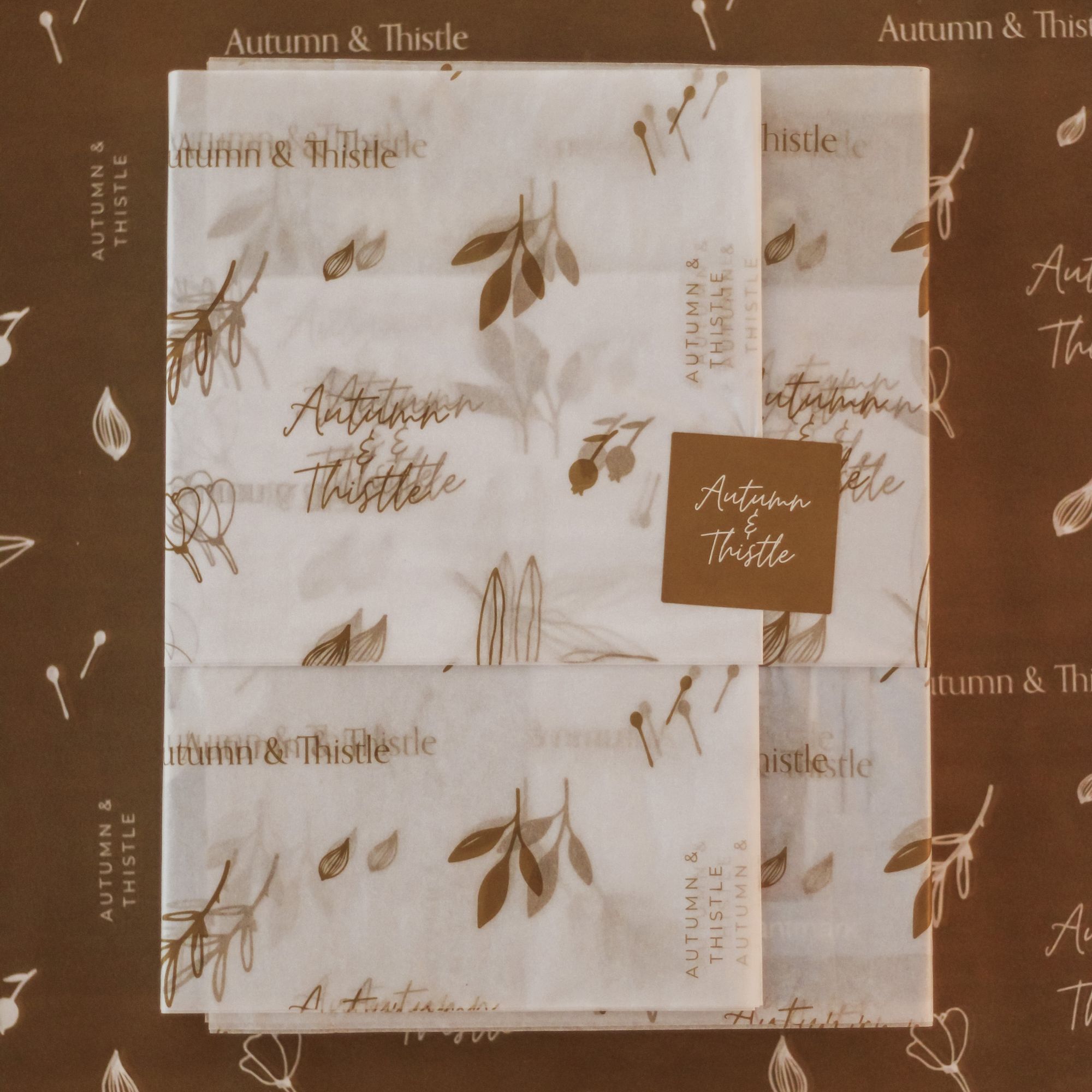
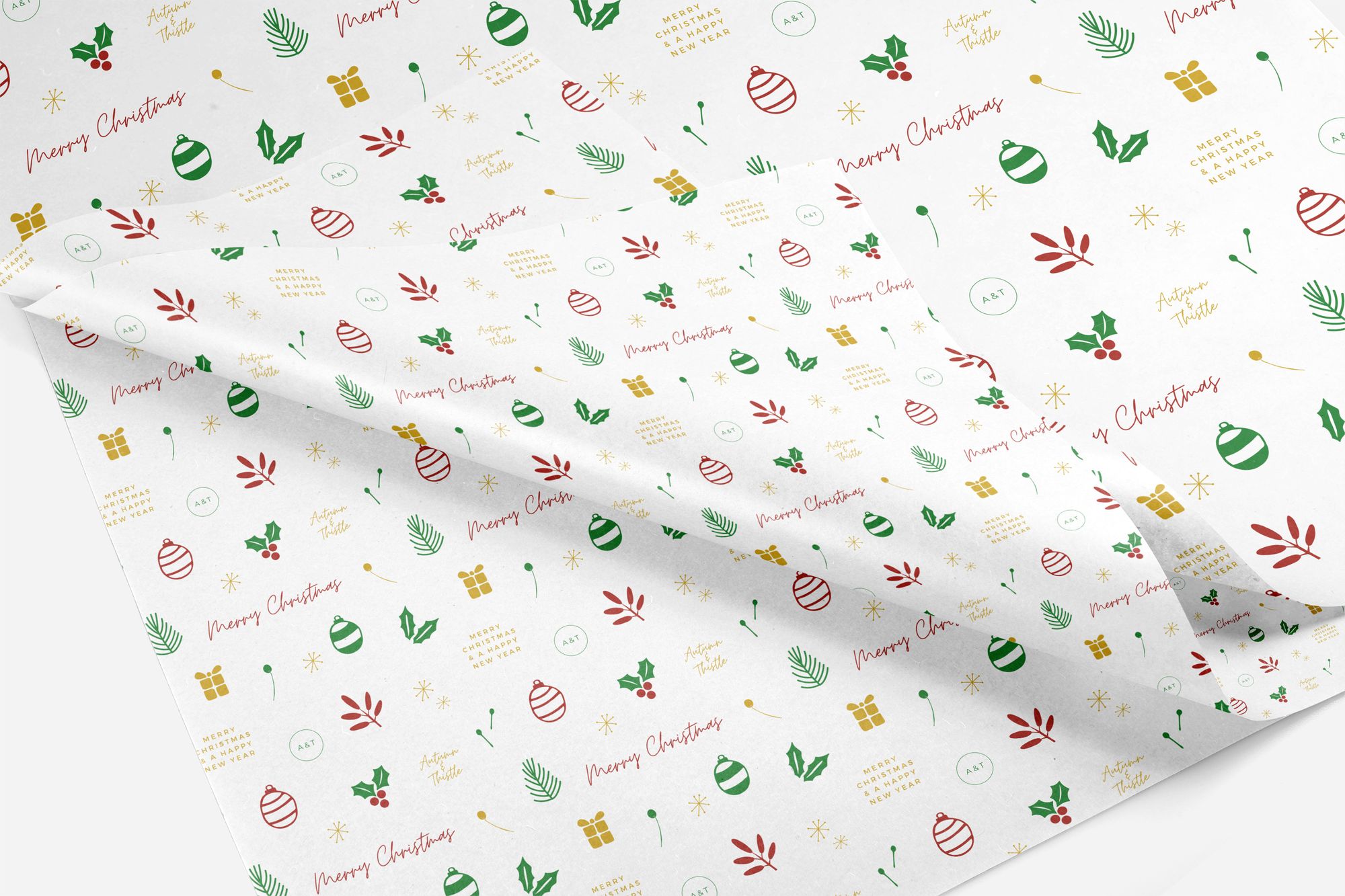
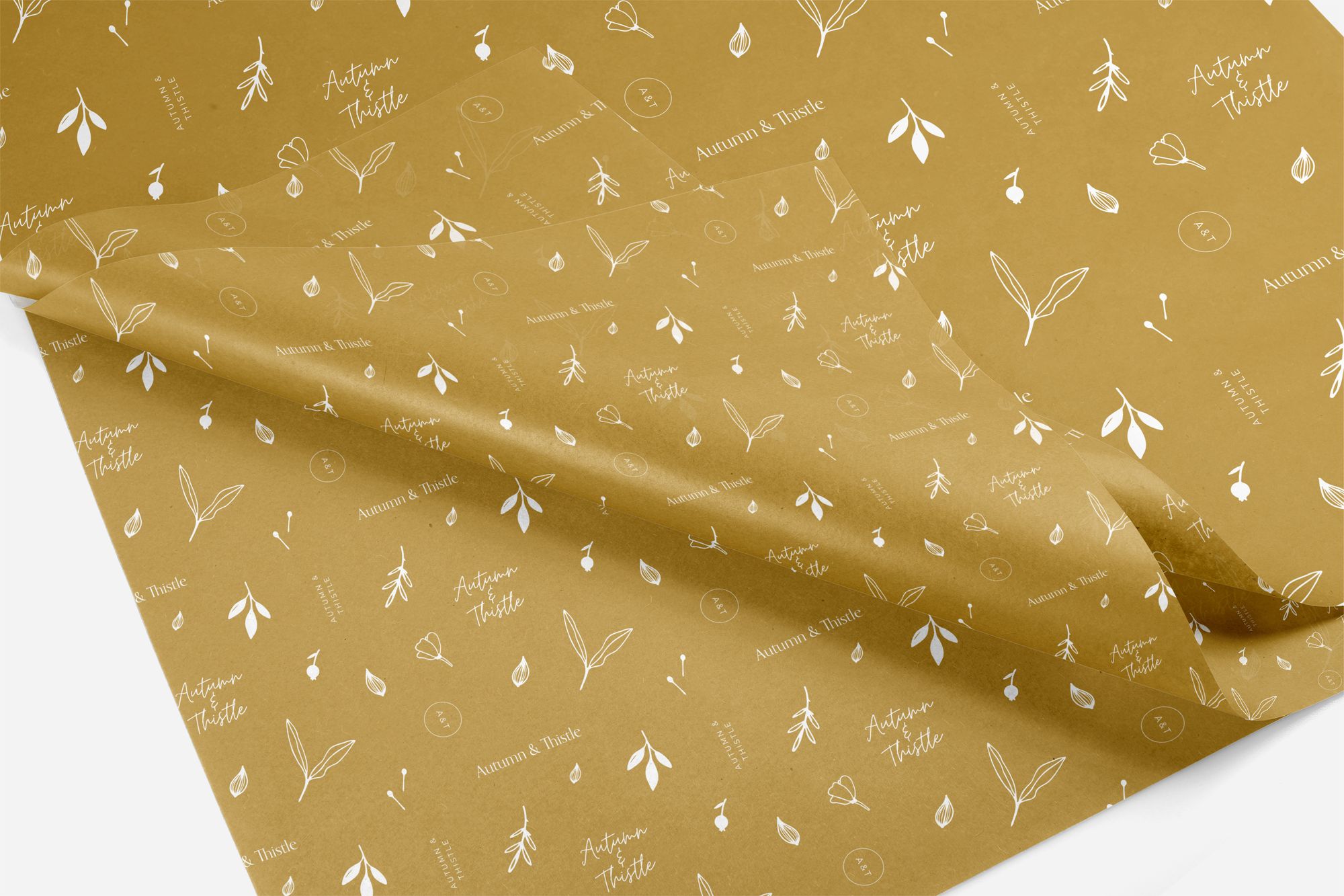
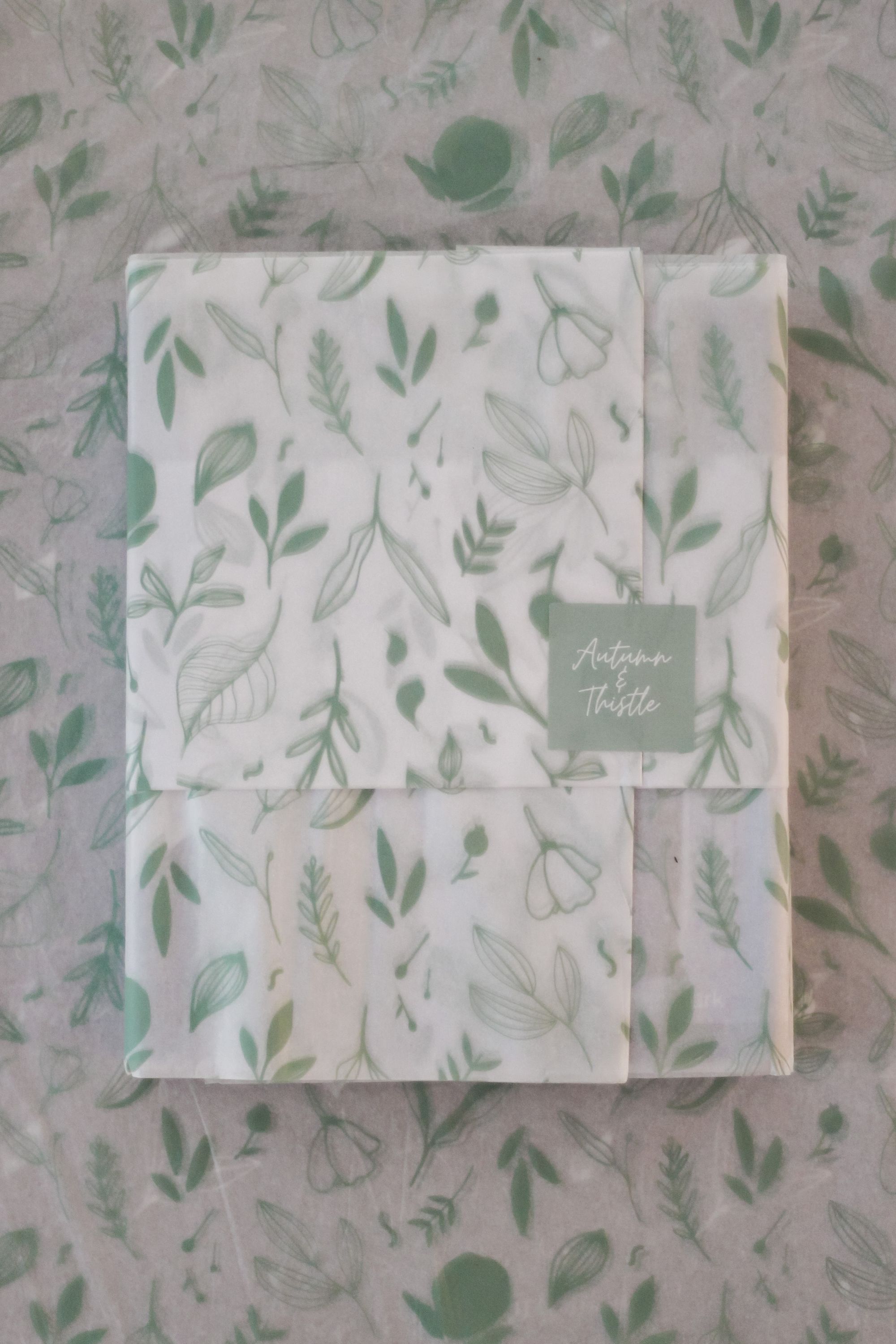
Catherine was an absolute dream client. She knew what she wanted but was more than happy for me to take the reins with the illustration and create something bespoke for her business. It was effortless, to say the least! I created a few mood boards for her different patterns, which I then used as inspiration for her botanic illustrations then we worked together to settle on the perfect colour addition to her brand which was the sage green.
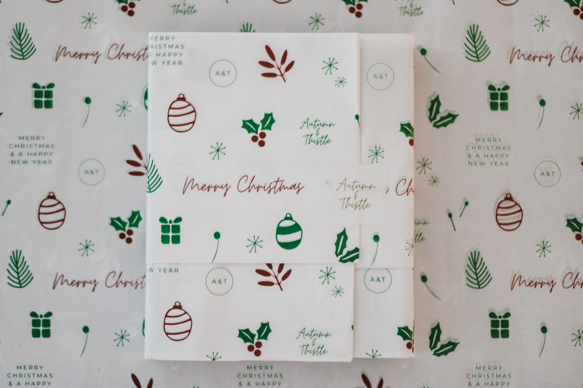
The tissue paper and stickers look fantastic when gift wrapping customer’s purchases!

How did you and Autumn and Thistle begin to work together?
Catherine from Autumn and Thistle approached me about illustration for her business’ packaging needs after following me on Instagram and seeing a few of my illustrations, my process and aesthetic. It was as simple as a few emails back and forth working through the details and nailing down what she wanted/needed and then she was more than happy for me to just let my creativity run wild!
What inspires your designs for this collaboration?
The illustrations were mostly organic, botanical inspired, so I took most of my inspiration from nature! Autumn and Thistle’s location in Richmond is very familiar to me, so I wanted to bring that sense of Australian flora and locality into the store. Stocking a lot of local brands and products, I knew it was important to embrace that and share a little bit of the local area through the illustrations.
I’m also a huge fan of simple line drawings. That’s usually my creative outlet, so it was quite different creating simple illustrations for a purpose.
What was something that stands out about this collaboration for you?
The biggest stand out for me would be the simplicity of the entire process. Not only between Catherine and I and our collaboration, but also with finding the correct specifications for printing and navigating through noissue’s website was incredibly easy!
Overall, the project is one that I cannot wait to share on my Instagram and website!
Why did you choose noissue for packaging and what products did you choose from our range?
Choosing noissue wasn’t even a conversation we needed to have! Being eco-friendly and with the ability to completely customise the packaging and at such an affordable price point, there really was no question. Autumn and Thistle’s products are lovingly wrapped with noissue’s tissue paper and sealed with customised paper stickers.
I recommend noissue to everyone and anyone! It was the perfect end to a beautiful collaboration.
Find more of Third Ginger Studio and Autumn & Thistle Homewares here:
Third Ginger Studio
Website: thirdgingerstudio.com.au
Instagram: @thirdgingerstudio
Pinterest: thirdgingerstudio
Facebook: thirdgingerstudio
Thistle Homewares
Website: autumnandthistle.com.au
Instagram: @autumnandthistle
