Building a successful ecommerce business comes down to many things—an in-demand and high-quality product, a compelling brand identity, a clear marketing strategy, a killer fulfillment system, etc.
But, if you haven’t creating an online store worthy of your brand and your audience, success could remain just out of reach.
For consumers, an online store reflects on the brand and products it is meant to highlight. If it isn’t well-designed, shoppers may conclude that the products aren’t that great either.
In fact, one study found that 48% of respondents said website design was the biggest factor in determining a business’ credibility. On top of that, 38% of people would stop engaging with a site if the design is unattractive.
So, it only makes sense that you give as much attention to your store design as you do to your products.
How does store design affect sales and conversions?
While there are still plenty of brick and mortar stores out there, ecommerce is devouring an increasingly large piece of the retail pie.
The ecommerce share of global retail sales jumped to 18% in 2020 and is expected to reach 21.8% by 2024. That’s a ton, considering it was only at 8.6% just five years ago.
As more businesses crowd into the ecommerce space, the need to differentiate is bigger than ever.
So, you need to develop a compelling design for your overall store that is both unique to your brand and friendly to your user. Despite the fact they are buying online, people still want an experience that can approximate that of being in-store.
You want to keep people engaged as they shop so it doesn’t even occur to them to shop with your competitors.
You also need to focus on the purpose of each page in your store.
Building the customer journey
Your store pages represent different stages in their customer journey, each page enticing them to click through to the next, ultimately getting them to the checkout page.
For the lion’s share of your visitors, the homepage will be the beginning of their journey (and the top of your sales funnel).
From there, through clear navigation and the right mix of product visuals, shoppers can self-segment and your subsequent pages can begin selling them on your fine wares, driving them further through the funnel.
Your homepage design dictates how many of those initial visitors will make it through to that next page.
It needs to talk to the most amount of people while clearly showing them all the right doors to walk through.
Controlling the customer journey
Where you have control of how visitors enter your store—via your social media posts, email marketing, or paid advertising—you can be more specific with where potential customers start their journey.
For instance, if you are running a flash sale for a particular product line, you can send both your email and paid traffic to a dedicated landing page about the sale and the products on offer.
This page has a much smaller audience and it’s only goal is to drive traffic to items on sale.
Traffic to that page is much more likely to lead to sales than the same traffic sent to your homepage, where they may lose focus on why they are there.
A dedicated landing page also lends itself to promoting product launches, where you can deliver a captivating marketing pitch outside of the intimidating eye of the buy button.
These pages are designed specifically to convert the traffic they get. To create these landing pages quickly, you can use a powerful tool like Shogun Page Builder.
Finishing strong
Another example is abandoned carts. We do it all the time.
The average cart abandonment rate is nearly 70% across all devices and almost 86% on mobile. So many sales dropped at the last minute!
And the cost to retailers is huge. It’s estimated that it costs ecommerce brands $18 billion each year.
There are many reasons for shoppers abandoning their carts, most of which have to do with store design.
Everything was going so well to the point that they added products to their cart, but in the end they ran into friction and decided it wasn’t worth it.
That could be a bad checkout flow, slow loading times, a difficult mobile experience, needing to create an account, and more.
The point is that great store design extends to the very end of their experience. Even a slight uptick in conversion rate here can mean a significant amount of extra revenue.
Which is why you need to make store design a priority for your brand. And, lucky you, we’ve got some tips!
Top design tips for creating incredible product and landing pages
To make your store pages really shine, you need to make sure you have the most important elements in place.
Great photos paired with bad copy won’t drive clicks. Great CTAs with a claustrophobic design layout won’t do it either.
So, here are some design tips for creating great product and landing pages. The winning page follows not just one but all the tips below.
Center the user with your design layout
Your visitors are who this is all for, so designing your pages to give them the best experience is the best advice you can get here. All of the following tips serve to create a better experience for shoppers.
But, what does it mean to center the user with your page layout?
You need to understand how people interact with the information on your pages. For pages with more text, like a Wikipedia entry, eye tracking experiments have shown that users scan in an F-pattern.
For more minimalist pages—like many landing pages—people tend to draw a Z-pattern with their eyes, drawing across horizontally then zig-zagging down the page.
Understanding that, you can see why many successful pages create alternating sections that follow that Z-pattern, making it easier for visitors to scan and read in full.
To expand on this, you can use heatmap software to see how your visitors actually interact with your store, adapting your pages to fit their tendencies.
Feature stunning photos and illustrations
We’ve come a long way with photography, digital design, and the capabilities of ecommerce platforms.
These days, it’s hard to make something as ugly as those old Geocities pages. And our eyes are thankful of that.
Given that fact, we all expect more too. We want to buy from pretty stores with photos that make us visualize their products in our lives.
So, using gorgeous photography on your ecommerce store is absolutely required. From various angles, with great lighting, in the studio and in its element, give your customers all the little visual details.
Where photography helps show how amazing your products are, illustrations bring personality to your brand design.
These visual elements drive visitors through your page and into the arms of your CTAs.
Don’t fear whitespace
The space between your page elements is just as important as the elements themselves. Eyes need breathing room too.
Also called negative space, whitespace is everything that isn’t content on your page.
It helps visitors navigate through the content on the page and digest it without being overwhelmed by a wall of information.
Remember, sometimes less is more.
Make your copy count
Page design isn’t all about the visual elements. Copy has an important role to play in your store.
Where your layout, illustrations, and photos may draw attention, the copy is what does the persuasive work.
Starting with a splashy and memorable headline (at least on landing pages) and continuing down to your key benefits, your brand story, and your product description, copy works hand in hand with the visual elements.
Inject it with your brand voice and you’ll easily connect with your target audience.
Showcase your social proof
Adoring customer reviews and fawning coverage from notable publications should be featured prominently throughout your store. They are one of the most valuable assets you have.
No matter how amazing your marketing is, your shoppers value the opinion of other shoppers over your marketing messages. In fact, nearly 94% of consumers said they rely on customer reviews when researching an unfamiliar brand.
It makes sense. We all do it.
So, use that to your advantage by leveraging your existing base of loyal customers as well as any great features from publications.
By creating repeatable social proof sections for your store, you can easily add it throughout your store pages.
Drive action with powerful CTAs
Finally, there’s the button you have been trying to get them to click the whole time—your call to action (CTA).
With all your great visuals, minimal design layout, powerful copy, and social proof in place, you want to create a call to action that they will want to click.
We don’t want to see any ‘Click here’ buttons. We need something compelling and straightforward.
Since you want them to take action, you need to use action language in your CTAs.
If it’s a product landing page or product collection page, a simple yet strong ‘Shop Now’ works wonderfully. If you are trading a discount for their email, your button could say ‘Sign up now to get 30% off’.
They don’t need to be clever.
Using a color that will stand out, place your CTAs where you know they need to see them—above the fold and throughout the page where you’ve demonstrated the value of your offering.
Examples of stunningly designed store pages
To get a better sense of great store design in action, here are a few really great examples from brands we love.
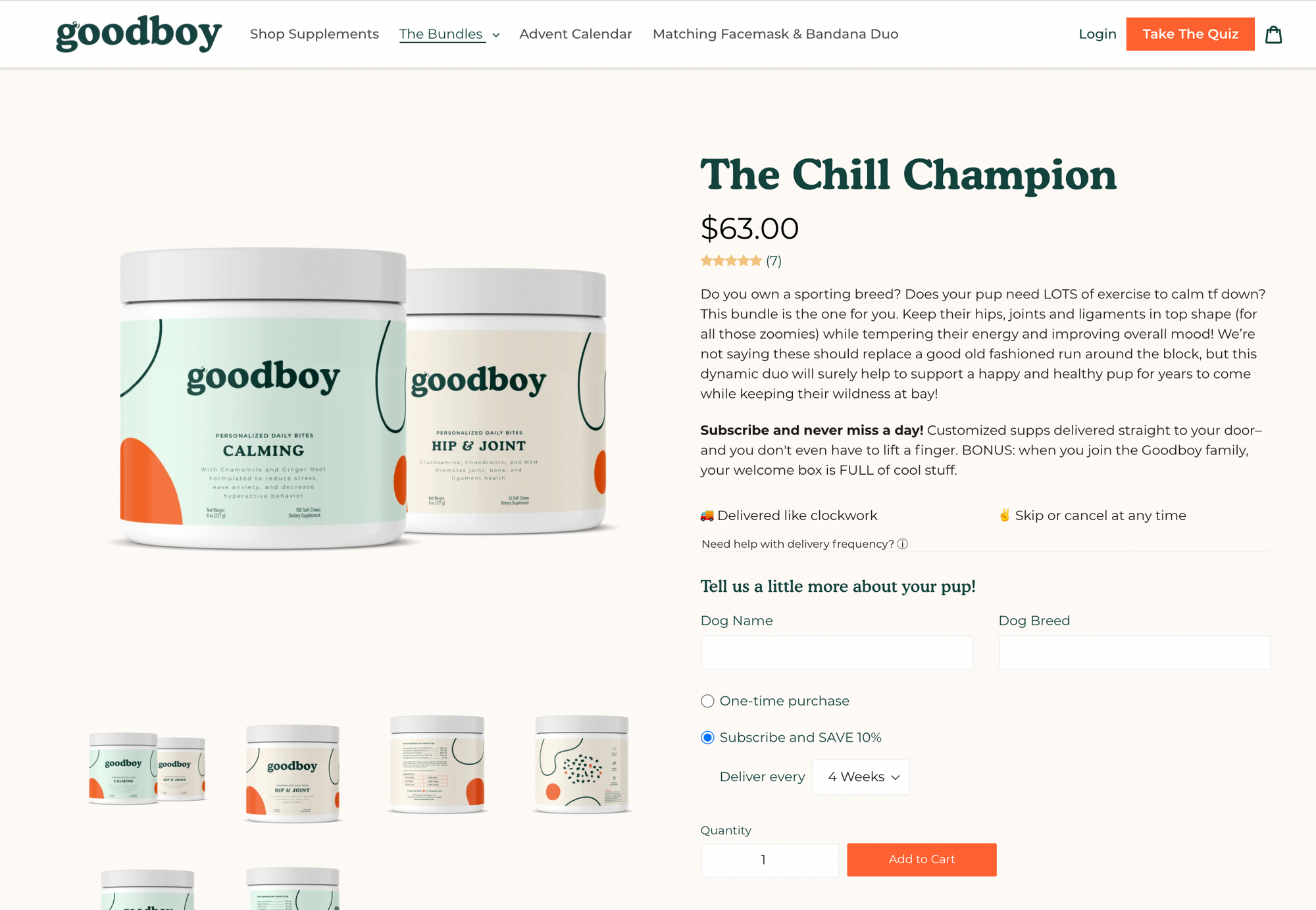
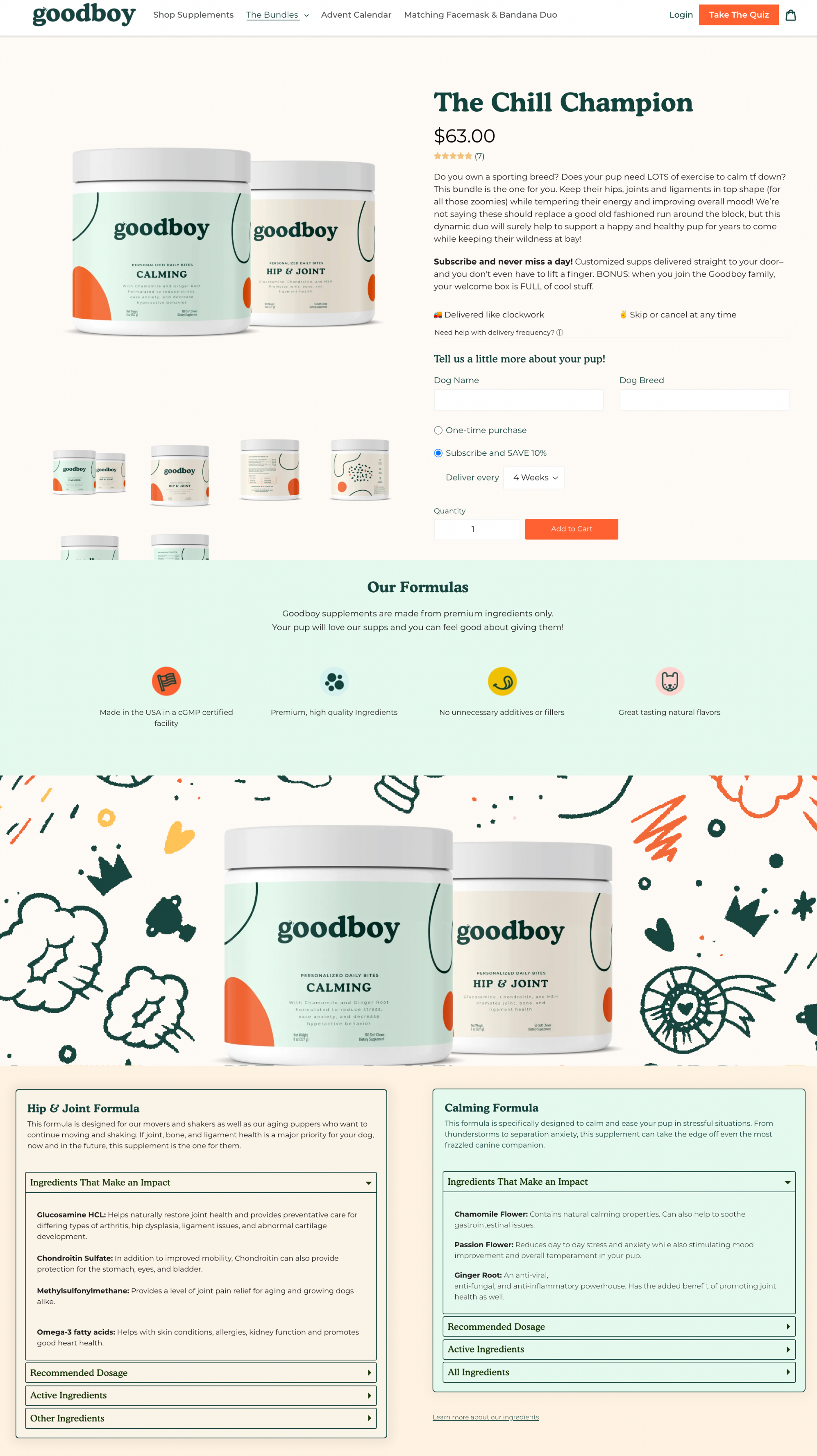
goodboy
This canine supplement company hits it out of the park with their beautifully designed store pages—from their active and engaging homepage all the way to their vibrant collections pages.
On their Chill Champion product bundle page, they use a calming color palette and delightful illustrations to enumerate the benefits of their supplements. They finish it up with a clear nutritional breakdown.
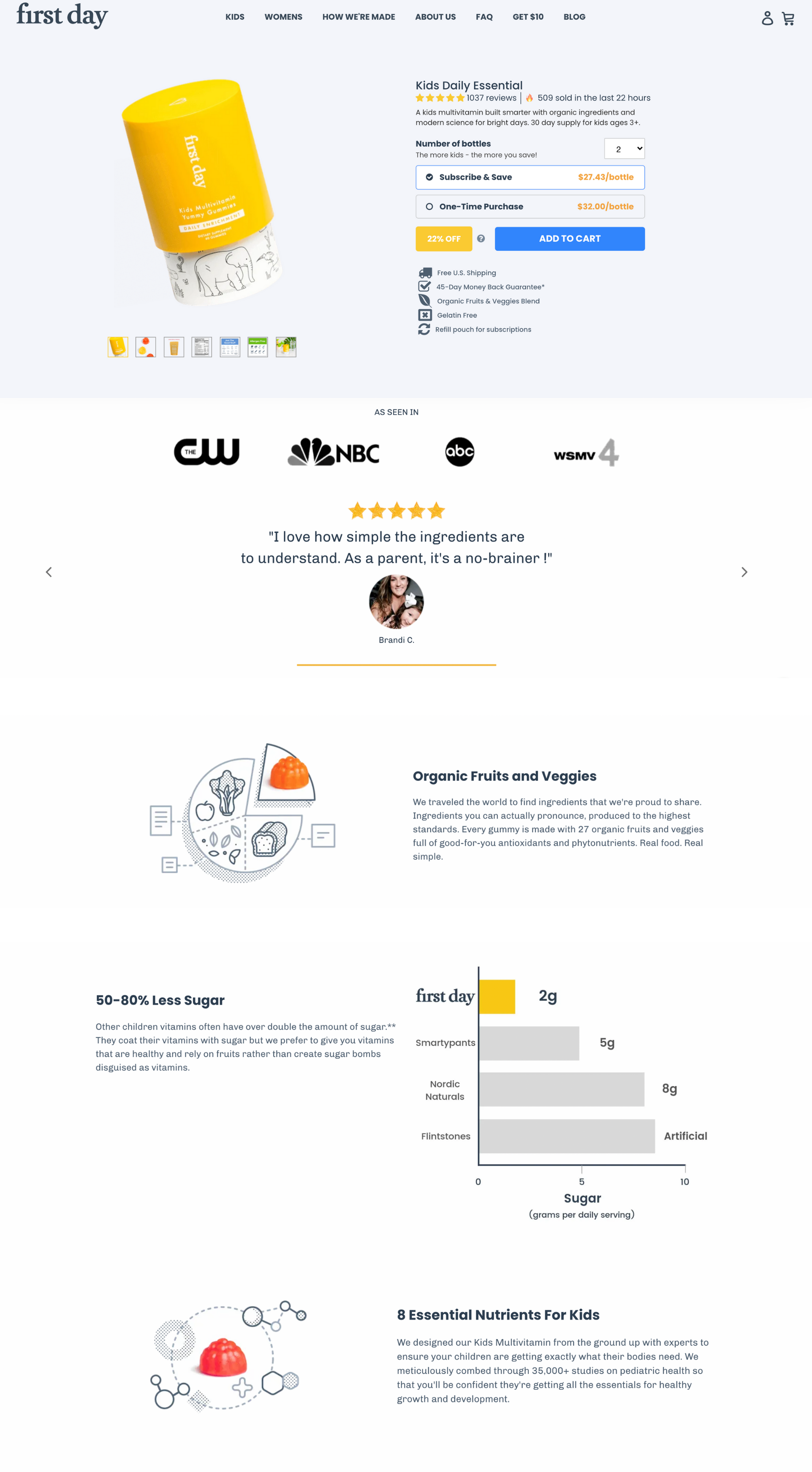
First Day
The children’s vitamin brand, First Day, uses playful illustrations and high-quality photography throughout their store to build out their unique brand.
In their Kids Daily Essential product page, they excel at making whitespace work for them and drive visitors down the page with an engaging Z-pattern.
To build trust with shoppers, they place their social proof section high on the page to showcase the love they get from their existing customers.
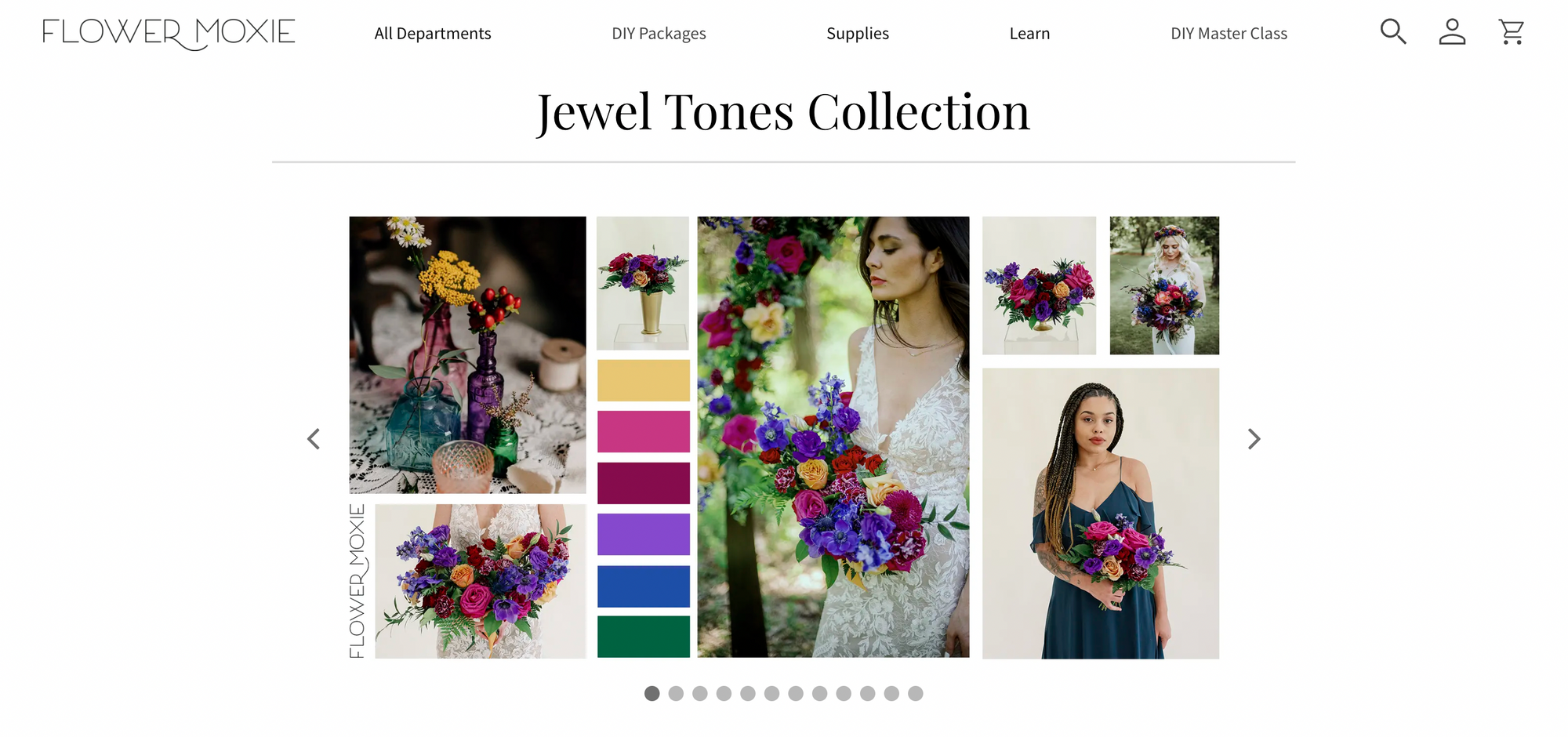
Flower Moxie
This wedding flower wholesaler uses powerful splashes of color throughout their store in a way that uniquely fits their brand and product line.
In their Jewel Tones package page, they lead with a carousel of lifestyle photography and a swatch of the product’s color palette.
The remainder of the page is dedicated to guiding shoppers step-by-step through the process of building their flower order. The information is clear and shoppers understand exactly what they are getting.
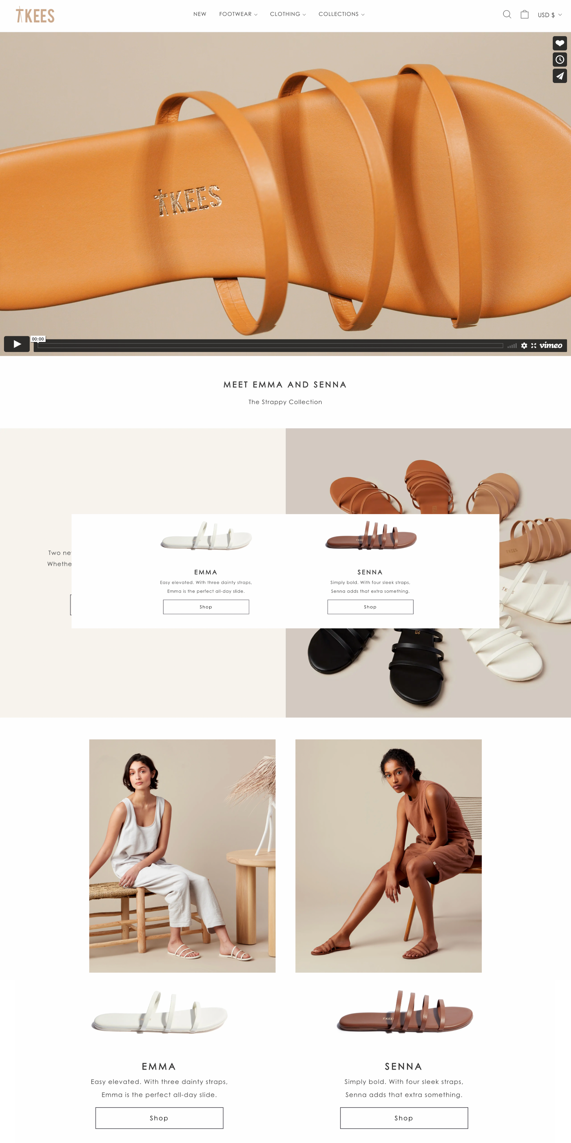
TKEES
This footwear and apparel brand goes hard with beautiful product photography and an emphasis on earthy colors.
In their Emma and Senna product launch landing page, they fill the whole page with a high definition video introducing their strappy sandals.
Scrolling down, visitors are met with a muted yet lush visual feast detailing the particulars of the sandals, with clear CTAs driving shoppers straight to the product pages.
Convert better by designing better
While there are many hallmarks of a successful ecommerce brand, good design is one of the most important.
The job of ecommerce marketers is to draw potential customers to their store and then entice them on to checkout. A well-designed store is built for just that purpose.
Follow these tips and you’ll be well on your way to ecommerce success. As a bonus, you’ll be beaming with pride at how lovely your store is.
Sean Flannigan is a Content Marketer at Shogun, a page builder app that helps you customize your Shopify and BigCommerce pages for optimal conversion optimization. When he isn’t writing content about ecommerce, he is likely biking or cooking.