Blue is brilliant. Just think of all the beautiful shade of blues in the world – a bright blue sky, the ocean on your last summer vacation, blueberries, blue suede shoes, even the Cookie Monster. All the good things!
It’s amazing how a color can have such a massive impact on a person, including your customers. Studies have shown that color alone can be responsible for 90% of initial judgments concerning products and packaging.
Someone's instant reaction towards a color is almost always individual to them and influenced by their memories, experiences, and culture. This is great news for businesses as that means you can be much more creative about your color choices in your packaging.
Overall, blue is a well-liked color that can promote a sense of reliability and trust, especially in marketing. Businesses around the world continuously use blue in their branding to promote stability and confidence to their customers.
So whether you are wanting to make a statement by using the coolest primary color around, or if your aim is to reflect the laid-back calm of your brand by using pastel tones – blue is the color for you.
Check out how these 10 businesses have used blue in their packaging and feel inspired.
Maison Frida
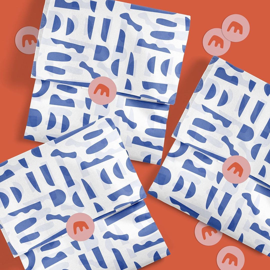
Maison Frida call themselves ‘a playful shop for kids’ and there’s no doubt their packaging backs up the playfulness. Simple but effective abstract-shaped patterns give off colorful good vibes straight away – just like their clothing collection. We love the simple blue on white background with the red-toned logo stickers. Fun!
Astrosoul Astrology Deck
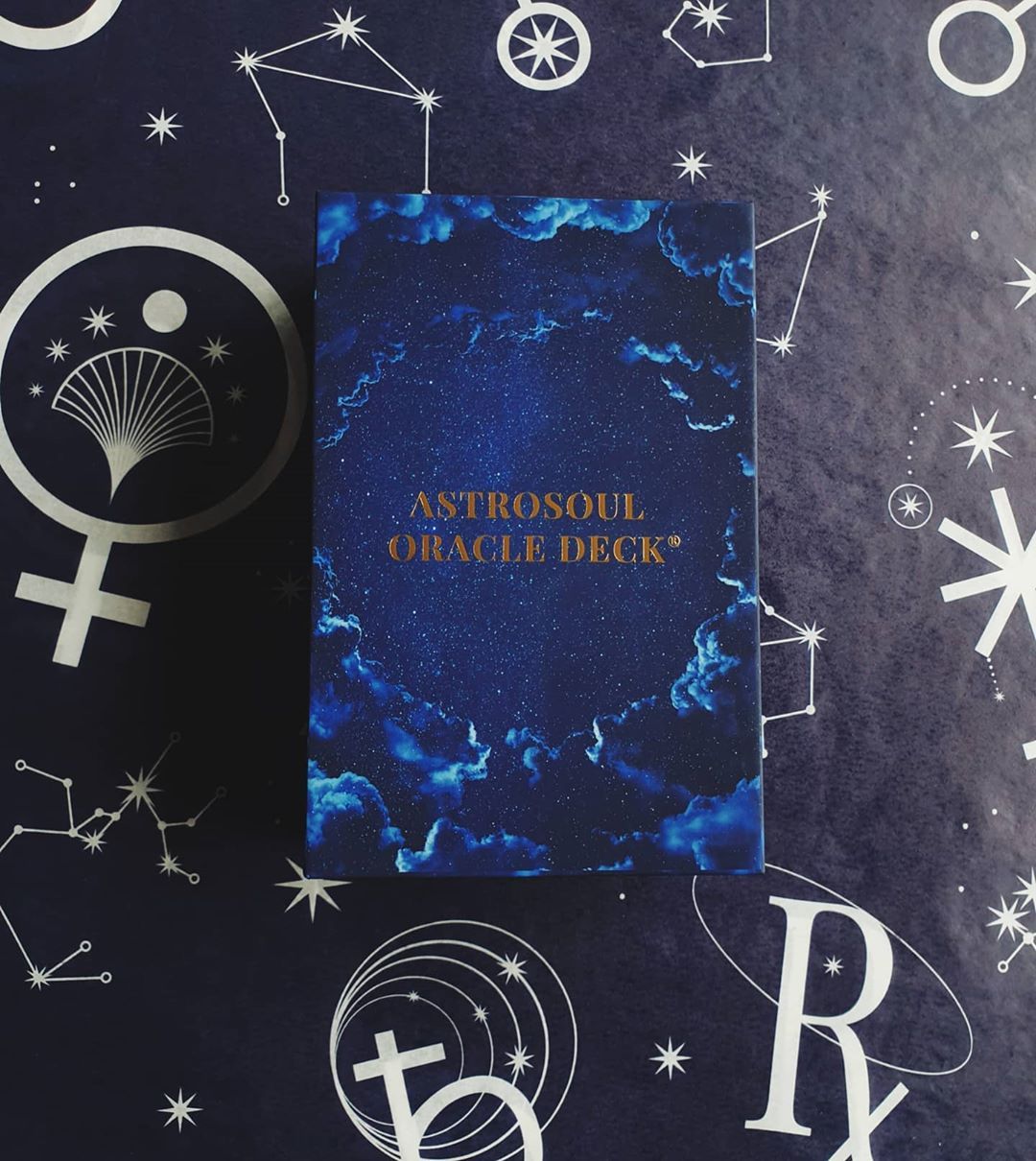
Designer and tarot enthusiast Maria shares her passion for astrology by sending her card decks wrapped in beautiful packaging. When your business is literally reading the stars, a deep night-sky blue is your obvious choice. And my my my, what a stunning result! Maria manages to reflect the deep spiritual theme of her products in this dark blue tissue with gorgeous astrological symbols in its design.
Chloe Giordano Embroidery
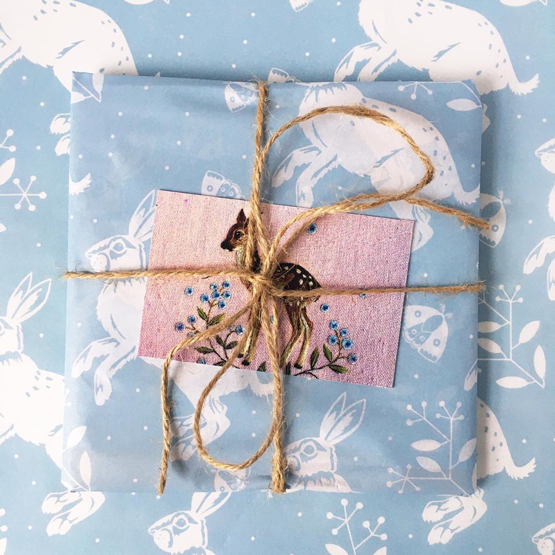
Chloe Giordano specializes in freehand embroidery and sells her original work alongside beautiful prints. The delicacy of the baby-blue shade she uses in her packaging reflects the intricate details of her embroidery. Unassumingly beautiful, her packages are tied up with brown string to add even more home-made charm.
My Tranquilitee

Tranquilitee isn’t only a cute play on words – everything this brand stands for is based on feelings of calm, peace and serenity. The simple blue stripes gently wave across their packaging paper to represent the waves of the calm oceans in their range of relaxation videos and T-shirts that celebrate the simple beauty of the beach. It’s almost enough to make you lay back, close your eyes and imagine a pina colada in your hand.
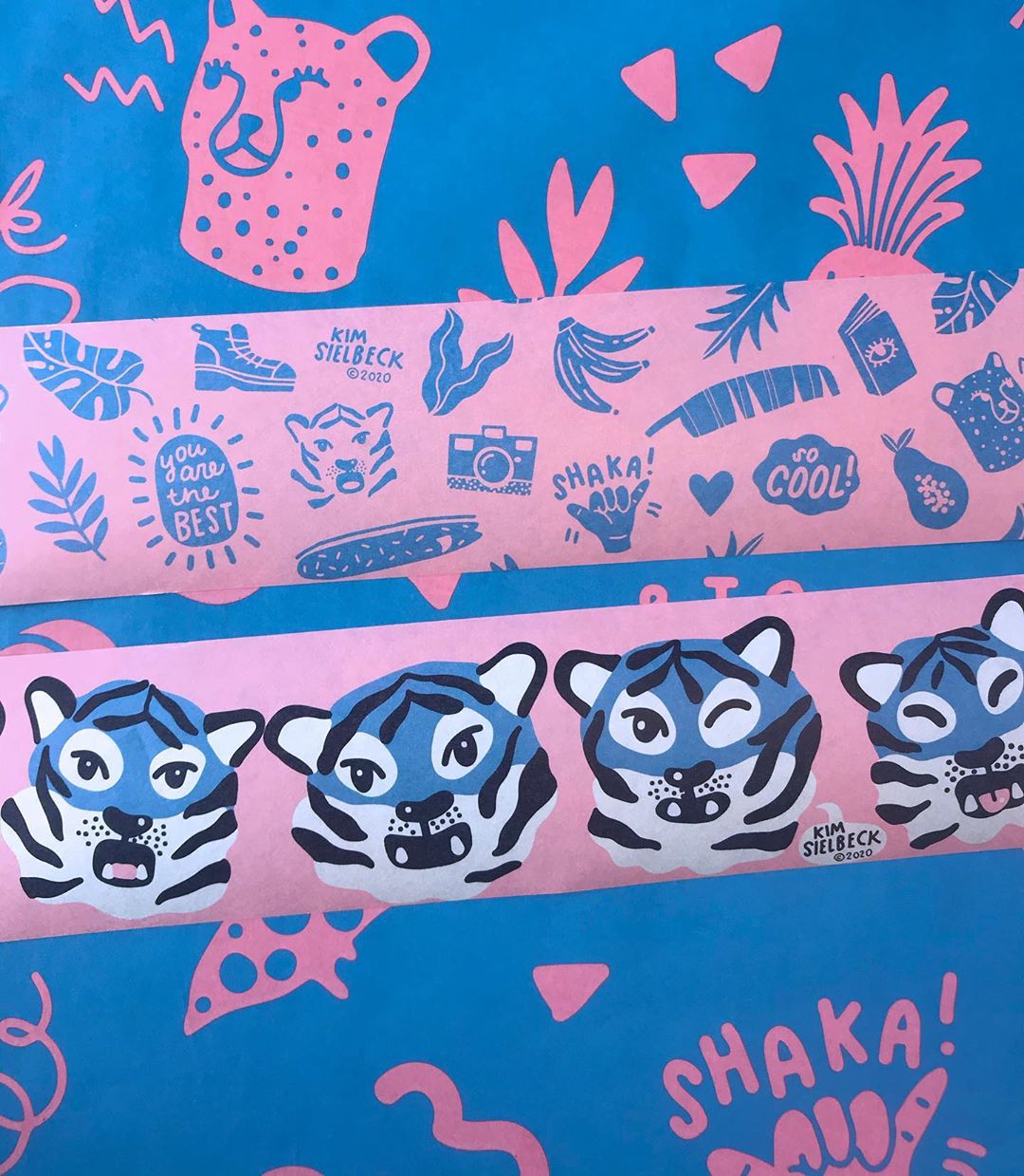
Kim Sielbeck

Kim Sielback is an illustrator and painter based in Hawai’i who produces fantastically fun art –and her packaging is no different. Colorful, positive and playfully combining blue and pink graphics, you get the sense of what is inside straight away – something joyful that’s bound to put a smile on your face. Fun, fierce and unique! Like this? Check out other ways to utilize pink in your packaging.
Mochi Panko
German-based illustrator and designer Mochi Panko knows exactly what looks good together. Red, white, and blue are three colors that complement each other so well. There’s a reason they feature on so many big world flags, symbolizing national pride. The striking contrast between these colors creates even more boldness and memorability, exactly what Mochi Panko is going for. We are sure her customers know exactly who their package is from – instant brand recognition!
Monann Illustration
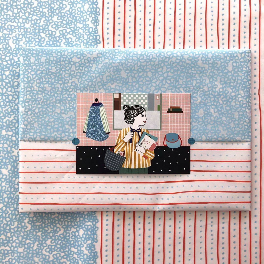
Simple patterns, maximum results. Joining in with the popular red, white, and blue color scheme, Amsterdam based illustrator Manon de Jong wows her customers before they even see her work inside by using paper that has beautiful detail yet still feels wonderfully simple. Manon says she is inspired by the beauty in everyday moments and her use of spots and stripes mixed with delicate flower patterns makes the ordinary extraordinary.
The Forest Mori
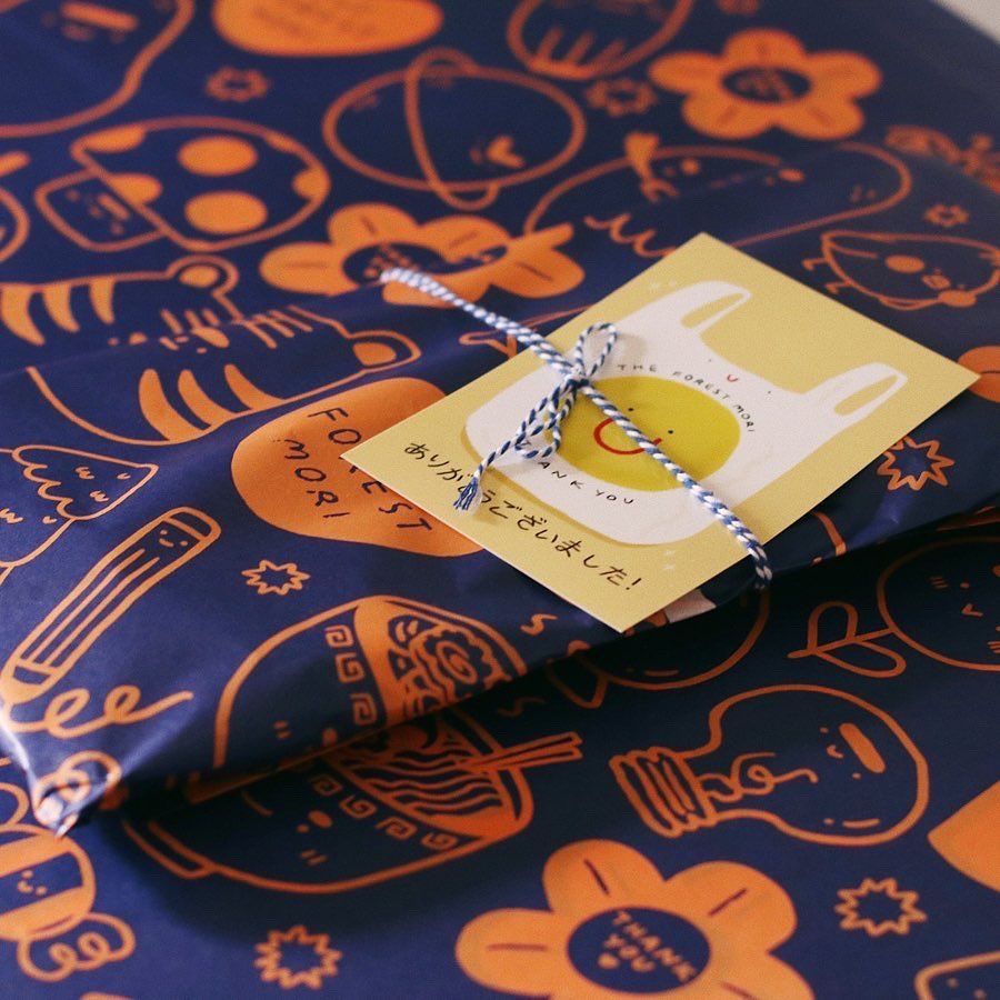
It’s not just red and white that look good with blue – blue looks good with just about everything! Just ask The Forest Mori who uses orange on a deep blue background to make their designs really pop. Using a navy blue shade instead of black alongside contrasting brighter colors is a really great way to create a statement without getting too dark. Perfect for any brand wanting to show off its cheeky side whilst keeping the professionalism of a dark-blue color pallet.
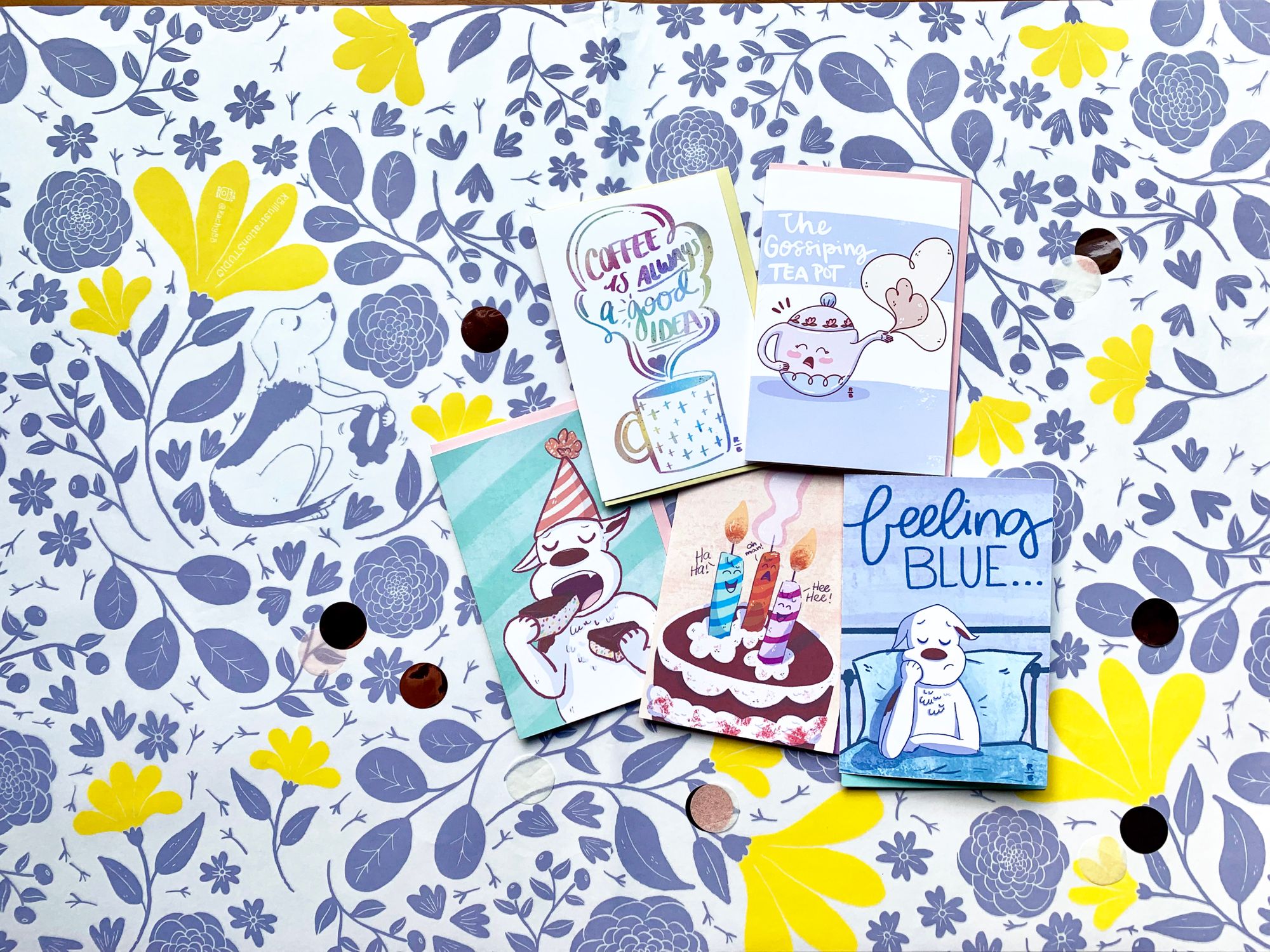
Sleepy Bee Studio

Sleepy Bee Studios are a UK based husband-and-wife team who specialize in lovingly handmade stationery and gifts. They describe their packaging style and being quintessentially English and we just love the muted blues in their watercolor themed tissue. The way the colors bleed from an intense shade into something more pastel feels like water rippling, creating a calm and reliable tone that is sure to impress their customers.
Noodoll

Noodoll is a whimsical design brand that creates cute little monsters for your children. These guys are there for fun, companionship and to make your little one feel safe. Noodoll’s packaging helps reflect that; the white with light blue illustrations of their fun characters gives an understated charming and playful design. When we look at this we feel relaxed and clean, like being wrapped up in cotton wool. Ahhh, lovely.
Honourable mentions
Eager for even more inspiration? Here are a few more brands we’re putting in the blue hall of fame.


With hundreds of possible shades and endless versatility, there’s no doubt blue is a great packaging color choice. Whatever color you decide on, make sure your number one priority is letting your personality shine through and complimenting your unique style. Oh, and tag us at @noissueco to show off your awesomeness!