Baking is no easy task. It requires skills, patience, and a lot of spare ingredients to experiment with (that is called learning, mind you, never failing). Whether it’s a hobby you indulge in from time to time on weekends with family, friends, or by yourself, it can be a form of therapy that you get to enjoy from start to finish—especially with those irresistible treats you get at the end. You never know how something as simple as a hobby might progress into something that can bring happiness to many people on a daily basis. But for an up-and-coming yet already beloved bakery in Brisbane, it began just like that.
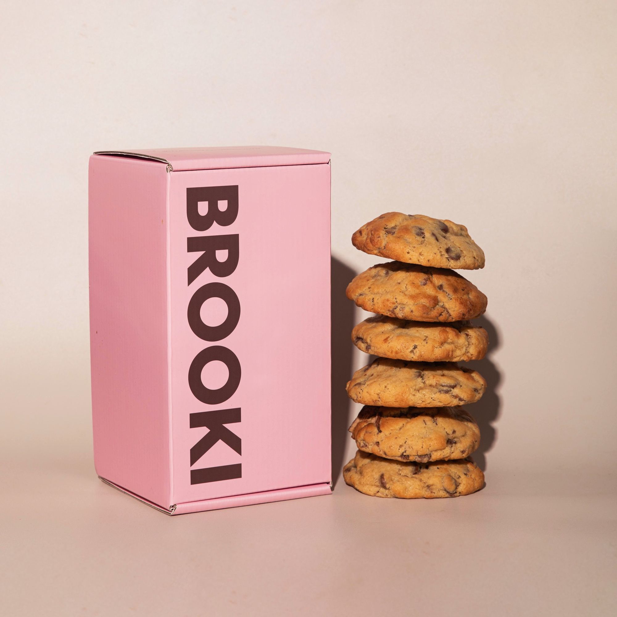
Meet Brooki Bakehouse, a crowd-favorite local bakery at Fortitude Valley in Brisbane, Australia. One thing that is unique about Brooki Bakehouse is its “Paris meets New York’s East Village” design approach—combining the best of both worlds and bringing them forth to Fortitude Valley, creating a sweet sensation only Brooki can exude and emulate in both branding and interiors. Another thing is the selection of their signature mouthwatering baked goods and desserts, which include their infamous NYC-style chunky cookies and many more.
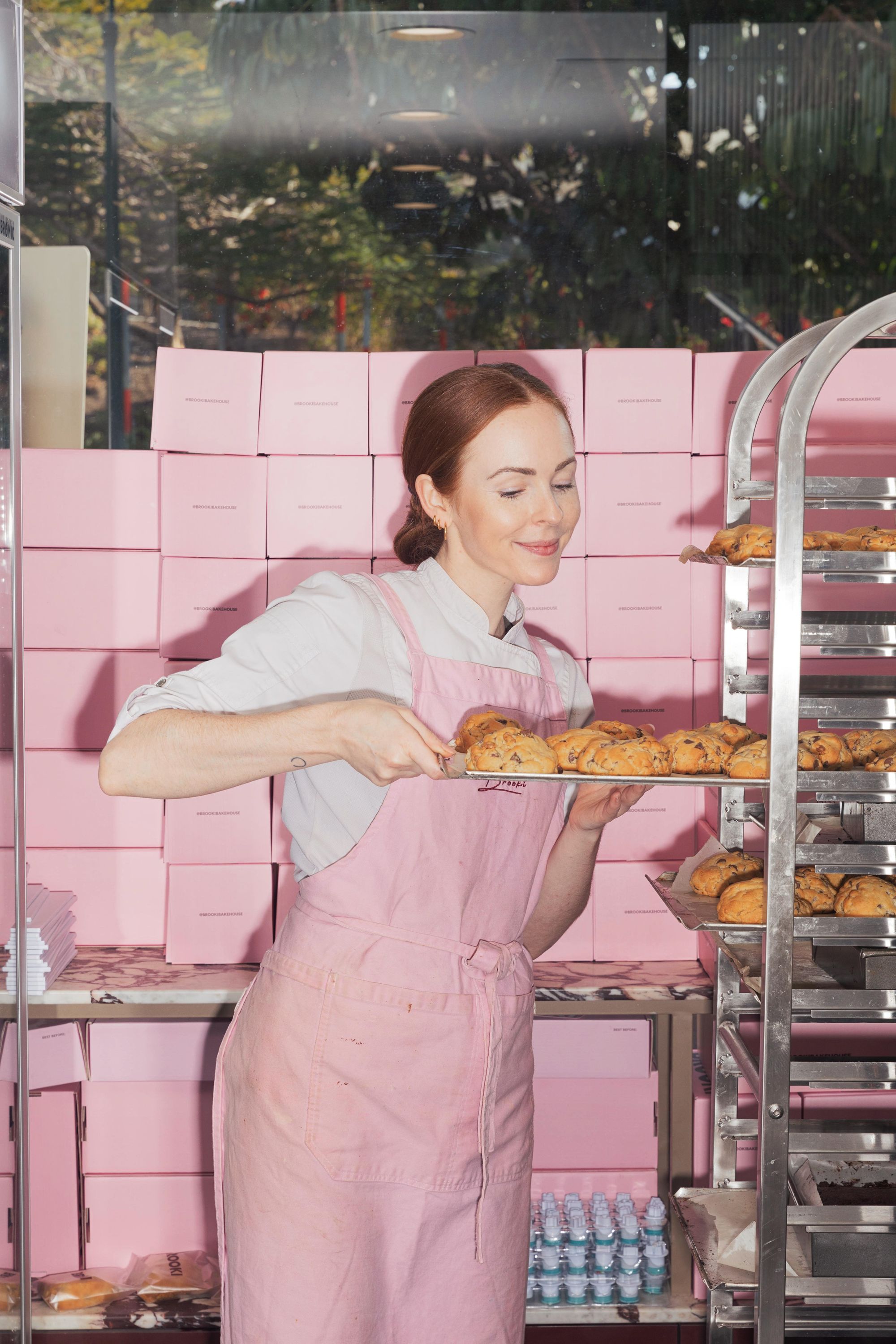
Many people might recognize Brooki Bakehouse through a series of “A Day in the Life” Tiktok videos by founder and baker Brooke Saward. Over time, these videos not only provided enjoyment to countless viewers but also turned them into a community that supports the bakery both offline and online. Most importantly, these videos also served as an inspiration to all aspiring bakers and bakery owners.
Brooki Bakehouse has recently collaborated with noissue for their branded, food-safe, and sustainable food packaging. Here, we chatted more with founder Brooke Saward about all things baking, the inspiration behind the shop design and overall branding, and why they chose noissue for their food packaging needs. Read on to learn more!
Tell us a bit about your brand, introduce it to the world!
I opened Brooki Bakehouse about a year and a half ago out of my undying love for baking. People always say you should do what you love and boy, let me tell you, I really really love baking! My hope was to always create a brand over a business, but I didn't really have a solid plan or vision of how I would do that when I first opened the doors.
Over time, the vision really found itself, when I realized my brand would not only be able to sell a product, but about creating a brand that centers around baking - sharing day in my life videos, tutorials, recipes, etc. By focusing on this aspect of the business, we actually have ended up selling so many more products as we find people want to support the brand in any way they can as it continues to grow. By offering a product that can be shipped in the mail, we have opened up our market to the entire country, not just the market of the city in which the bakery resides.
Tell us about the design for your packaging and how you’re using them?
The brand colors were a bit of a fluke, if I'm honest! Originally, the brand colors were going to be pale blue and white for the first iteration of the logo. However when I found the retail space for the bakery, it was much more industrial and masculine, which led me to reconsider the brand colors because suddenly pale blue felt too delicate.
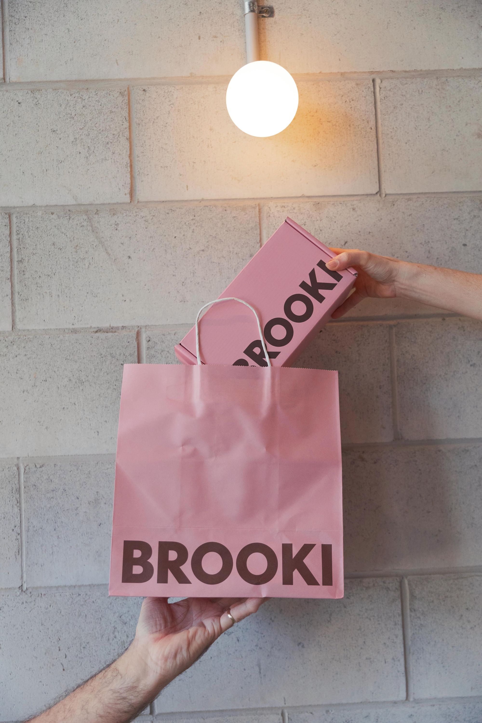
I started brainstorming and thought to myself about all of the retail spaces you typically see with bakeries, that are quite feminine with pastel hues, and how I wanted Brooki to feel different. I wanted it to feel a bit edgier, a bit more trendsetting and unexpected. So I decided to create quite a dark and masculine space - with exposed black ceiling pipes and raw bricks to add an unfinished element.
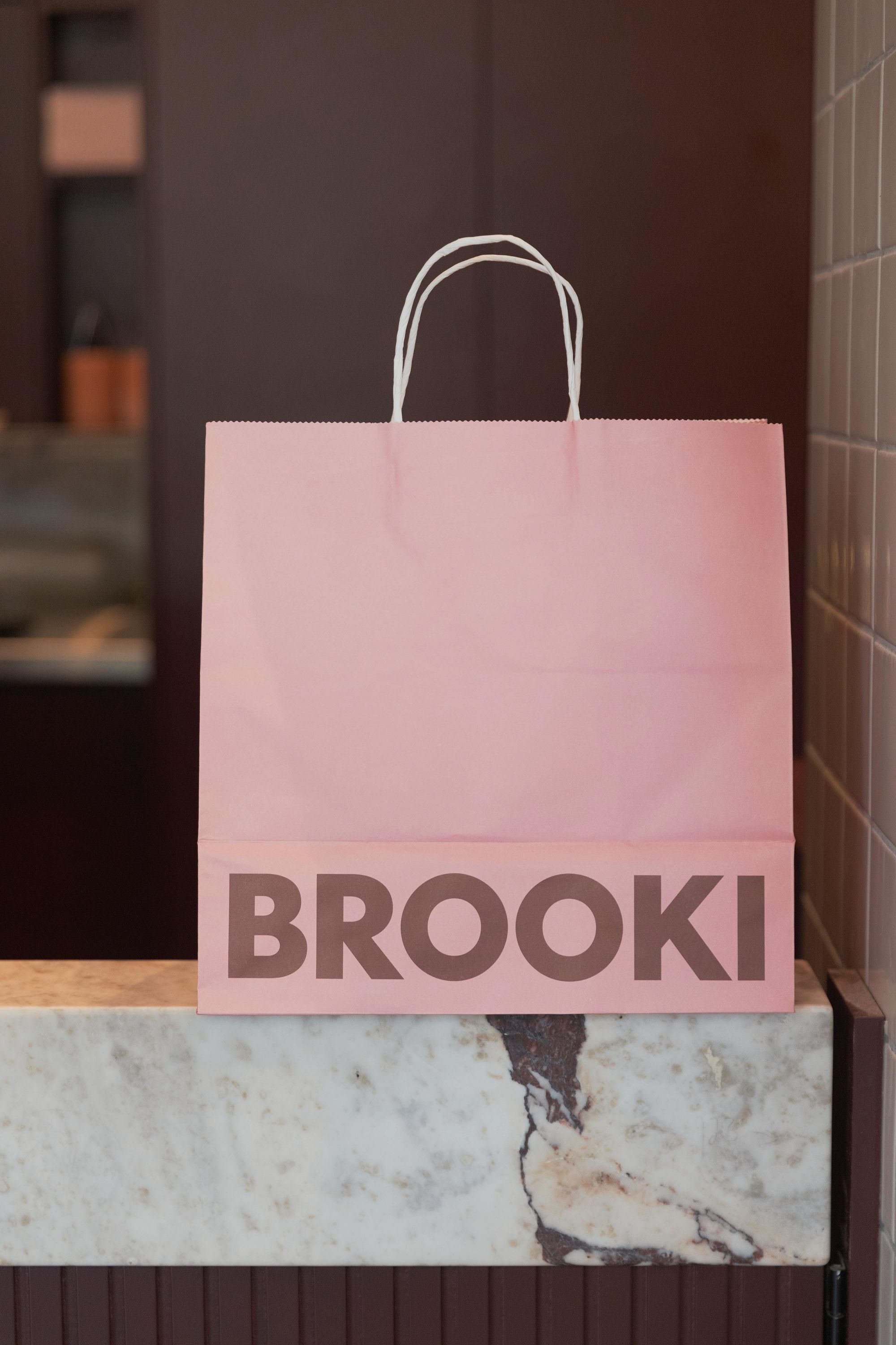
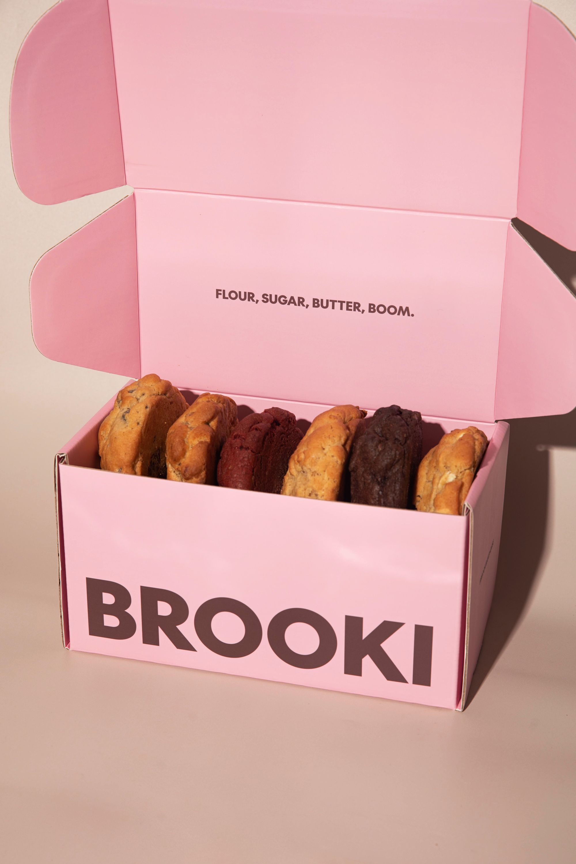
Contrasting this with Italian red marble on the counter bench and brass finishes, the bakery space feels quite industrial but bougie at the same time, as if it has the elegance of a French pastry shop but the raw edginess of a bakery in the Lower East Village in New York. To continue this paradox, I combined pale pink with a dark burgundy color to balance the feminine and masculine energy, so you don't really place the branding as one or the other - it's sort of in its own space.
As for the logo, we have recently changed to a much cleaner, bold font with the help of Sophie from Here Today Studio in Los Angeles. Sophie is a long time friend of mine and probably the coolest person I know - she's always on top of design and branding trends, so I couldn't think of anyone more perfect to give Brooki the direction it needed with the logo, packaging design, and our website. It was actually Sophie who introduced me to noissue five or six years ago when you were just selling tissue paper!
All of Brooki’s yummy treats would not reach the people who need (and want) them without showcasing them to the world, and in the how’s and whatnot of perfectly capturing the essence of Brooki in every photograph, we had a quick chat with Sun Box Studios’ director and photographer, Grace Smith. Here, Grace shares some tips on how to emulate your brand’s look and feel through the lens.
When Brooki Bakehouse came on board with a social media subscription here at Sun Box Studios, we knew we’d have to give her photos a bold and groovy style. So we thought we’d share some of our tips and tricks so you can achieve a similar look to the cookie queen herself.
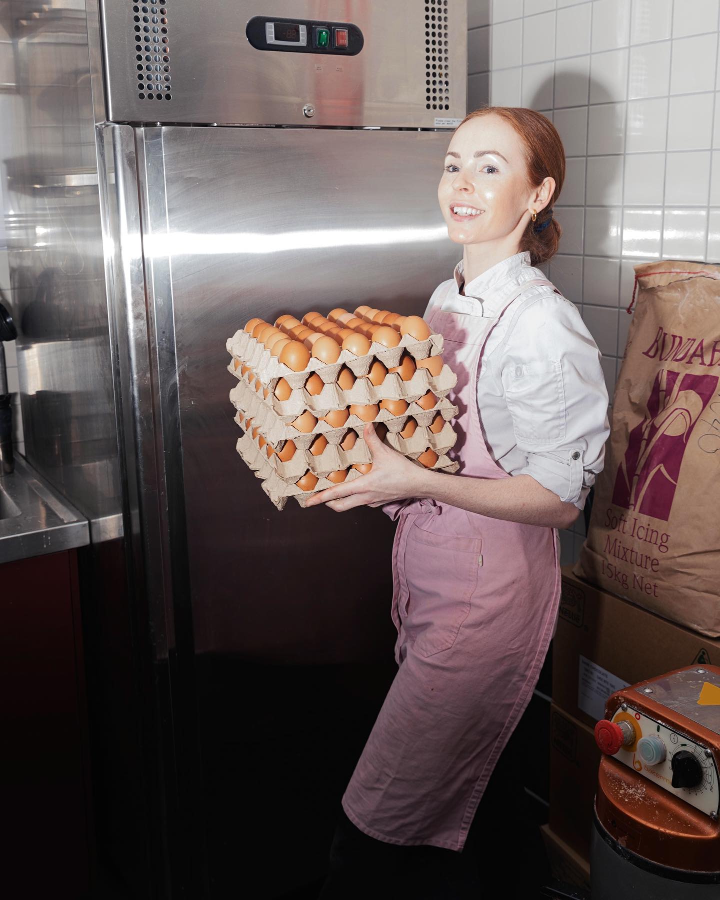
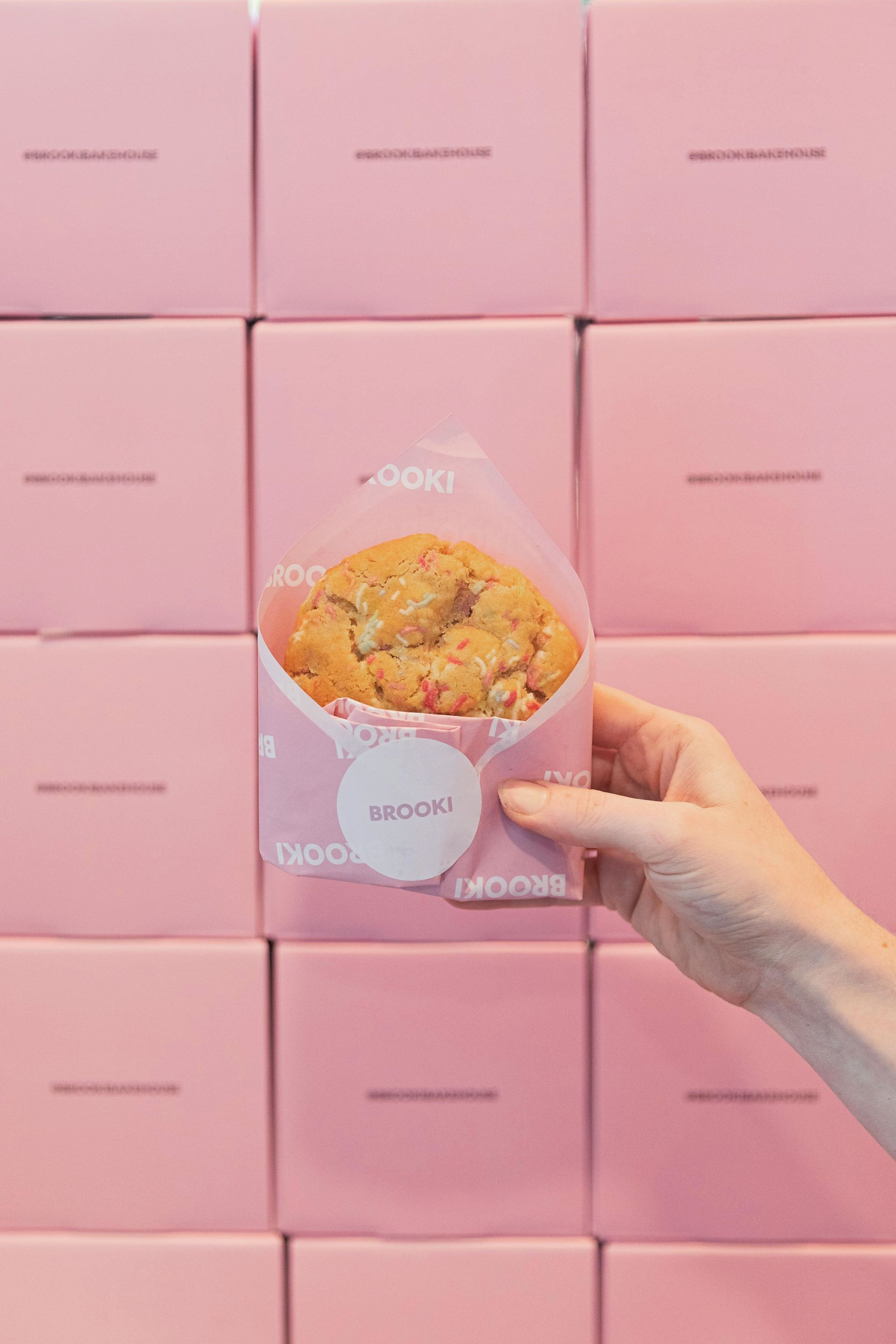
- Firstly, it’s a bakery, it can be messy, we embraced the imperfection and chaos and have included them in the photography process, with flour dusted aprons, buttercream icing bowls and the dunking of cookies in coffee.
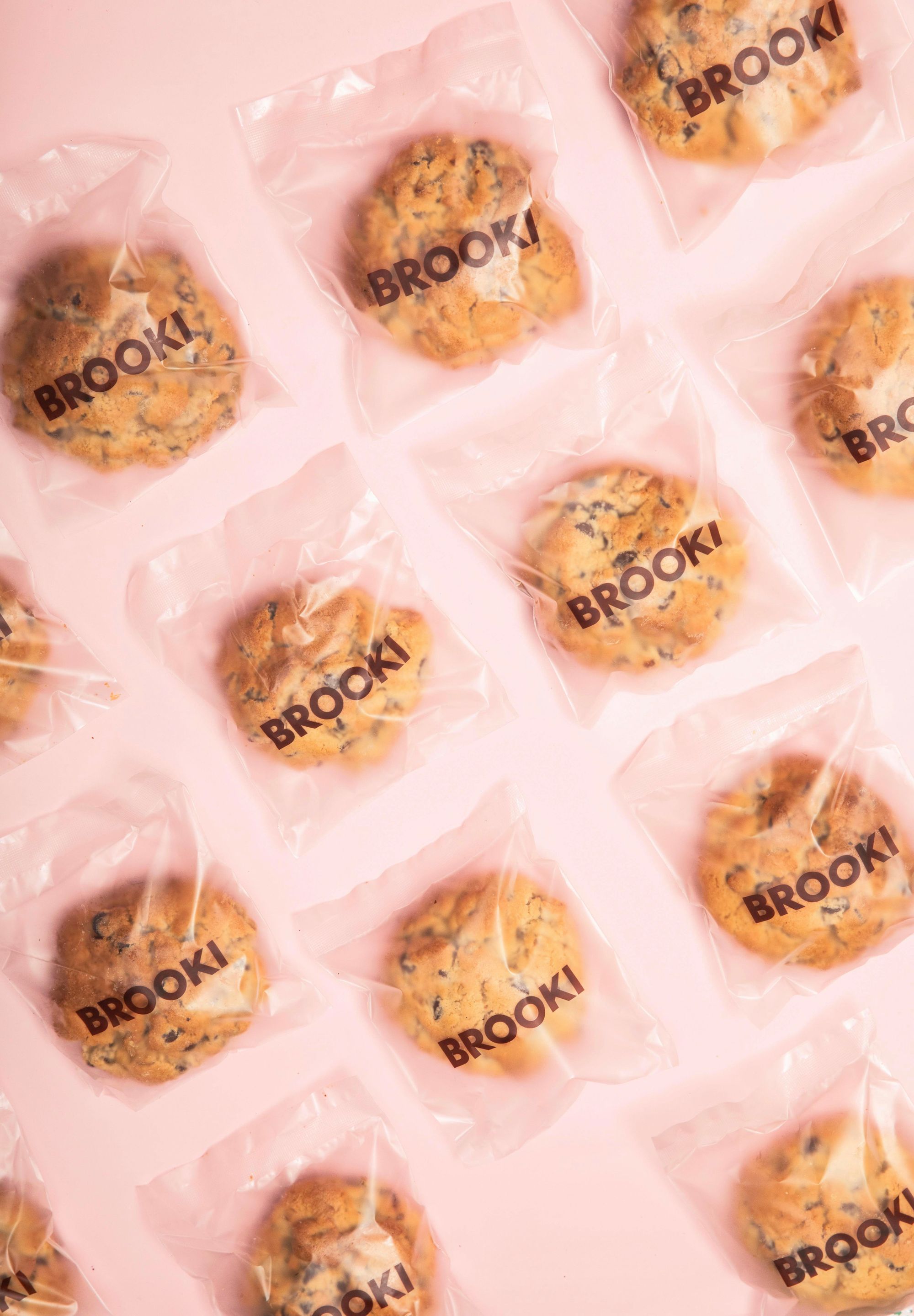
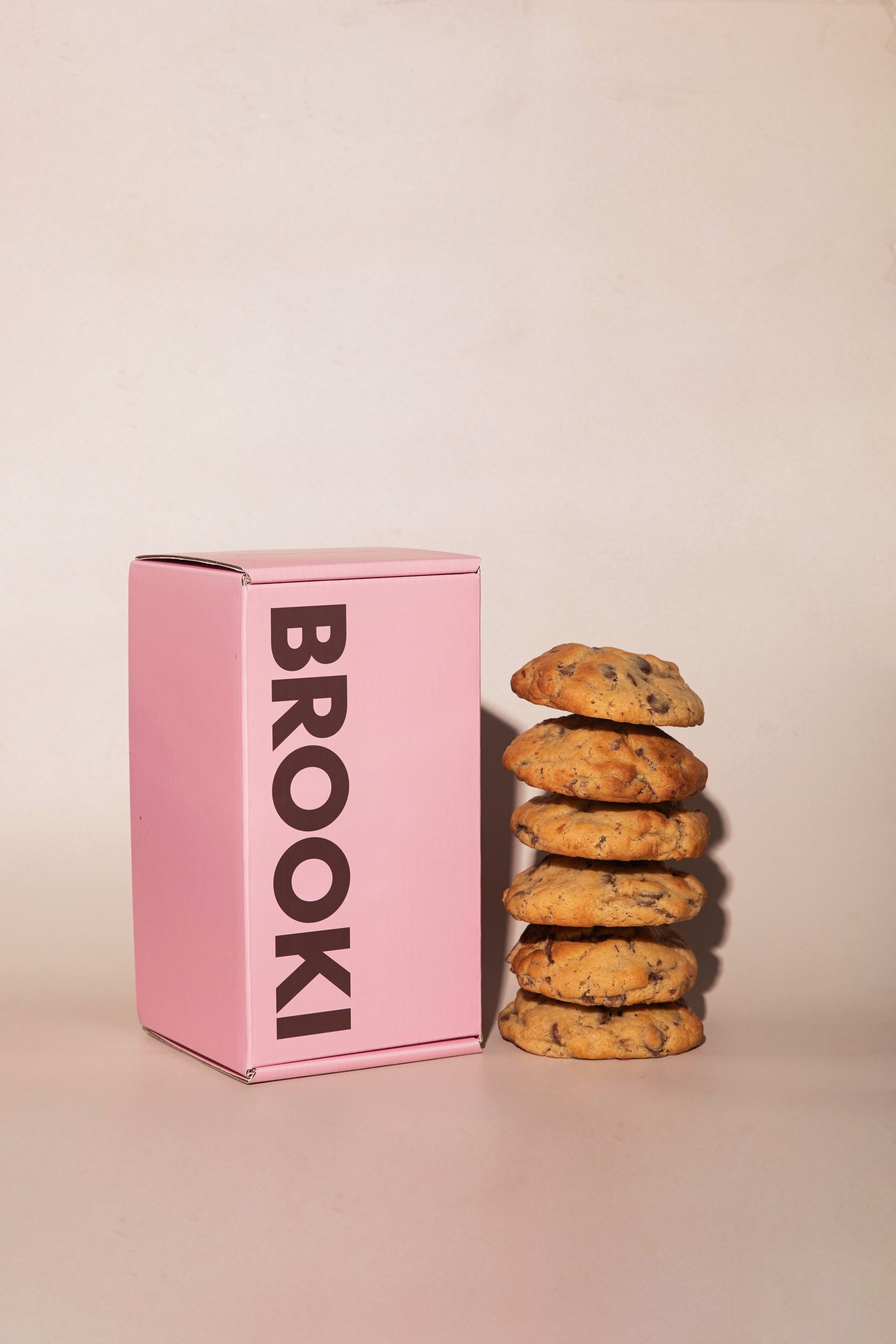
- We loved the contrasting flash effect for a lot of images we have shot, capturing all the amazing noissue packaging and those irresistible baked goods using an open profoto monolight head with no diffusion. The light was either bounced off the ceiling or pointed partially directed at the subjects.
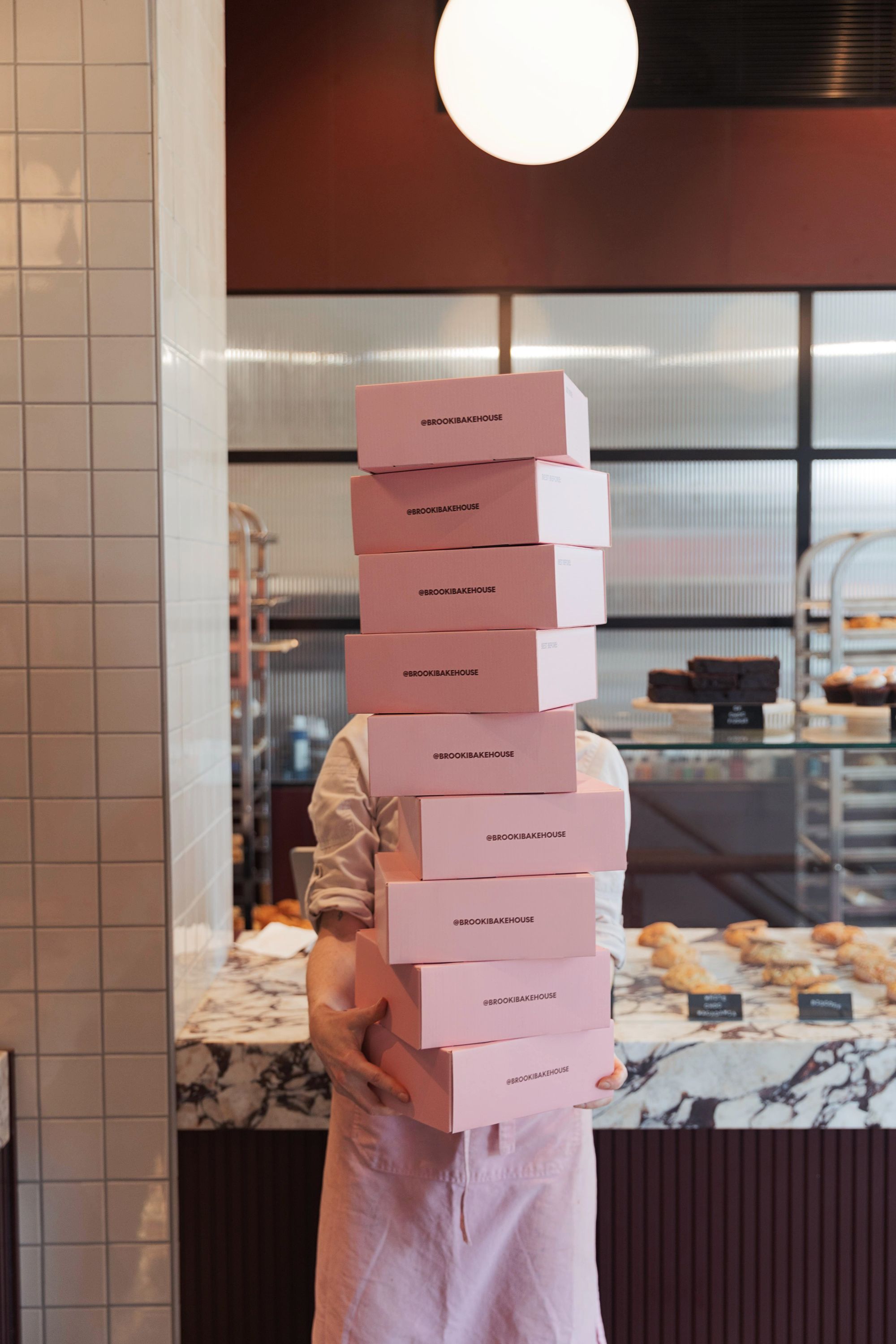
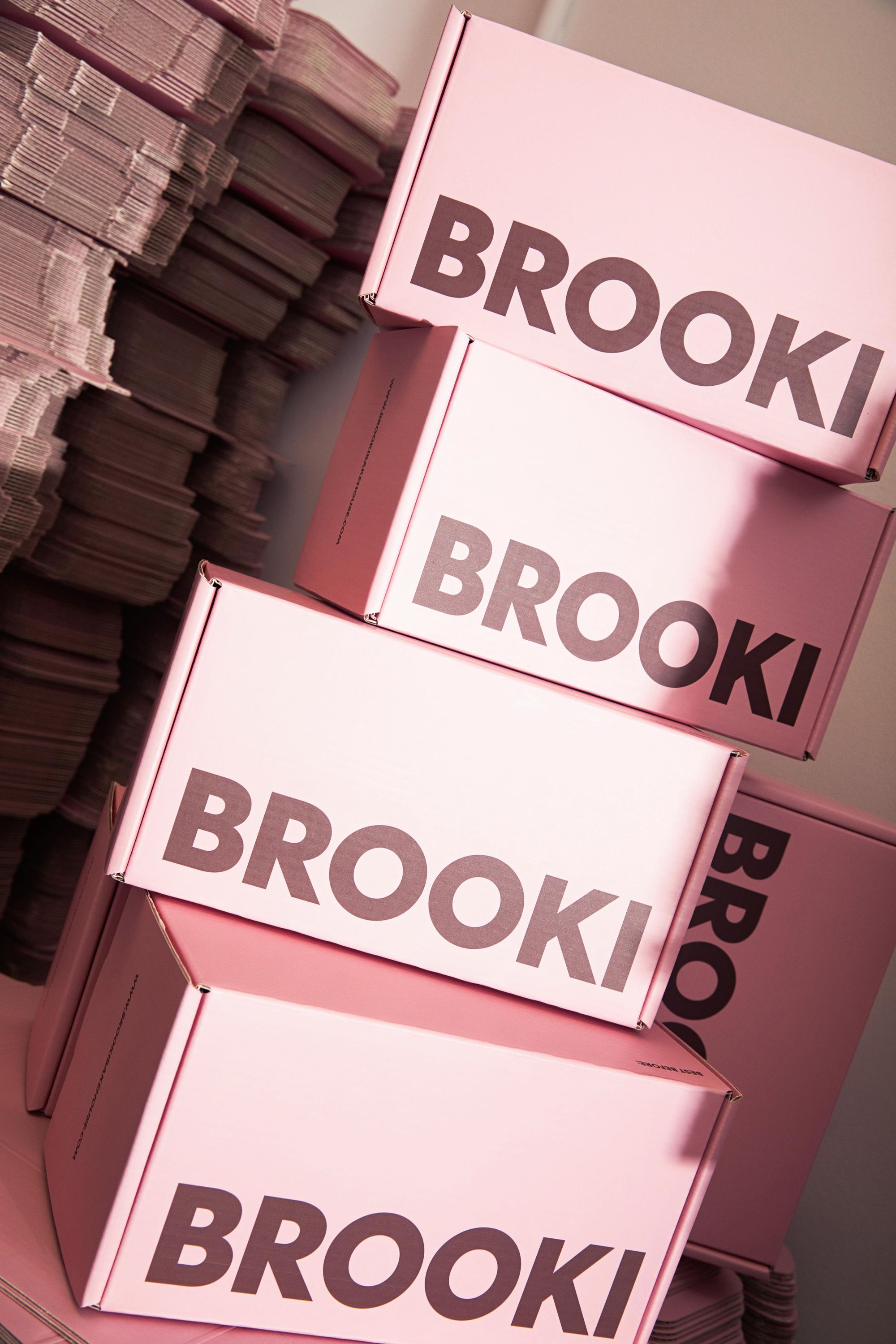
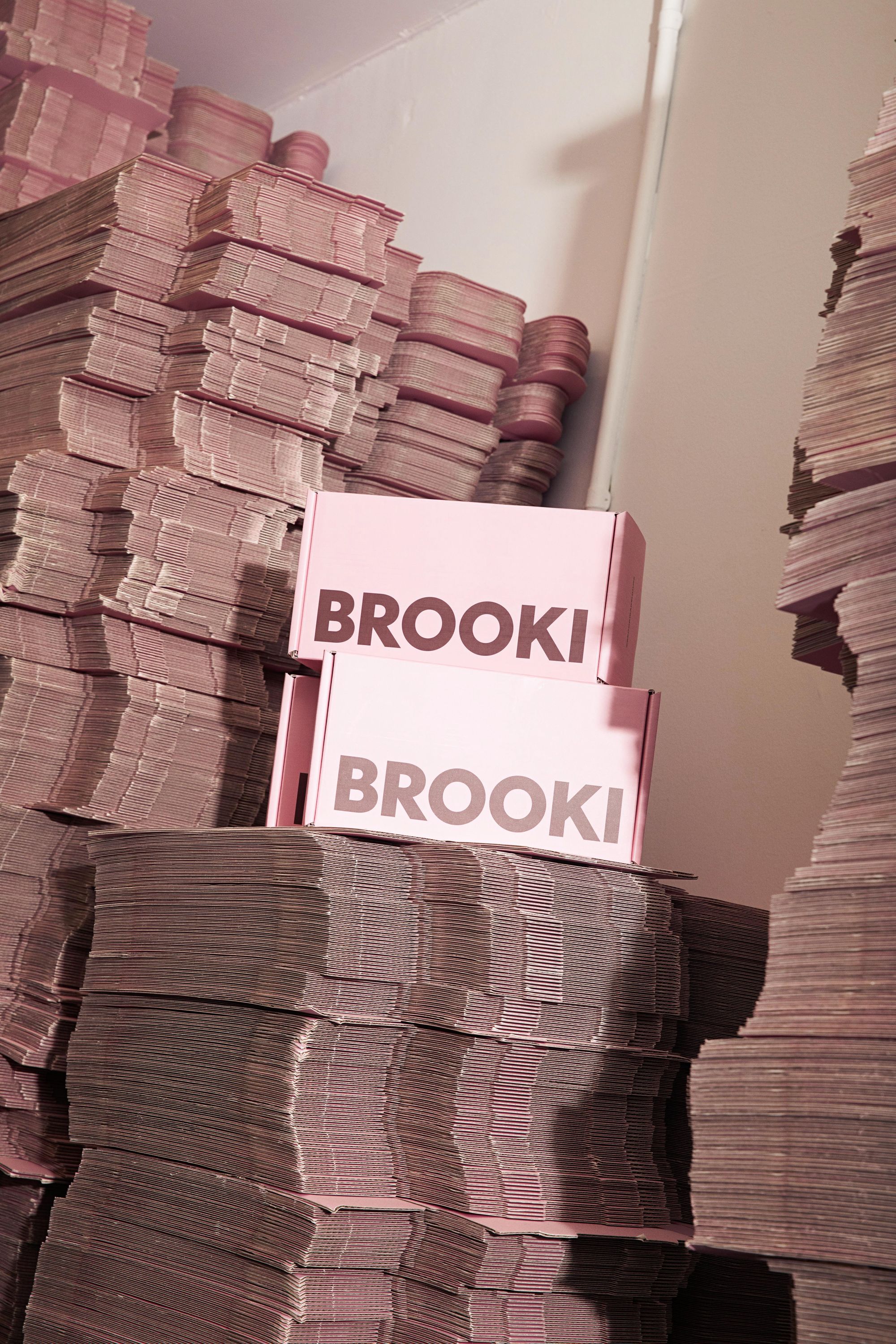
- More is more sometimes, right? When it came to shooting the packaging, we loved framing a lot of the boxes amongst the large quantities of product that Brooke has to keep on site, we also wanted movement in imagery with lots of candid moments of Brooke doing what she does best, baking of course!
- All of the shoots have been taken with a Canon 24-70mm lens. Being in quite a tight space and shooting everything in and on site meant that shooting needs to be quite mobile and flexible, so you can capture everything quite quickly without losing time changing up equipment.
- Obviously snacking on one of the Brooki NYC Cookies to keep that creative energy flowing!
What made noissue a good fit for your packaging?
I've long considered noissue to be at the forefront for creating great packaging products, especially when it comes to recyclable mailers and their commitment to the eco-friendly alliance. Packaging is a tricky one for me from an ethical standpoint, because I fully comprehend the issue of waste and single use products, but also understand the global market we live and work in, where packaging is a necessity to get your products from A to B, especially when it comes to food grade products that require specific packaging to ensure food safety.
Thus it was really important for me to partner with a company who not just understands eco-friendly packaging solutions, but has it at the core of their brand ethos. As we continue to grow and reach more customers, I want to make sure we are doing everything we can to provide ethical packaging products, and I know noissue will keep us in the best position to hear about new innovations and packaging materials as they become available to the mass market.