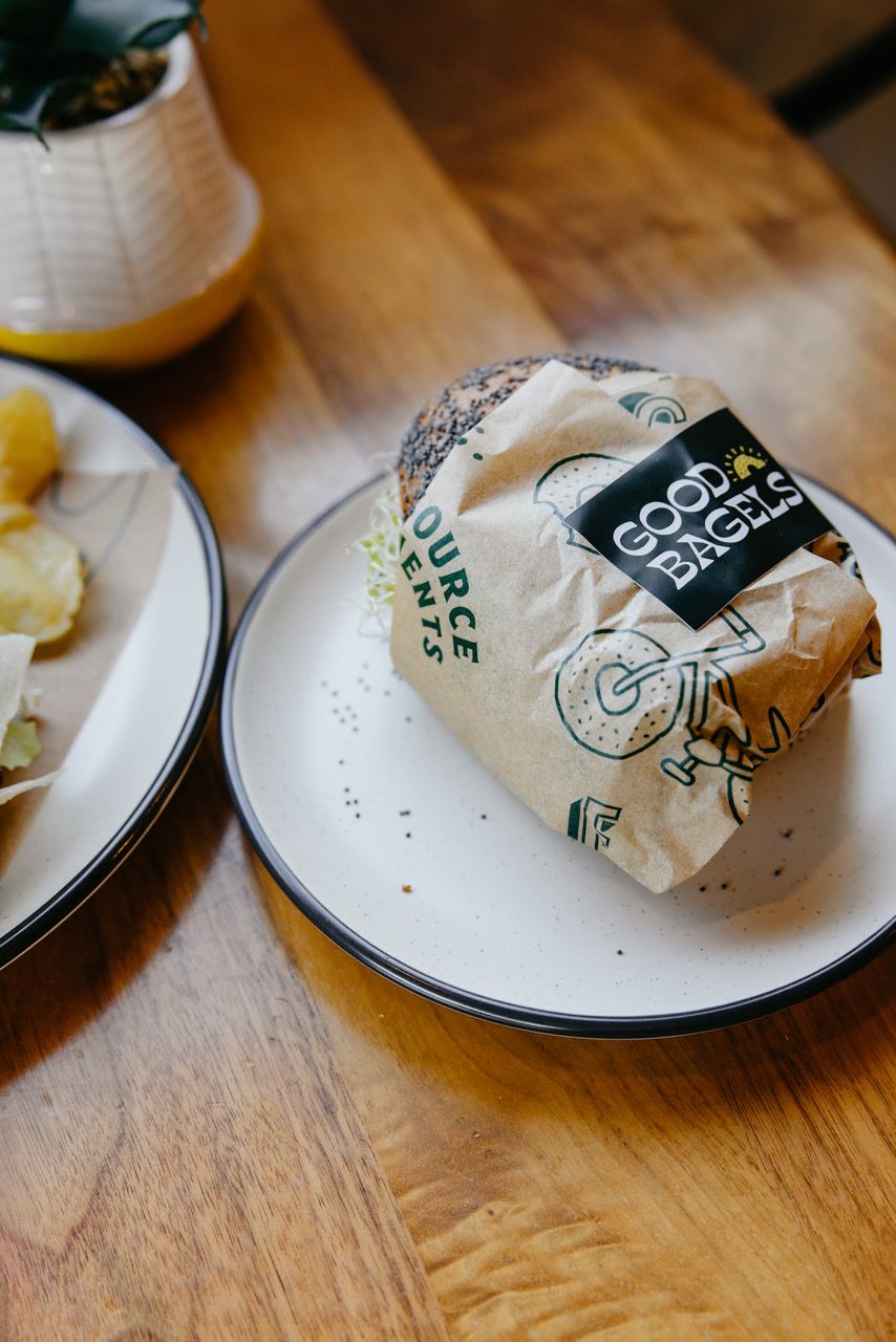
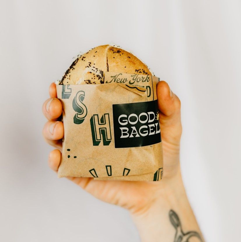
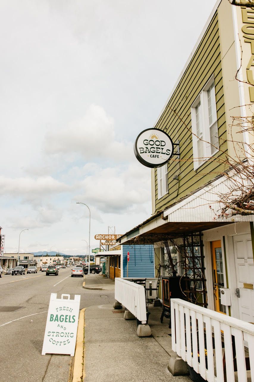
We chatted with the team at Good Bagels about their journey to creating quality bagels as a testament to their childhood staple food, re-creating the feeling of comfort from it, and sharing it with their community in Anacortes, Washington. Inspired by both the modern New York and the outdoorsy Pacific Northwest, their design on noissue food packaging is sure to be memorable—just like their really good bagels!
Tell us a bit about your brand, introduce it to the world!
Good Bagels is an artisan bagel and sandwich shop in the heart of Anacortes, WA. It was created by two brothers from NY, who grew up eating fresh, NY style bagels–it was a staple for them! When they moved to Washington State they quickly realized there weren’t any quality bagel shops in the area. With Alex being an entrepreneur and skilled baker, and Nick being a highly trained chef of 10 years, they jumped on the opportunity to fill the void in their town of Anacortes. Excitedly, they went back to their house and began baking and when they got their recipes down, they invited a bunch of friends over to try their bagels and all they kept hearing was, "damn, that’s a good bagel"! Thus, the name Good Bagels was born!
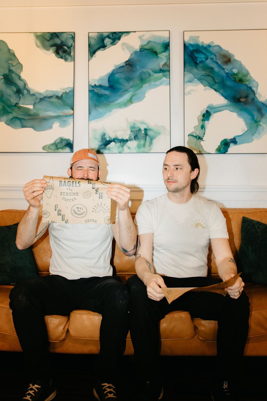
Good Bagel’s purpose is to make quality bagels and sandwiches from scratch using the highest quality local ingredients available. They are committed to fostering the idea that Anacortes is the gateway to discovery by filling people’s bellies, getting them ready for their day, and providing an après-style retreat to gather afterwards.
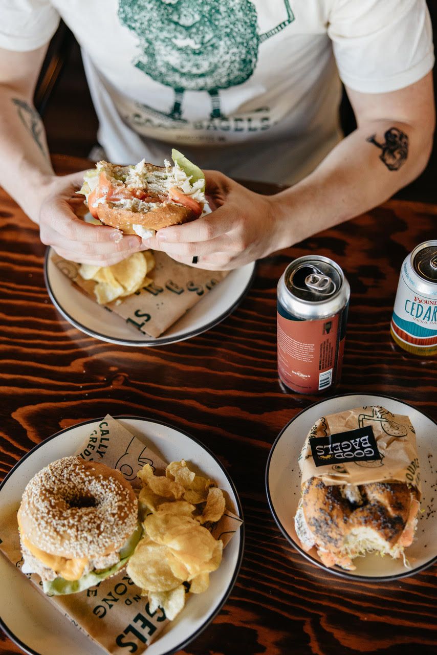
The shop itself is warm, inviting, and celebrates the PNW community. It’s filled with lots of comfortable seating, artwork from local painters, hiking guidebooks, board games, and ski videos playing on the TV.
As far as the brand aesthetic, it draws from our roots in New York and love for our PNW community. We wanted our branding to feel like a classic New York Bakery/Delicatessen was picked up and dropped in the woods of the Mt. Baker wilderness.
Tell us about the design for your packaging and how you’re using them?
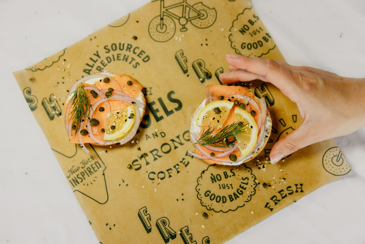
The packaging that noissue printed for us is our sandwich wrap. The illustrations are inspired by NY and the PNW. Mixed typography and Deli tickets from NY delicatessens, bikes and our beloved sun/bagel logo mark that celebrates the outdoor community.
What made noissue a good fit for your packaging?
We chose noissue not only because of their good reputation, but most importantly, we love love loved that they have sustainable options. It was a perfect fit!
