
@luxeycup
Logos are the number one thing that people think of when they think about branding. When you picture Apple, Nike, or Adidas, your mind probably jumps automatically to that bitten apple, the swooshing tick, and the three stripes.
When you see those symbols on someone’s shirt, shoes, or shared post on Instagram, you know straight away what brand they’re rocking. That’s the power of logos: to immediately identify a brand wherever and whenever it’s spotted.
But what exactly is a logo, what makes a good one, and how can you create your own? Check out our guide below.
What is a logo?
A logo is defined as ‘A symbol or other small design adopted by an organization to identify its products, uniform, vehicles, and more.’ It’s a mark that can represent your company, what you do, who you are, your product or service, or your customers and your values, and works as a recognisable brand element for your audience.
What a logo needs to do
"A logo is a flag, a signature, an escutcheon, a street sign. A logo does not sell (directly), it identifies. A logo is rarely a description of a business. A logo derives meaning from the quality of the thing it symbolizes, not the other way around. A logo is less important than the product it signifies; what it represents is more important than what it looks like. The subject matter of a logo can be almost anything" — Paul Rand.
As Paul Rand explains, the purpose of a logo is to identify, not explain. As long as your logo is recognizable and memorable, it can be whatever you want it to be. Just because you sell candles, doesn’t mean you have to have a candle in your logo. If you’re a photographer, your logo doesn’t need to be a camera. Even if your logo is just your brand name, as long as it’s identifiable, it’s successful.
Take one of my personal favourite logos for example, the National Geographic logo. Is it a magazine, or something related to geography at all? Nope. It’s a rectangle. But it’s simple, distinctive yellow shape is recognizable around the globe, no matter where it’s placed.


The same goes for many of the world’s most iconic logos, such as Apple, Nike, or McDonald's. None of these logos explain what the brand offers, but they do identify the brand and create a memorable mark that their audience recognises.
This is the goal for your logo, too!
What makes a good logo
While the options for what your logo can be are endless, not all logos are created equal. There are a few things that make a logo successful.
1. It's readable
First and foremost, your logo needs to be readable. It’s no use having a fancy logo design if no one can make out your business name, and if they can’t, you will only confuse your audience and never gain brand recognition. Whichever font you choose for your logo needs to be clear enough for your clients and customers to read at both large and small sizes. It’s important to consider your audience here too – young children learning to read, visually challenged people, and elderly generations with worsening eyesight may need even clearer fonts than others, for example.
2. It's flexible
It’s important to have variations of your logo to use in different situations to make sure your logo is flexible. For example, if your primary logo is a combination mark made up of text and an icon, you will need a version that just includes the icon to use as your favicon, app icon, or in other smaller situations. Similarly, you might want a version that is just the word mark. Also, if your primary logo is aligned horizontally, you may want a vertical version for situations where horizontal space is limited. These versions allow for variety in your designs while maintaining a cohesive brand and ensuring that your primary logo isn’t just being squashed into every situation, even if it doesn’t fit.
3. It's scalable
It’s important to consider scale when creating a logo, since it will be used in so many different ways from the tiniest sizes to the largest, and needs to work in each and every situation. Favicons (the icon associated with your website, typically displayed in the address bar or tab of a browser, or next to the site name in a user's list of bookmarks) are typically one of the smallest places that your logo will be used, so this is a good benchmark for reviewing whether your logo works at this size. It needs to still be readable and recognisable, no matter how small it is.
And just like a logo needs to work on a small scale, it needs to work equally as well at large sizes. Depending on your business, your logo may end up being used on billboards, buses, planes, signs, and other large surfaces. This means that your logo needs to scale well in terms of design and resolution, remaining crisp, clear and strong regardless of how big it gets.
4. It's recognisable
Last but not least, it only takes consumers 10 seconds to form a first impression of a brand’s logo, but it takes 5 to 7 impressions for consumers to recognise the logo, so you need to stand out. Your logo needs to be strong and unique enough to wow your audience in that first 10 seconds, and be memorable enough for them to recognise you in those next 5 to 7 impressions.
The 7 different types of logos
Not sure where to start? There are seven different types of logos, each containing typography, imagery or a combination of both, and all providing a different feel and meaning to your brand.
1. Wordmark/logotype (name only)


These April + The Bear and Beetle Ink Co logos are examples of wordmarks.
2. Monogram/lettermark (Initials only)

This Paper in Print logo and Aunty Ellen logo are both monograms.
3. Brand mark/symbol/icon/pictorial mark (A symbol)


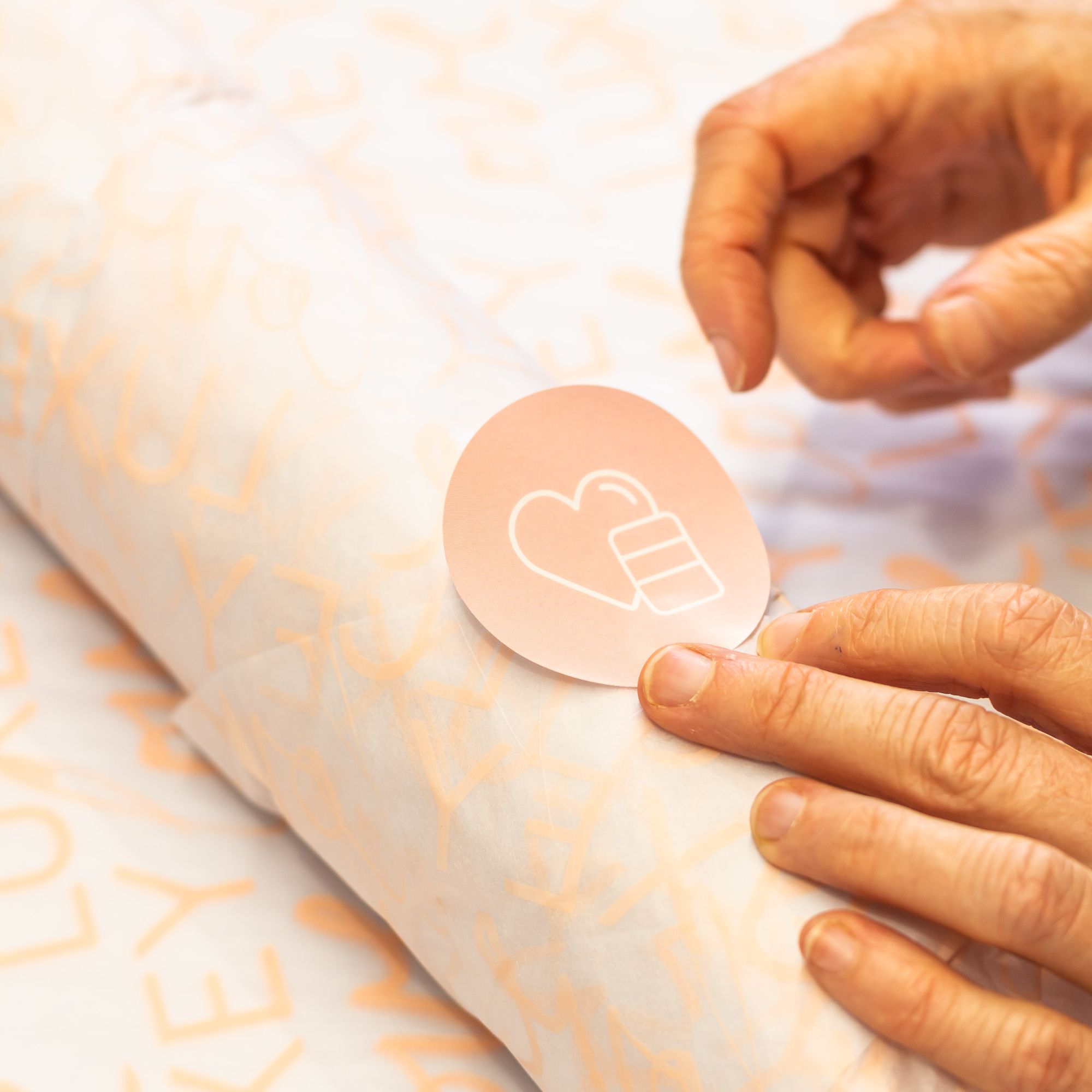
These m.aykes and LuxeyCup logos are both symbols.
4. Abstract logo mark (Abstract symbol)

The circle mark in this My Meraki logo is an abstract symbol.
5. Mascot (Character logo)


These Adourable and Hu Made logos both use mascots.
6. Combination mark (Symbol and words combined)

This Habitat Coffee Co logo is a great example of a combination mark, combining a symbol and the brand name.
7. Emblem (Symbol and words combined in a badge, seal or crest)


These White Orchid and Wick & Maple logos are examples of emblems.
What you'll need to design your logo
1. Understand your brand
The best way to design an effective logo that will keep your brand consistent and help you stand out for years to come is to be intentional about how and why you’re designing it.
Before you dive into creating your logo, first get clear on your identity, your audience, and your unique voice. This will give you everything that you need to ensure that the logo you create is communicating the right things to the right people.
2. Know your goals
It’s also important to understand what you’re going to be doing with your logo once you have it. Take stock of your business goals and think forward to what might need your logo on it in the future.
Is it going on tshirts, conference slides, kickstarter campaigns, food products? Whatever it might be, having your goals in mind while designing your logo will ensure that your logo will stand the test of time and work for you and your vision!
3. Find inspiration
Once you have clarity about who you are and what you want to communicate to who, you can curate a useful moodboard for your brand that reflects your vision. This will give you an overall visual direction for your brand as a whole.
While those moodboards focus more on the big picture mood and direction of your brand, it’s also useful to find specific inspiration for the layout, typography, and other elements of your logo. This isn’t about finding logos to replicate, but finding elements that will inspire your own logo.
You can use Pinterest, Behance, Dribbble, or Instagram to find inspiration, and pull it together into a document you can reference as you work on your logo.
4. Use fonts, colours and elements that align with your strategy
The best way to start creating your logo is with typography. Typography is so powerful in communicating meaning, especially when you’re able to use your brand strategy and choose the best fonts for your brand to convey your message.
Different styles of typography feel different and create a different energy for your audience, so even typing out your business name in a font that’s aligned with your strategy will be an incredibly powerful place to start.
Take your time to browse and find the best fonts for your brand, then you can start putting them to work, combining them together, and creating a logo that feels aligned with your brand.
As well as typography, there are other elements that you can incorporate into your logo or logos. These could include:
- Icons
- Illustrations
- Shapes
- Lines
- Dots
- Dates
- Trademark/registration marks.
When you’ve laid out some type, you can add in these elements to make your logo unique, and align it with your message.
Where you can use your logo
There are an infinite number of places that you could put your new logo, but the point isn’t to just slap it everywhere for the sake of it – that’s overkill and doesn’t serve a purpose. Instead, be intentional with your logo and where you put it, and put a bit of thought into how it’s done. Here are some great places to display it.
Social media
The first place most people think to pop their logo is on their social media profiles and that’s a great place to start. Doing this consistently across all of the platforms that you use will instantly refresh your brand and help keep everything cohesive.
Website
Your website is your home on the internet so this is a key place to pop your new logo. You may end up placing it in multiple spots on your site, but the two main ones to cover are the header and footer.
One spot on your website that is easily forgotten is your favicon. This is the tiny logo that sits next to the page name in a browser tab. It’s only little but it makes a big difference. Choose the simplest version of your logo and pop it as your favicon so that all those people with a million tabs open at once can spot yours with no trouble!

Emails
You and your company likely send a lot of emails to clients, customers, and collaborators, so having your logo in your email is a no-brainer! Update your email account profile photo to your logo so that it shows up in people’s inboxes, and pop it in your email signature to sign off your emails in style. If you use email marketing with your customers, you can update your email template with your new logo too.

Presentations
Whether you’re doing client presentations, a pitch deck for investors, webinars for potential customers, product demonstrations or any other type of presentation, use your logo throughout to keep it on brand and mark it as your content. I recommend using a full version of your logo at the beginning, an icon version in the bottom left of every page, and the icon version again on the thank you page at the end.
Business cards
First impressions count, and when you meet someone, the first visual representation of your brand that they encounter is potentially your business card, so let’s make it the best it can be. With your logo front and center and your details alongside it, that first impression will be a winner!
Printed promo
Alongside business cards, there are a range of other printed collateral that you might use to promote your brand. These could be postcards, brochures, posters, discount cards, information packets, pricing guides and more. Putting your logo on these will align them with your brand and maintain consistency across all of your items.

The Kind Jungle’s promotional cards featuring their logo
Signage
For businesses with a physical location, or even those who sell at markets, you’re going to need some branded signage so that people know where to find you and that they’re in the right place when they do! Windows, neon signs, chalkboards, pull-up banners and footpath signs are just a few methods of signage that you can pop your logo onto.
Products and Packaging
If your business sells physical products, adding your logo to them is a no-brainer. Take a look at all of the products that you own – there’s likely a logo on it somewhere! I’m sitting at my desk now and almost everything has a logo stamped, printed or embroidered on it. Let people know who made your amazing product on the packaging and the product itself.

Merchandise
You’ve probably seen big corporate businesses doing this, but it’s not just for them! Promotional merchandise like mugs, pens, pins, sticker, badges, tote bags, lanyards and a hundred other potential items with your logo on them make amazing giveaways, client gifts, and things for you and your team to use and rep!

Apparel
Speaking of things you can rep, apparel is often a big one that can utilise your logo really well. Whether you have a uniform or just want to rock a cool t shirt or hat or other item of clothing, you can pop your logo on it so that people know who you are!
Vehicle
Last but not least, whether you have a company vehicle or a personal one, adding your logo can in turn add business! Promoting your business while your run errands, zoom between meetings or make deliveries is multitasking at its best. You never know who will see your logo and look you up!
Go forth and logo
Whether you’re creating your own logo, or working with a designer to craft one for you, the process of producing a mark that represents your business and puts your stamp on the world, is an exciting one. It’s a chance to really create something memorable and remarkable.
And when you see people wearing, sharing, and displaying your logo, well that’s a whole new level of excitement! That means you’ve crafted not just a mark, but something meaningful.